
Workflow
Introduction
The workflow module allows you to insert different types of buttons, input cells, output cells, and submit, which can be used to direct you to the specific actions of your choice. Workflow can be used to organize your app, as you can control the shape and design of buttons and have more than one sub-menu inside the module.
This module is the best to use if you want to build any type of App.
Installation
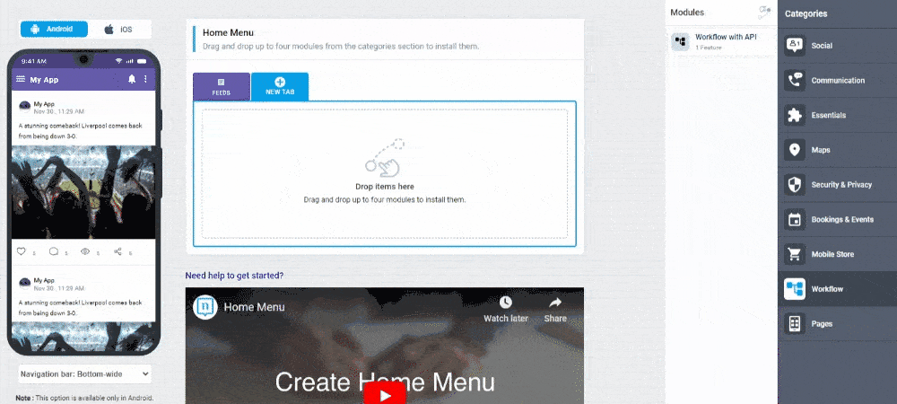
You can install this module in your app in the following places:
- App's Home Menu ✓
- App's Side Menu ✓
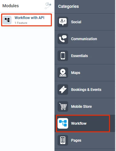
You can find the module in the workflow category. Click or drag and drop the module into your home to install it.
Configuration
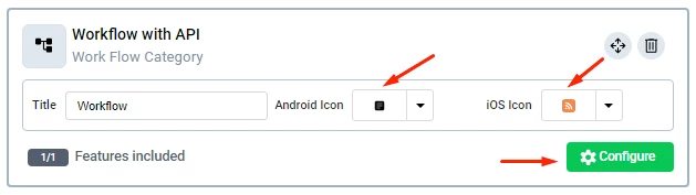
1.) Once you have installed the module by clicking or dragging and dropping it in the home or side menu,
You can rename the module and choose an Android and an iOS icon for it. Click the "Configure" button to open the settings of the module.
Duplicability
This module can only be installed in your home and side menus.
Main Features
Separator cells
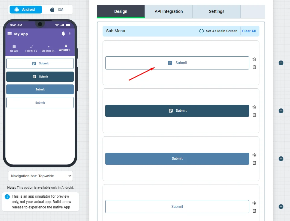
Separator cells are for designing the shape of your workflow. You can use it to separate buttons and add text. Click or drag and drop a separator cell of your choice into your module to install it.
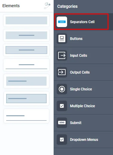
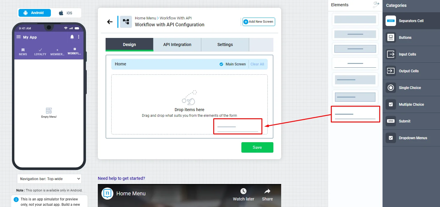
Click the cell to configure its settings.
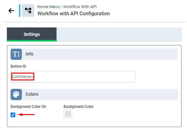
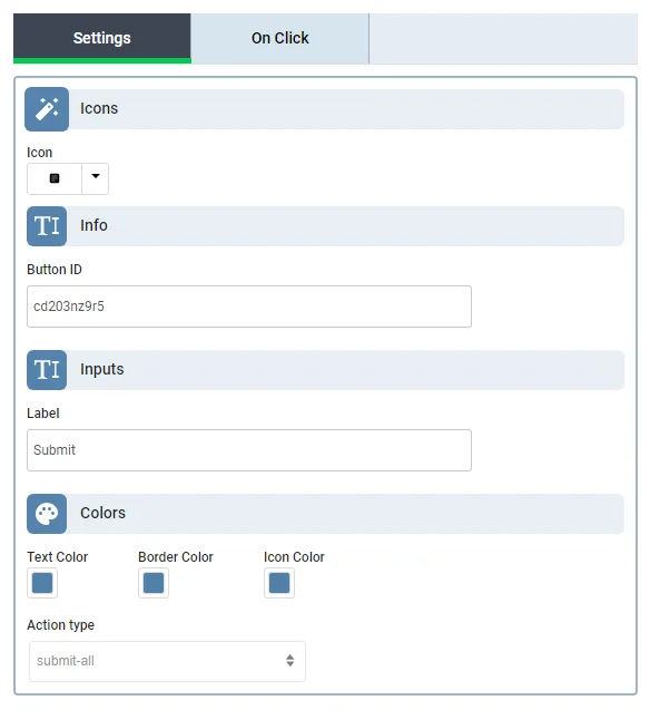
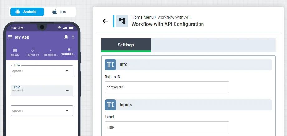
The button ID has to do with developers; if you have a backend system and are a developer, you can order a particular button by its ID. Note that all separator cells, buttons, input & output Cells, single & multiple choices, and dropdown menus have the same option of button ID.
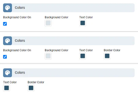
Each cell has its own design. You can always choose if you want your separator cell to have a background or not.
You can check each one and pick the ones you want.
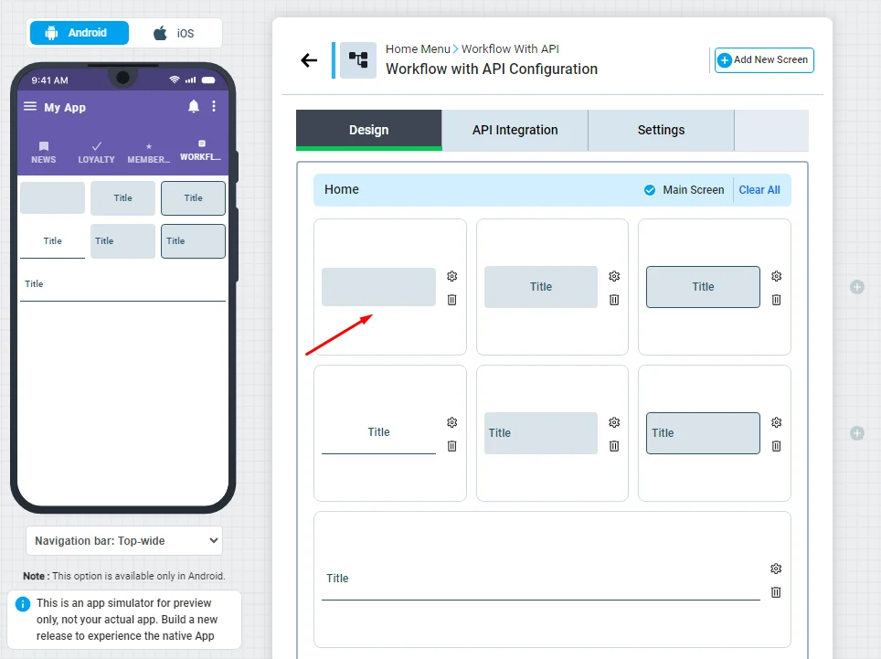
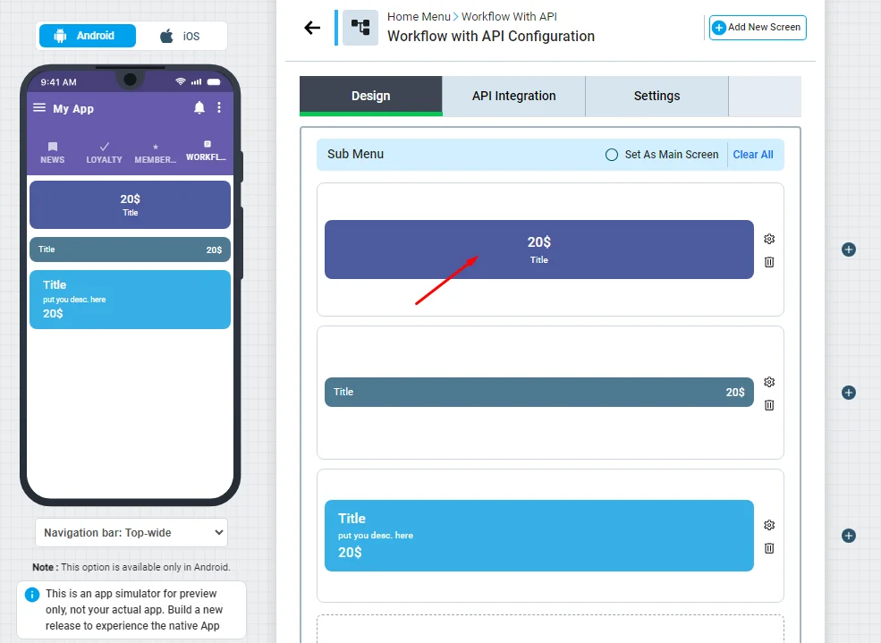
Buttons
Click or drag and drop a button of your choice into your module to install it. And drop it in your home menu.
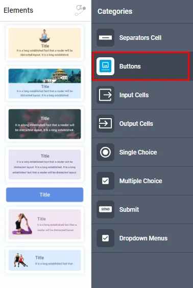
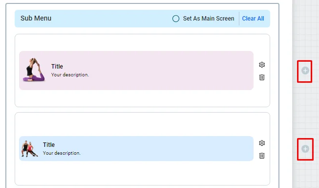
You can add up to three buttons or cells in each row.
Note that these two buttons can only be inserted on their own.
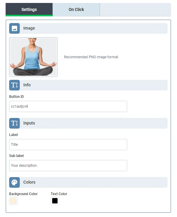
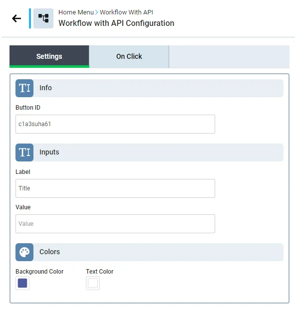
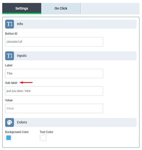
Click the button to open its configuration.
In the settings tab, you can get the button ID and customize your button's layout: change the button's image, add background and text color, and add text and description.
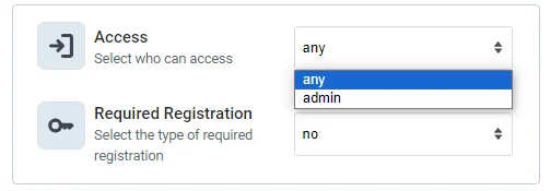
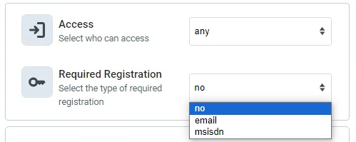
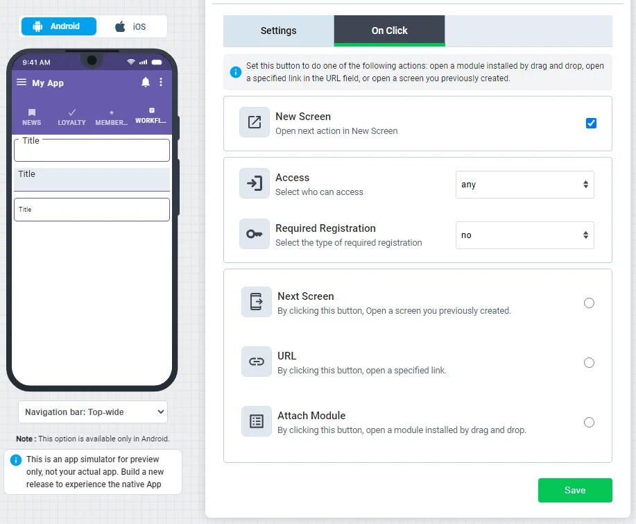
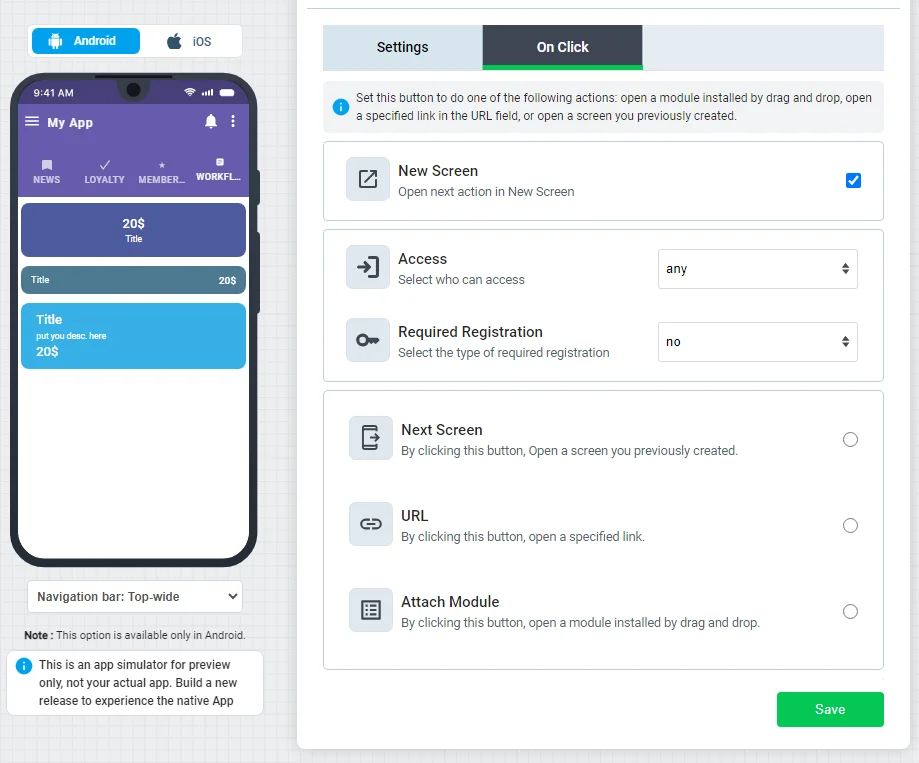
In the On Click tab, you can find the following:
- Access
- Required Registration
- Next Screen
- URL

1.) Access
You can design a button that is accessible to all app users or just admins.
2.) Required Registration
A button can be used for restricted transactions on your app. For example, users can navigate through your shopping app without the need to sign up, but if they want to complete their purchasing process, this button will restrict them and ask them to register first. Users can register via Email or msisdn.
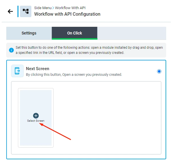
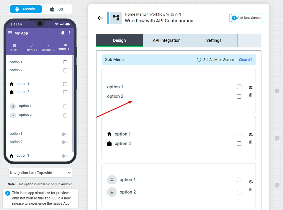
3.) Next Screen
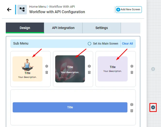
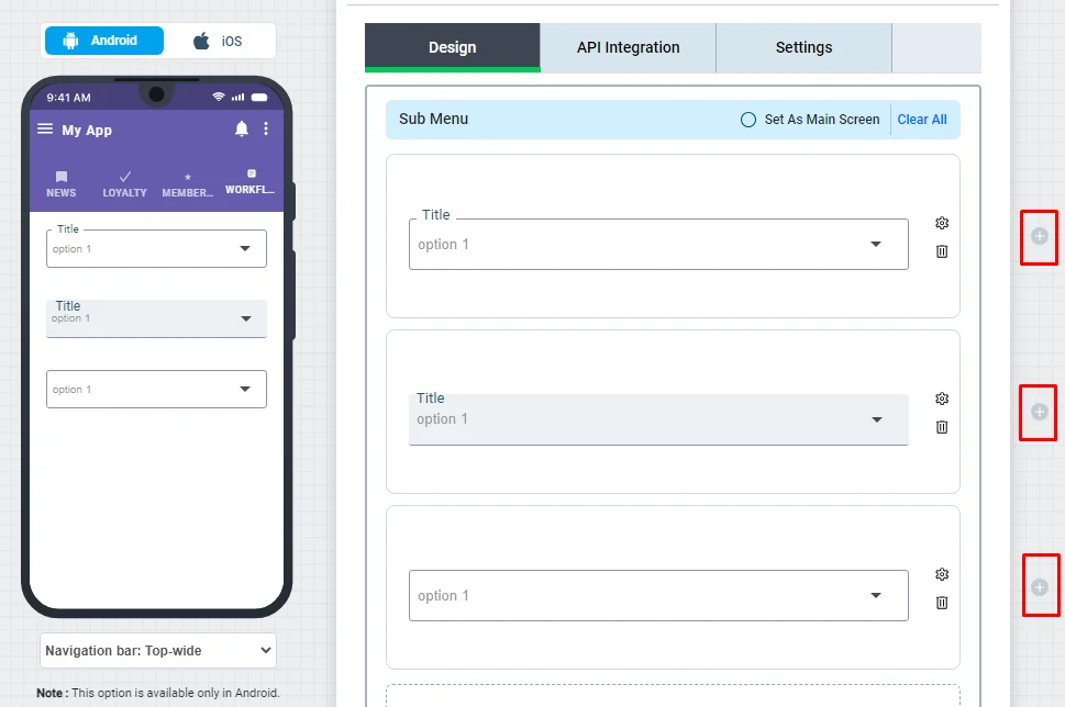
This is where you add another screen (submenu) to be represented once you tap on the button.
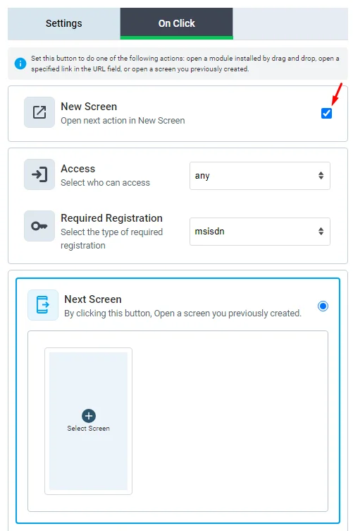
For example, let's add a screen (submenu) to this button.
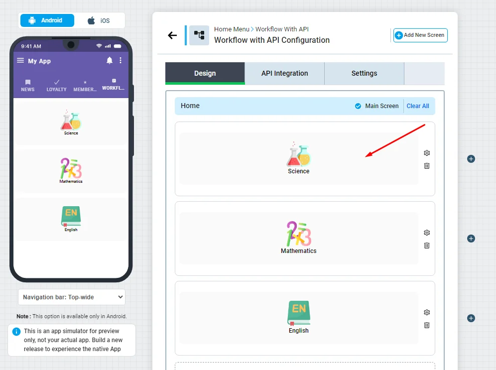
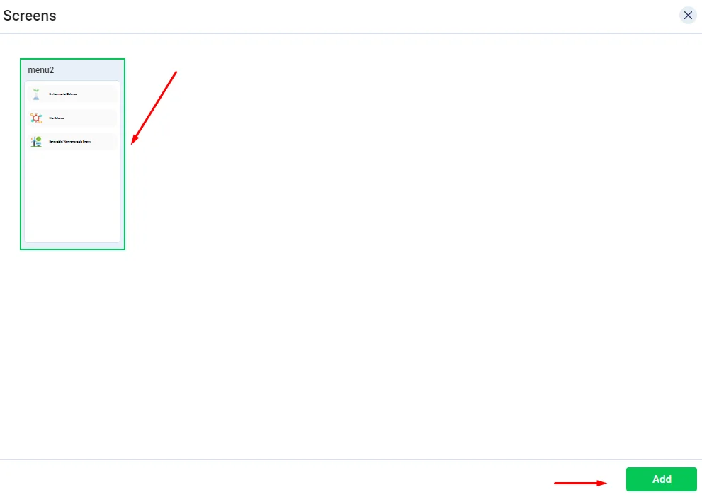
First, create your screen (submenu) and click "Add New Screen".
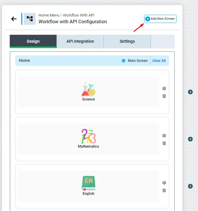
Design the submenu, and don't forget to click Save. Then, the newly created screen will be displayed on the left App Screens menu.
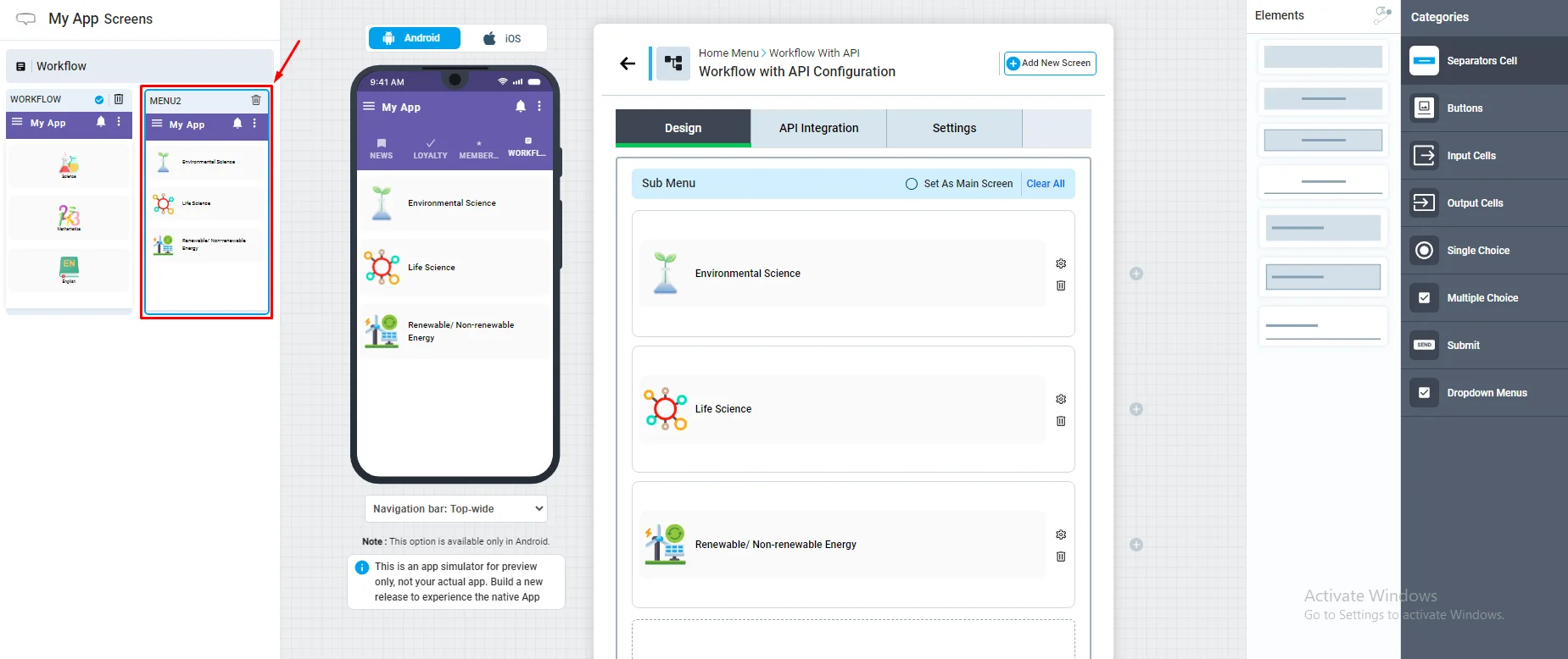
Now go back to the main menu by clicking on the screen and clicking the button.
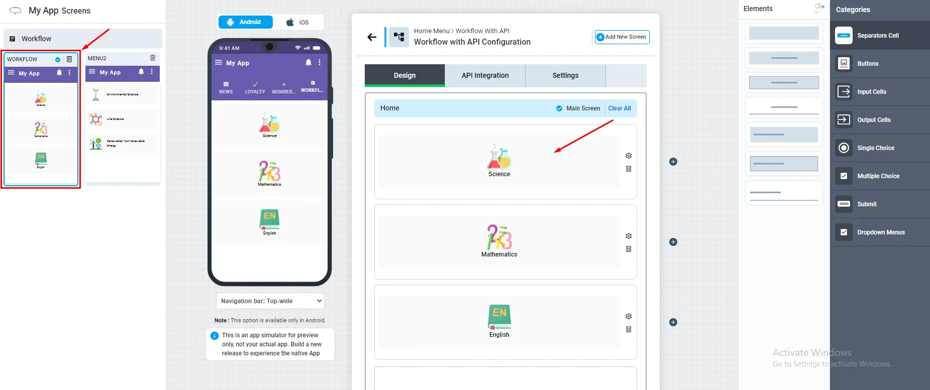
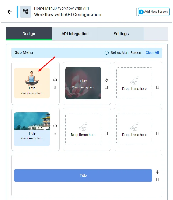
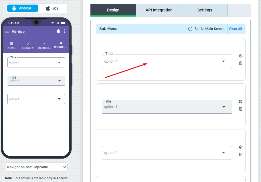
Click "Select Screen."
Choose the screen you created and click Add.
You have the option to replace the screen with another one, or you can delete it. Once done, don't forget to save.
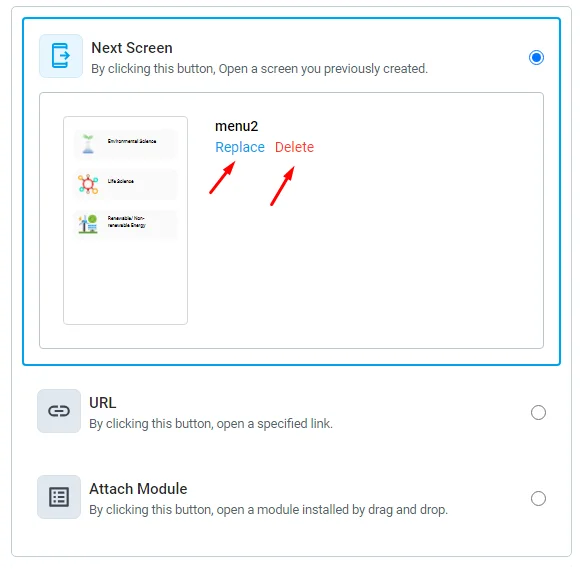
Your button now represents this screen (submenu), and when your app user clicks on it, it'll direct the user to the screen you added.
4.) URL
You can add a website's URL or a link to a specific channel, chat group, or event. Note that this feature can only work with channels, chat groups, and events.
From the side admin menu, go to channels and click on the channel 'View Details' button.

and you will find the invitational links. Copy the channel link.

Go back to your workflow, paste the channel link in the URL section, and don't forget to save.
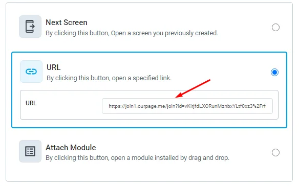
Your button now represents this channel; when your app user clicks on it, it'll direct the user to this channel.
To determine which user specifically accessed a given page of yours, you can add a URL that can transmit a user identifier into a URL, but your URL must have one of the following variables:
- $user_id ⇒ It will pass the user ID.
For instance:
Your website's URL is [https://nandbox.com/app-builder-blog]. In this instance, you can include the variable $user_id into your URL: [https://nandbox.com/app-builder-blog/$user_id].
The URL will then return the user ID as [https://nandbox.com/app-builder-blog/32371289738912].
- $user_login ⇒ It will pass the user's login either via email, mobile, or a random ID in case your app requires registration.
The same is true for $user_login: add the variable to your URL [https://nandbox.com/?id=$user_login], then URL will return with the user login: [https://nandbox.com/[email protected]]
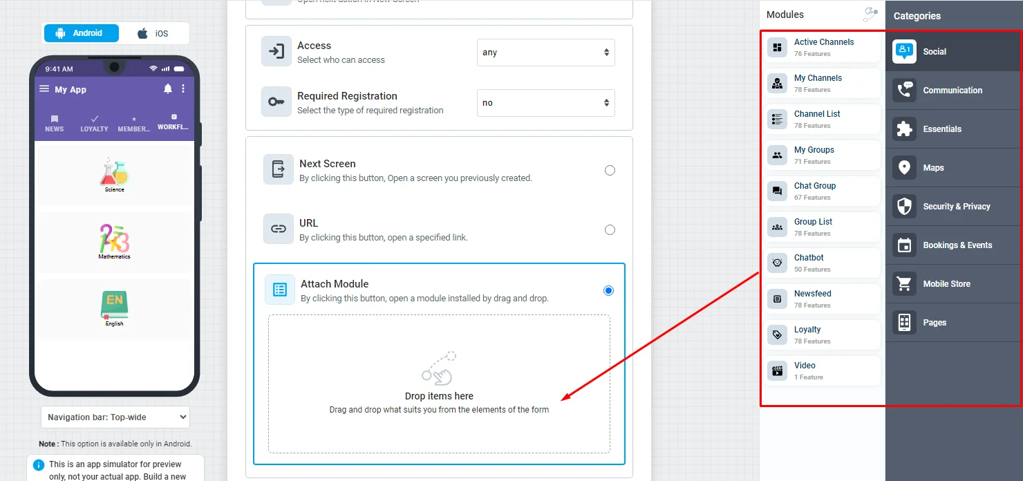
3.) Attach Module
You can simply click or drag and drop any module of your choice and set up its configuration, then click save.
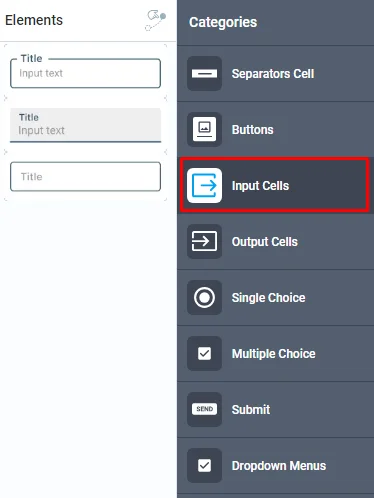
Input Cells
Click or drag and drop an input cell of your choice into your module to install it. This is where your users provide the required information to be sent to your server. There are three types of cells to choose from.
Click the cell to customize its design.
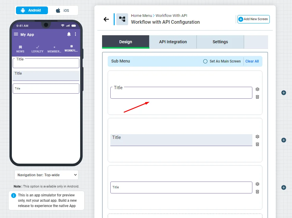
You can get your input cell ID, change the text color and add your cell's title.
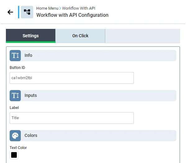
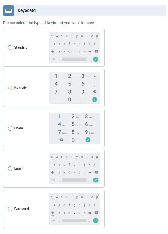
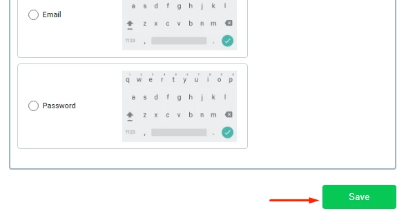
Choose which type of keyboard you want to use in the cell
Configure your cell settings by clicking the 'On Click' tab
And don't forget to save.
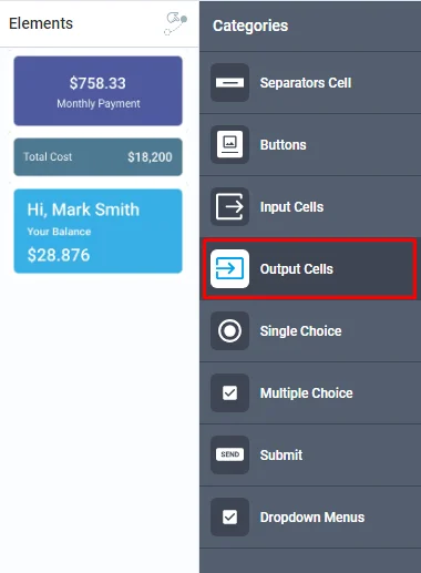
Output Cells
Click or drag and drop an output cell of your choice into your module to install it. This is where your users will find the desired information that your server has sent back. There are three types of cells to choose from.
Click the cell to customize its design.
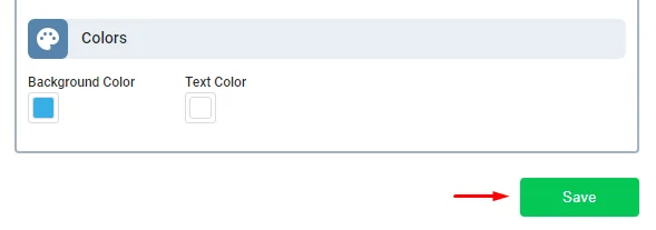
You can get your output cell ID, choose a background color, text color, title, and value (description).
You can add a sub-label (description) in the last style.
Configure your cell settings by clicking the 'On Click' tab,
and click 'Save' when you are done.
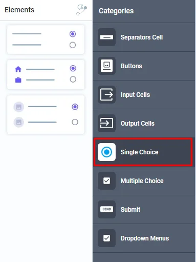
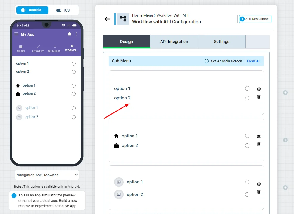
Single Choice
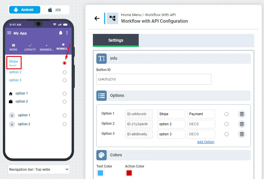
Click or drag and drop a single-choice button of your choice into your module to install it. This is where your users have to make only one choice from multiple options.
Click the single-choice button to customize its design.
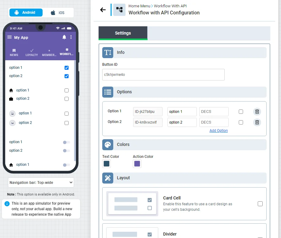
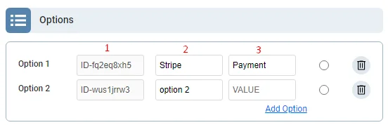
You can get your choice button ID, and customize your options to be displayed to your users:
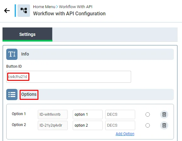
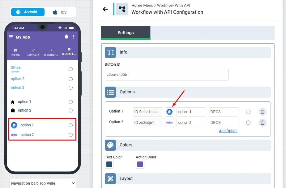
1.) ID section is the ID of the choice button. Note that if you're a developer and you have your own backend system, you can add the ID that you want to use to test your button
2.) This is where you add your option title; for example, if you want to add multiple payment gateway options, that would be your place to create one for Stripe and another one for PayPal.
3.) This is where you add your option description
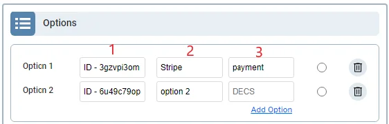
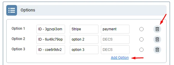
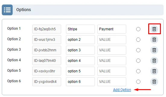
You can also add extra option or delete unwanted one
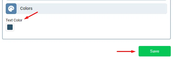
Choose your text and action colors
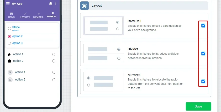
Next, you can choose one of these layouts:
- Card cell
- Divider
- Mirrored
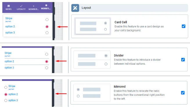
You can also select two or all of them
The second button choice has the option to select an icon and choose it's color
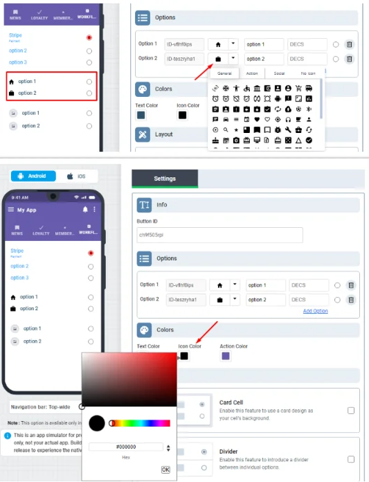
While the third button choice has the option to upload an icon of your choice.
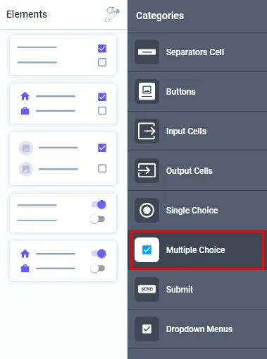
Multiple Choice
Click or drag and drop a multiple-choice button you want into your module to install it. This is where your users can make multiple selections of your options.
The only difference between the single-choice and multiple-choice buttons is the ability for users to select more than one option, as they have the same configurations.
And of course, you can choose what button design you want to add.
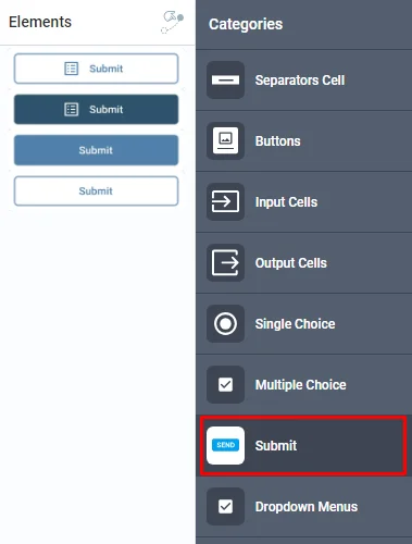
Submit
Click or drag and drop the Submit button of your choice into your module to install it. This is where your users submit their actions after inserting the required data, giving an order to the server to receive these data.
Click on the button to customize its design.
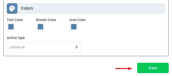
Choose an icon for your button, get your submit button ID, add your label, choose text color, border color, icon color and choose your action type
Configure your button settings by clicking 'On Click' tab
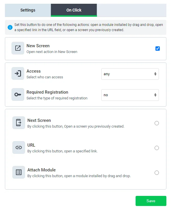
and then click save.
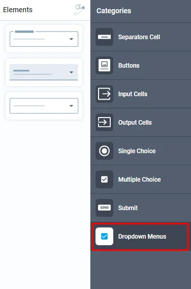
Dropdown Menus
Click or drag and drop the drop-down menus of your choice into your module to install it. It's a list of choices that moves up and down when the user interacts with the menu by clicking on the button.
Note that these menus can only be inserted on their own.
Click on the menu to customize its design.
Get your menu button ID and add your label.
Here is where you add your options to be displayed to your users:
1.) ID section is the ID of the choice button. Note that if you're a developer and you have your own backend system, you can add the ID that you want to use to test your button
2.) This is where you add your option title; for example, if you want to add multiple payment gateway options, that would be your place to create one for Stripe and another one for PayPal.
3.) This is where you add your option description [VALUE]
You can also add extra option or delete unwanted one
Then, choose your label text color and don't forget to click 'Save'.
Workflow menu background
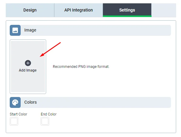
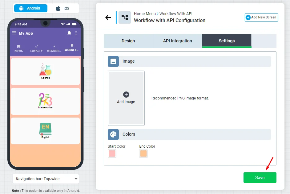
After you finish designing a specific menu, you can add a background for this menu that will be viewed behind your buttons and cells. First, click 'Settings'
Here, you have two options:
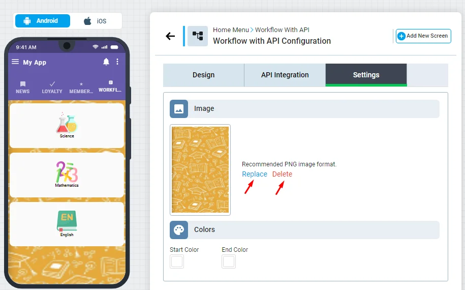
- Add an image of your background. Make sure to upload a PNG-format image.
You can also replace or delete your image.
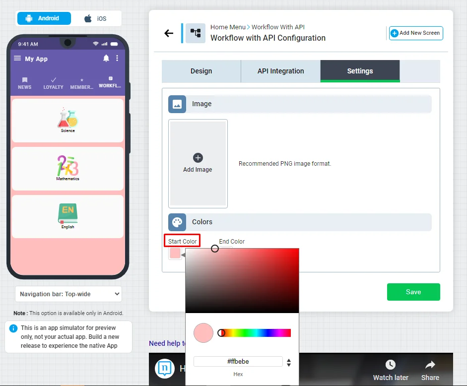
- If you don't want to add an image, you can only set colors on the menu screen. Your chosen color is centered in the start color, which fades away as you move down the screen.
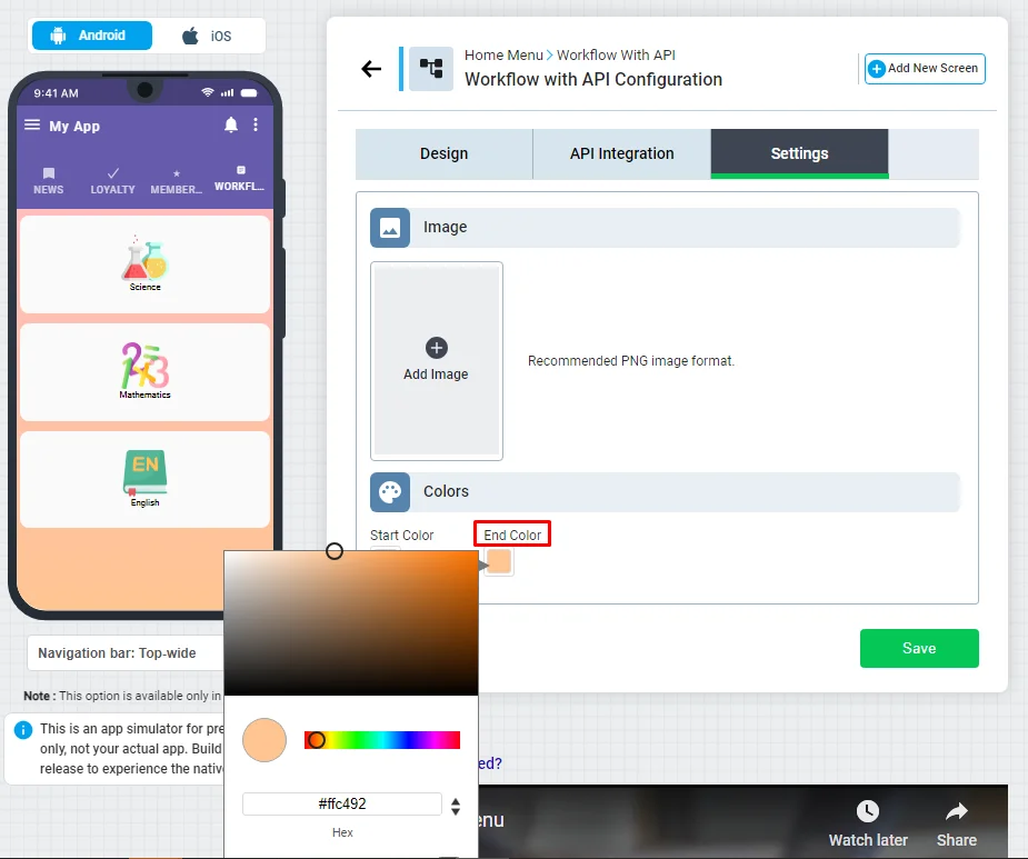
- While the end color is the opposite, the end color of your choice is centered at the end of the screen and gradually fades away as you move up the screen.
Note that you can choose one color design or choose both
and don't forget to save
Updated about 1 year ago