App Information
- Add your app's name.
- Choose your icon background color.
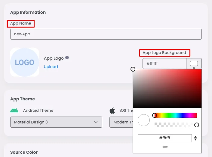
- When you upload your app icon in a PNG format with a minimum size of 1024x1024, the platform will suggest a palette that will work with your app icon color theme. You can Click 'Apply' at this point.
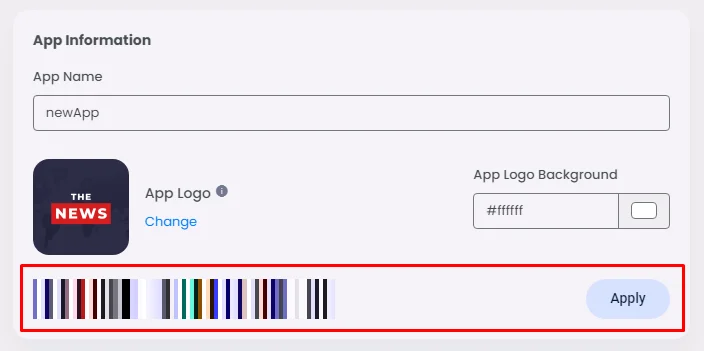
This platform made it easy for you to pick the right palette with the right color design for your app icon. If you want to make your own color scheme, you must have knowledge of how colors work scientifically and how to choose the right colors for you.
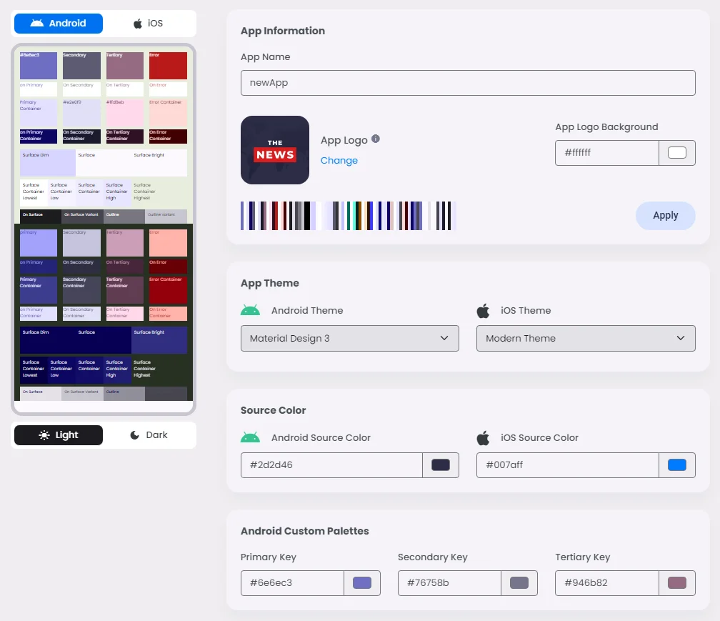
App Theme
The app theme is where you control the design theme for both Android and iOS
Android Theme
You have here two choices, either Material Design 3 or Material Design 2:
- Material Design 3: With its bright colors and simple shapes, it focuses on flat design. It focuses on depth through shadows and layers.
- Material Design 2: Adds dynamic color, rounded features, and more ways to customize the look. The goal is to make it more flexible and easy to use.

iOS Theme
You have here two choices, either Modern Theme or Classic Theme:
- Modern Theme: Smooth, simple, and up-to-date with the latest design trends, with rounded edges and flexible plans.
- Classic Theme: Based on older versions of iOS, it uses more traditional iOS design features like sharper edges and a more structured layout.

Source Color
With Android and iOS, you can pick the Source Color of your app, which is a set of colors used in an app's design to create its visual identity. The choice of the source color is based on your corporate logo, app logo, or trademark color.
Source Color is a single color that is used to generate three main key colors: primary, secondary, and tertiary.
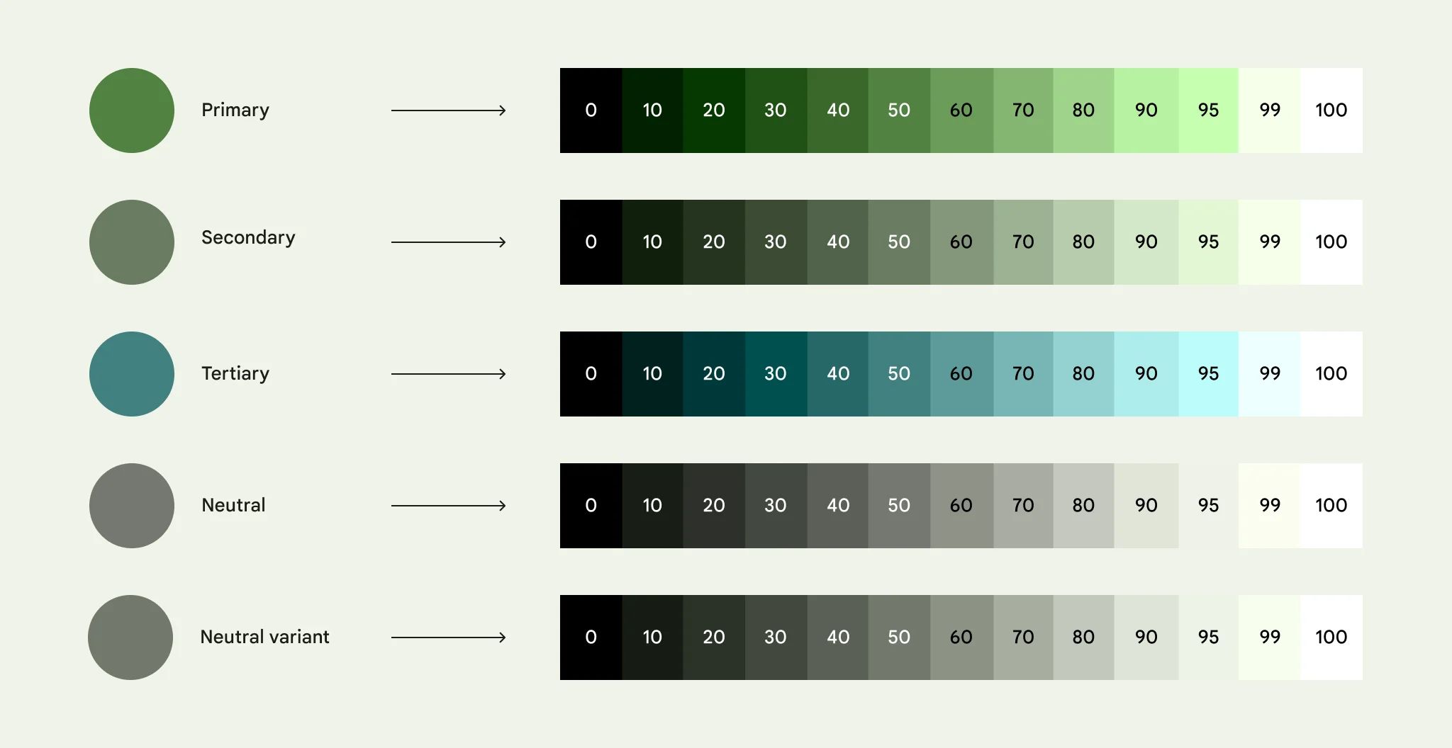
These three key colors create tonal palettes composed of tonal increments for each key color; therefore, the Color Scheme will be generated automatically! which are a group of key color tones assigned to specific roles that get mapped to components.
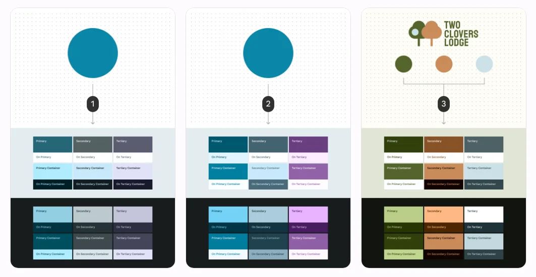
- The user-generated (wallpaper-based) method is used to turn a source color into a color scheme.
- The content-based method uses the same source color to make a color scheme. Take a look at how the tones (how light or dark) of some colors are changed to make them look more like the source picture.
- Custom colors, like brand colors, are run through the program one at a time, making a scheme that is unique to the brand.

Advanced Settings
If you need a specific primary, secondary or tertiary color key, you should first understand what these keys mean. First, let's talk about the color wheel and color theory to get a better sense of what colors are before we talk about Primary, Secondary, and Tertiary colors.
Color theory combines art and science in a useful way to help people choose colors that go well together.
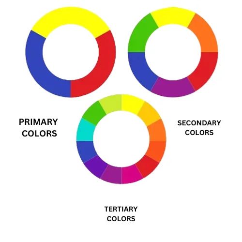
The color wheel has 12 main colors. On the color wheel, these are the colors: orange, purple, red, blue, yellow, green, mauve, turquoise, and chartreuse. There are three groups on the color wheel: primary colors, secondary colors, and tertiary colors. You can mix two colors to make a new color. This is called Color Theory.
Concept of Primary Colors
The idea of basic colors has been around for a long time. The choice of primary colors has changed over time in a number of areas that study color. Philosophers, color order systems, art historians, and scientists who study the physics of light and how we see colors have all written about basic colors.
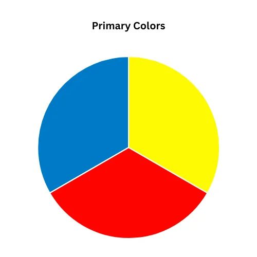
Why do we use primary colors?
A primary color is one of the basic colors on the color wheel. These colors can't be generated by mixing colors together; they can be combined to produce other color shades, which means that mixing two primary colors generates a Secondary Color.
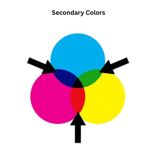
Concept of Secondary Colors
There are secondary colors in between the primary colors. The final shade of the secondary colors will depend on how many primary colors you use. Any two primary colors can be mixed together to make a new color, which is what a secondary color is.
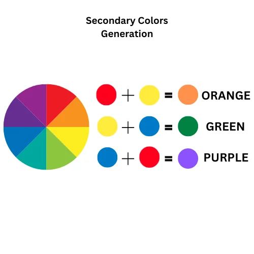
Secondary colors are generated by mixing two primary colors:
- Purple (red + blue)
- Orange (red + yellow)
- Green (yellow + blue)
Why do we use secondary colors?
The secondary color is used to draw attention to the primary color, which is still the main color in the design. Mixing a primary color with a secondary color creates a Tertiary color.

Concept of Tertiary Colors
When you mix full saturation of one primary color with half saturation of another primary color and none of a third primary color, you get a tertiary color. Tertiary colors are made when secondary colors like orange, purple, and green are mixed in different amounts. There are six third-level colors. Additionally, you can make them by mixing all three primary colors.
Tertiary colors are Amber, Vermilion, Magenta, Violet, Teal, and Chartreuse.
Why do we use tertiary colors?
The tertiary colors are often used as complementary colors to emphasize the main color, which is helpful because it helps designers mix the colors they want better.
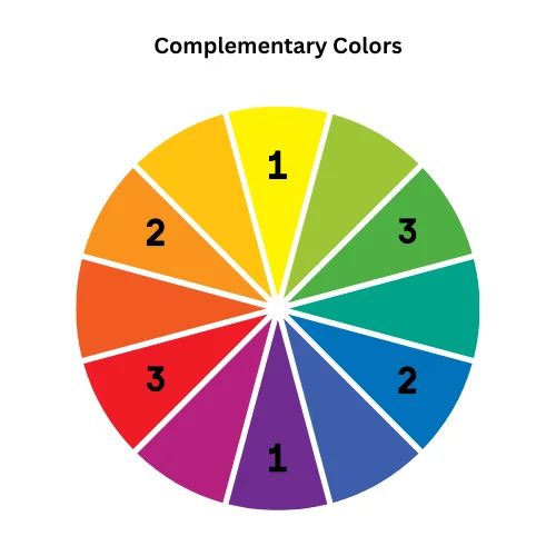
Concept of complementary Colors
Complementary colors can help you choose the right key colors. These are the colors that lie opposite each other on the color wheel.
Complementary colors
- Purple-Yellow: Purple is complementary to Yellow [1–1]
- Orange-Blue: Orange is complementary to Blue [2–2]
- Red-Green: Green is complementary to Red [3–3]
How do you select key colors for your app?
- Selecting an appropriate scheme can enhance your brand identity.
- Consider the purpose and mood your app aims for, your brand identity, and your visuals.
- Conduct user research to determine your color scheme.
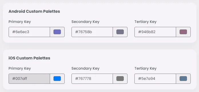
- If the primary color of your company's logo is green, it will serve as your primary key color, generating various shades. Consequently, you can maintain a single palette while still ensuring distinct elements stand out, and the same goes for secondary and tertiary key colors.
Here's where you customize your key colors:
The final color scheme will look like this:
You can get both light and dark themes through a single set of color roles. The dark theme colors are also given instantly.
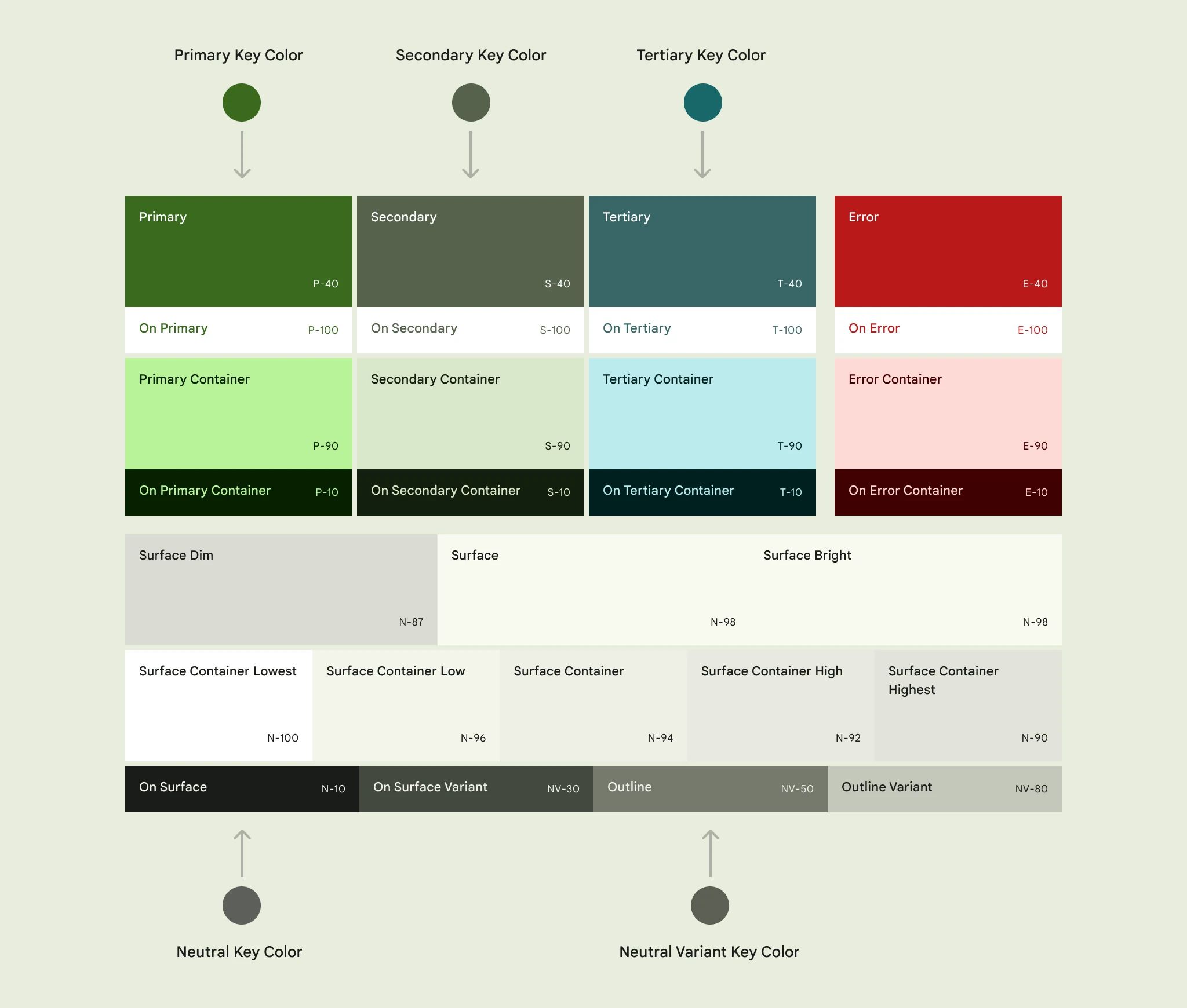
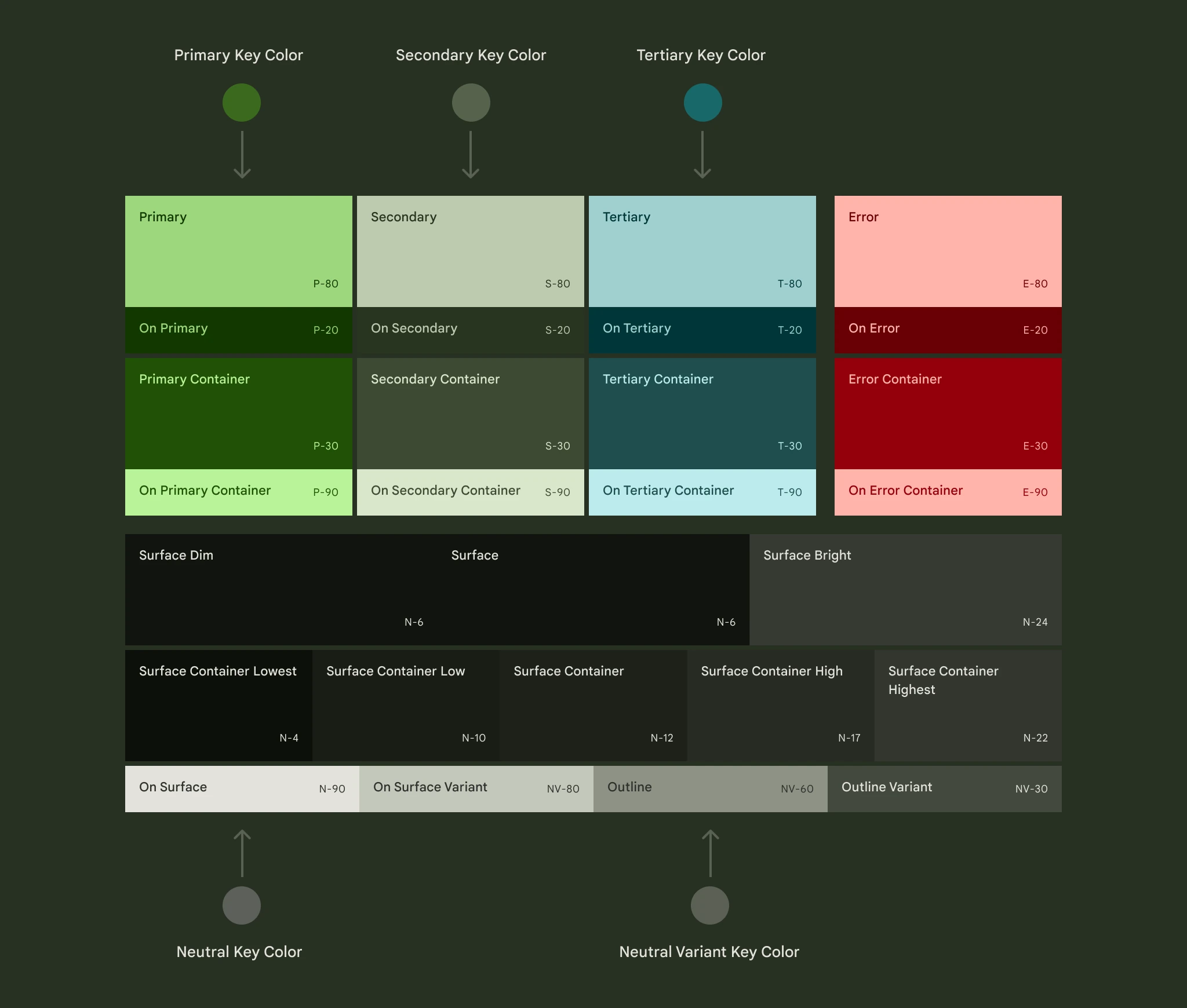
Note that the color system is built on accessible color pairings. These color pairs provide an accessible minimum 3:1 contrast.
Examples on color schemes in your app
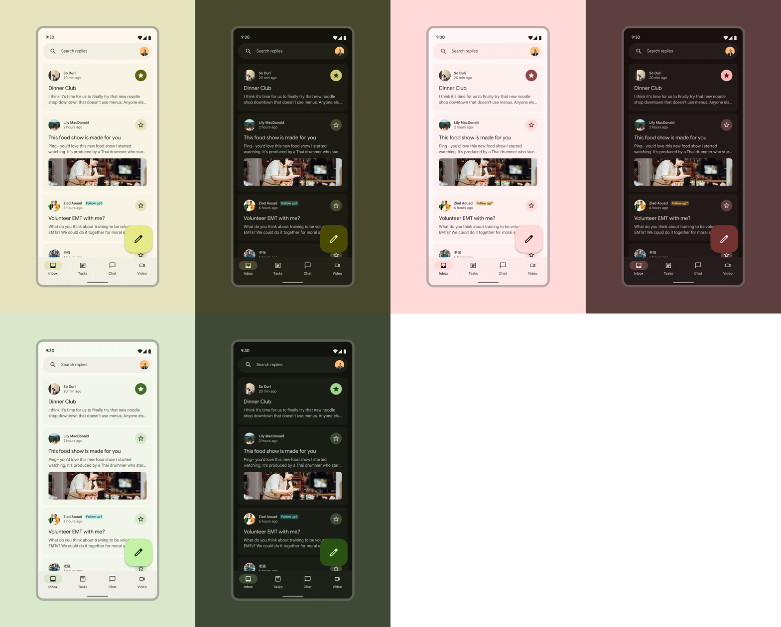
1. Android Light & dark Themes:
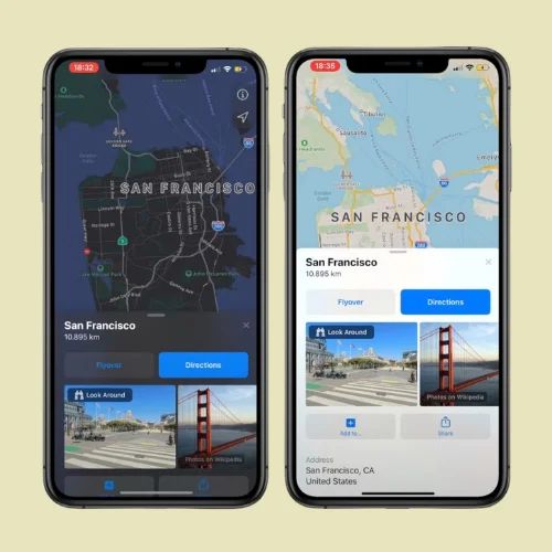
- iOS Light & dark Themes
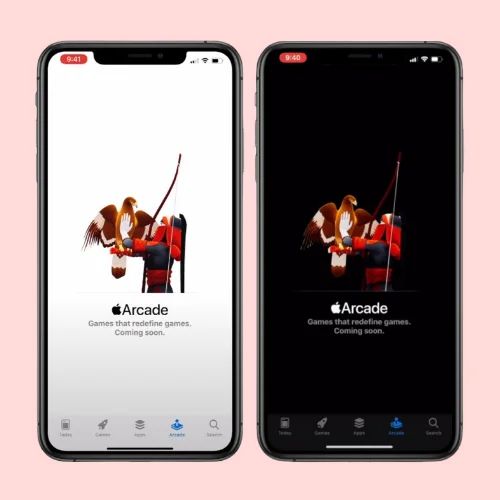
- Automatic dark theme
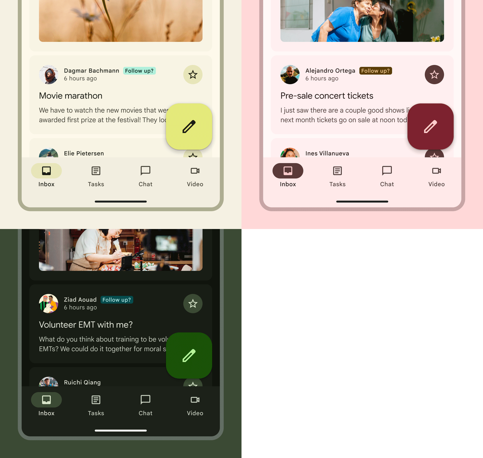
2. Buttons:

- For light and dark schemes, filled button color parts are used:
- Primary
- On primary
- On primary
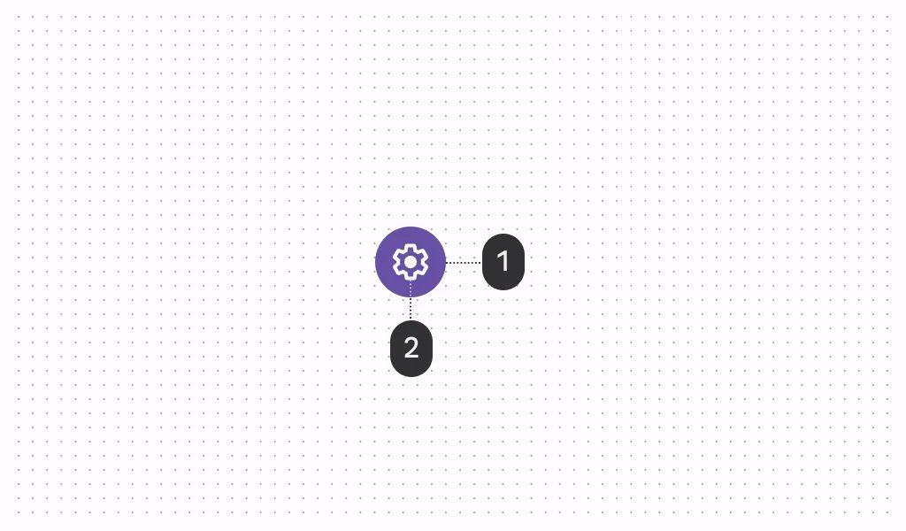
- For light and dark schemes, filled icon button color parts are used:
- Primary
- On primary
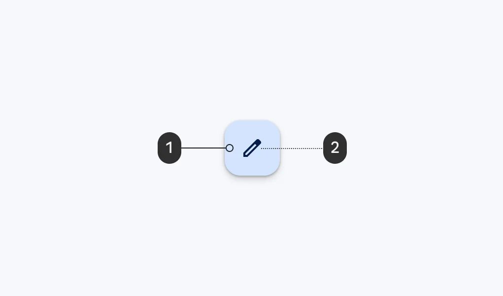
- The color mappings are the same for FAB, small FAB, and big FAB. The primary FAB color parts that are used for light and dark schemes are:
- Primary container
- On primary container
❓ FAQs
Q: How can I customize my app’s branding (logo, name, and icon) without any coding?
A: You don’t need to code a thing! Here’s how you can make your app look and feel like your brand in just a few clicks:
Q: How do I change my app’s name and icon?
A:
- Update your app name
- Head to the App Information section.
- Type in the name you want—this will appear as your app’s title.
- Upload your app icon
- Click to upload a PNG file (minimum size: 1024×1024 px).
- Once uploaded, the builder will suggest a matching color palette for your app.
- Love the suggested colors? Just click Apply. Want your own style? Pick your preferred colors manually.
Q: How do I set my brand’s color theme?
A:
- The platform automatically creates a full color scheme from your app icon or a source color. This includes primary, secondary, and accent colors that flow beautifully throughout your app.
- Choose from built-in themes like Material Design 3 or 2 for Android, and Modern or Classic styles for iOS—no coding required.
- Want full creative control? Go to the Custom Palettes section and fine-tune each color with easy-to-use color pickers.
