
Dashboard & Branding
Dashboard
Your dashboard will give you an easy-on-the-eye summary of different modules on the nandbox app builder.
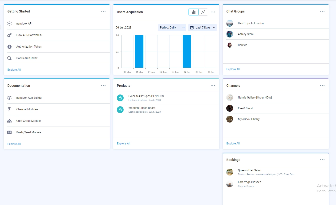
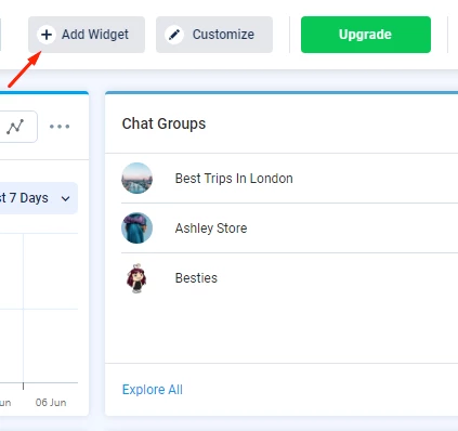
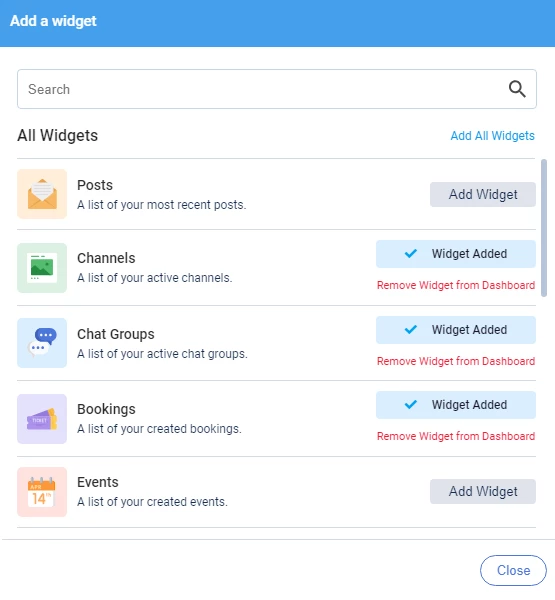
To add a new widget, click on the 'Add Widget' button at the top right-hand side of the page.
You will find various widgets to choose from.
You can also customize the arrangement of widgets on your dashboard by clicking 'Customize.'
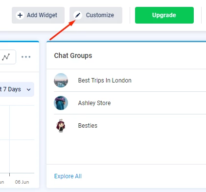
Drag and drop widgets to different sections on the dashboard.
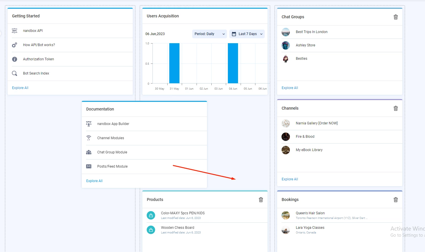
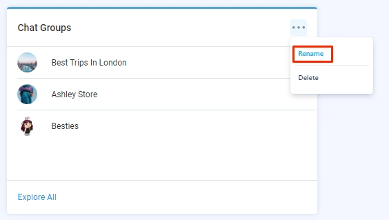
You can rename and delete widgets.
Branding Section
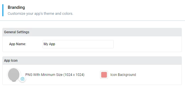
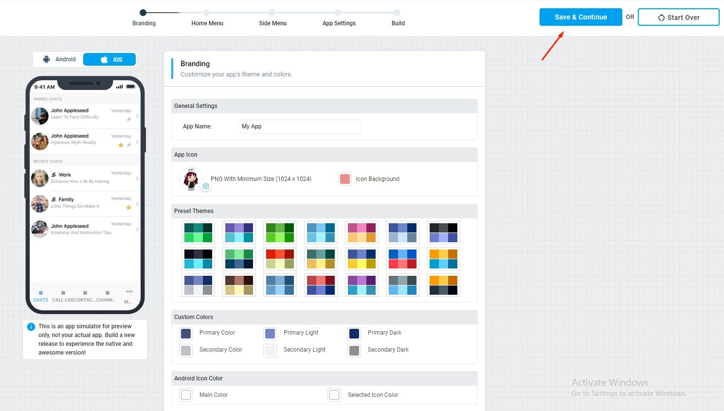
The branding section in the nandbox app builder allows you to fully customize how your app looks; make sure that your app has a distinctive look for it to stand out among the rest.
Here, you can rename your app, choose its icon, and choose your app's color palette.
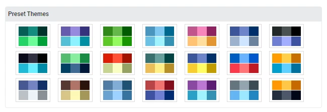
Choose from an array of ready-made themes and colors carefully picked by our top designers.
Upload your app icon in a PNG format with a minimum size of 1024x1024. You can also choose the icon background of the app icon.
Choose from ready-made themes.
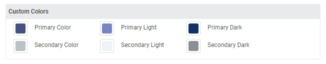
The nandbox app builder also allows you to customize your own theme by mixing primary and secondary colors to make the trademark color of your Android app.
Examples On Primary And Secondary Colors
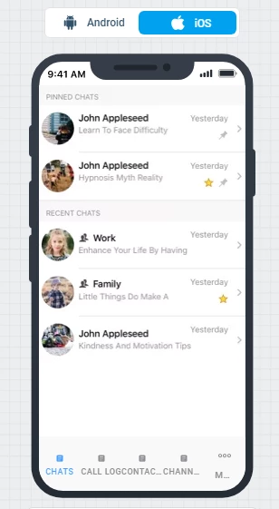
iOS color choices are very different from those of other operating systems. iOS works on a different basis than systems that use primary and secondary colors. Instead of having different color schemes for each app, it always uses the same set of colors for all of them to have a similar user experience.
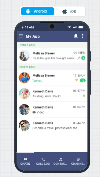
For example, these are three different iOS apps, but they have the same standard colors in the 'Settings' page.
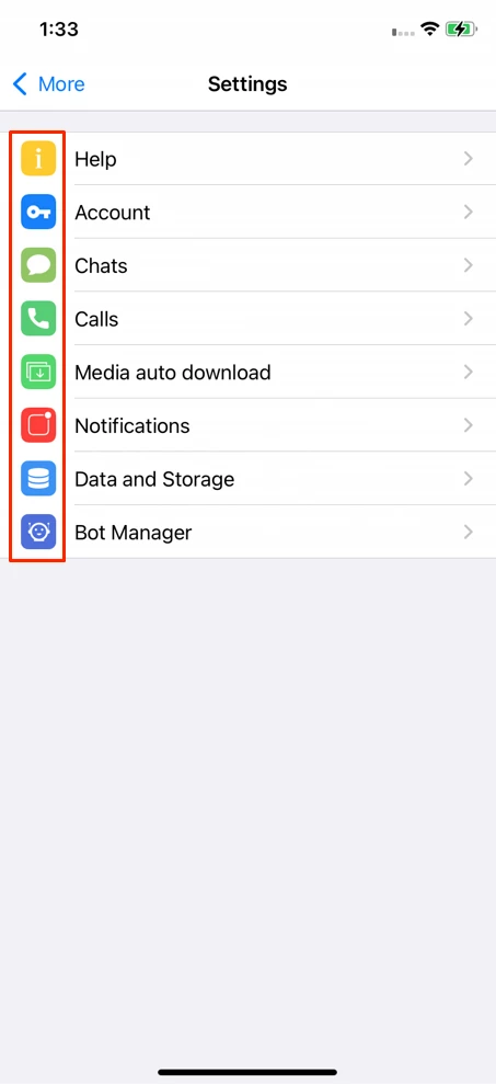
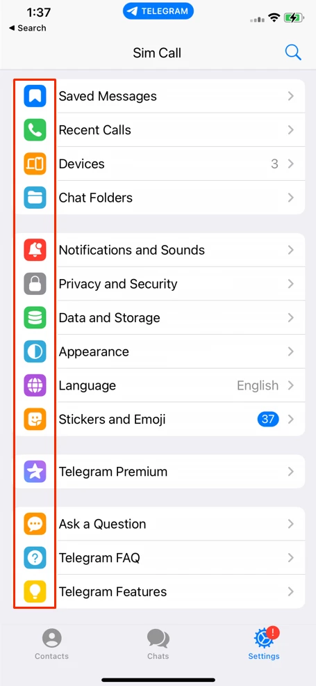
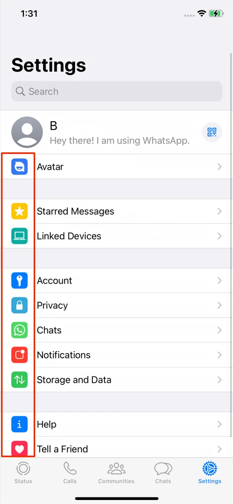
Please note that this section is only related to Android, as iOS colors are the same in all their apps according to Apple guidelines.
Primary Color: Android applications use the primary color most often. It appears on the toolbar, action buttons, and active icons because the primary color should draw attention to the app's essential features and functionality.
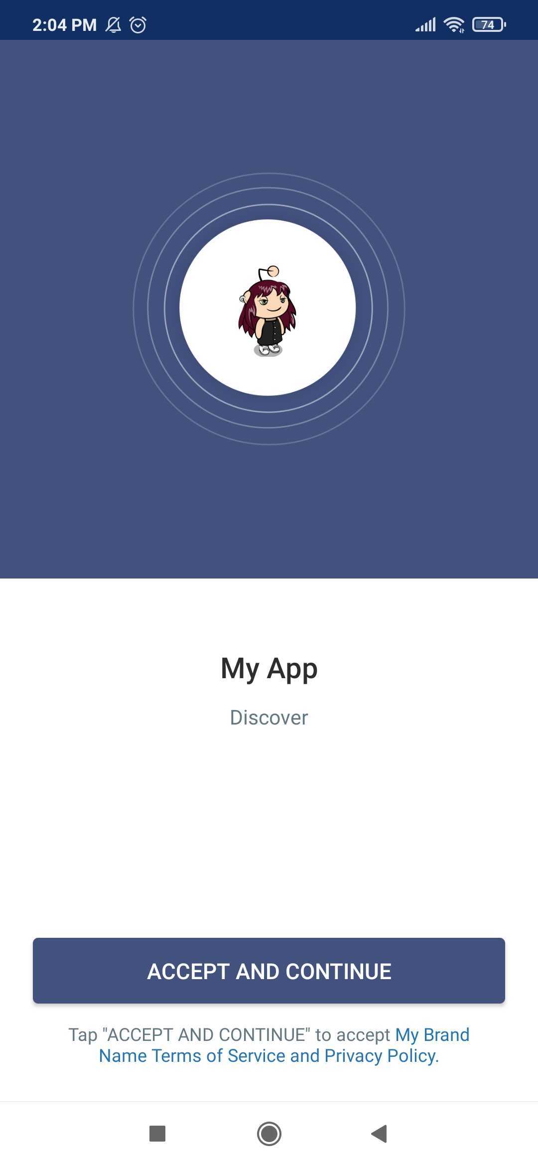
- App Color.
- Splash screen and 'ACCEPT AND CONTINUE' button colors.
- Tab bar color.
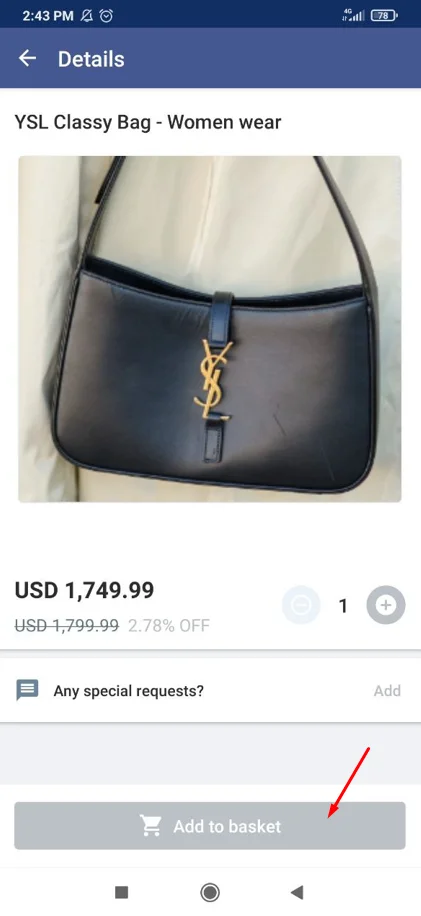
- 'View cart' button in store

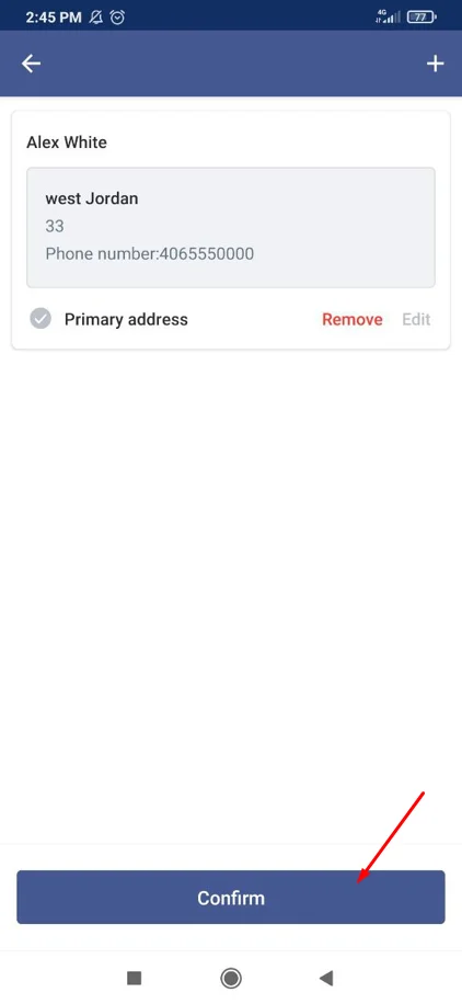
- 'Confirm' button color of address added to store.
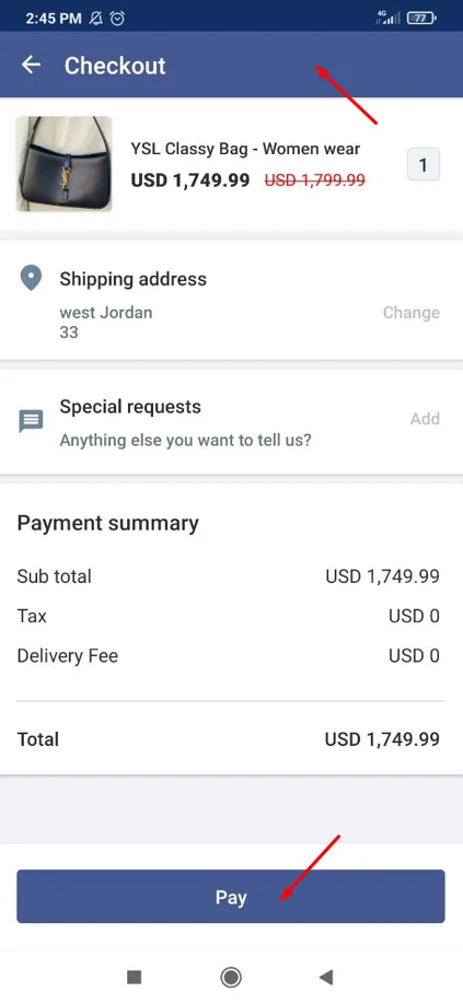
- Check out page and 'Pay' button in store
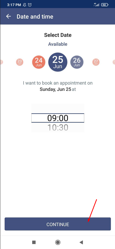
- 'Continue' button in bookings.
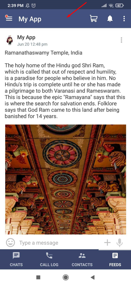
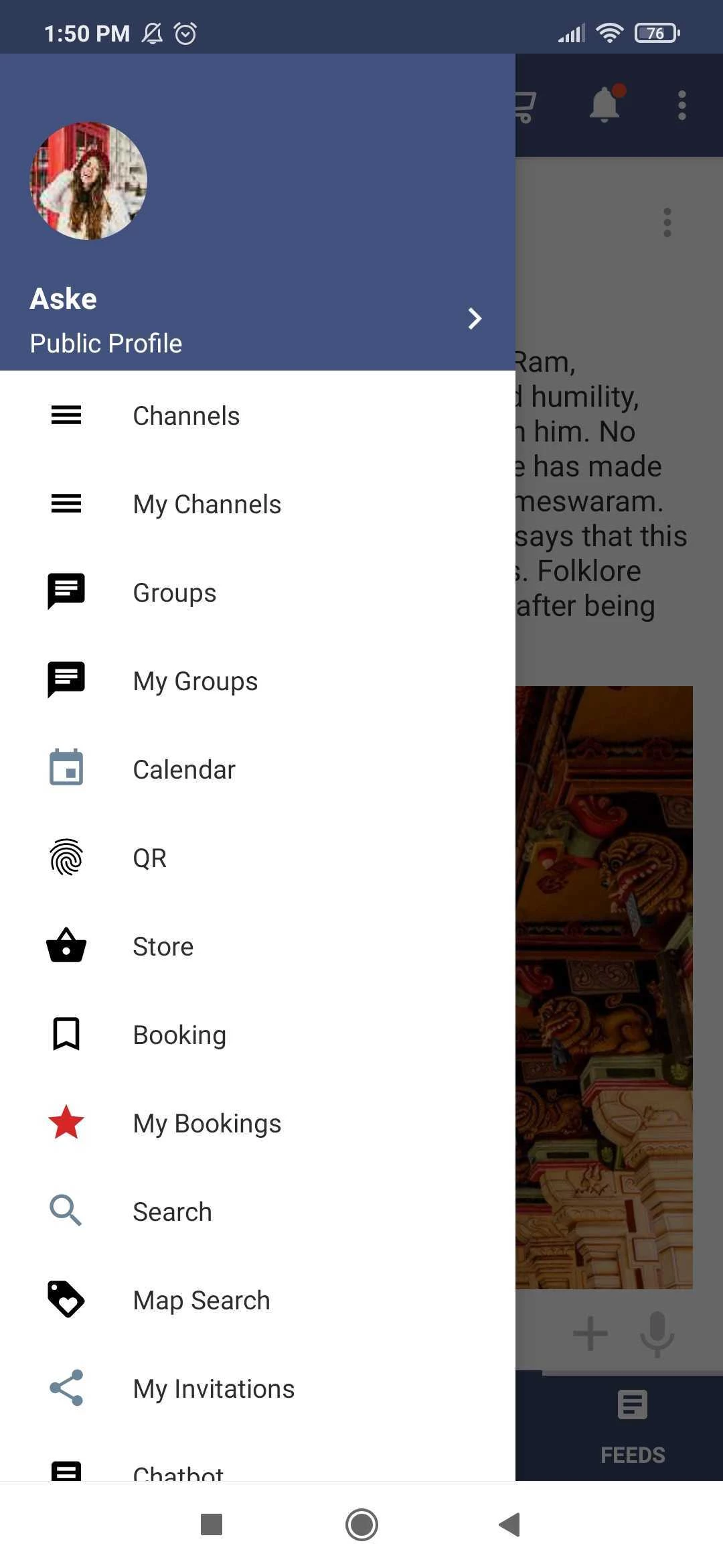
- Side menu color.
Secondary Color: The secondary color is used to draw attention to or emphasize certain interface elements. It provides a visual contrast to the primary color, which it should match.
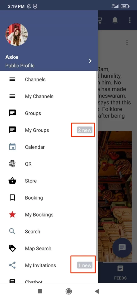
- Notifications color.
-
'Add to basket' button color in store.
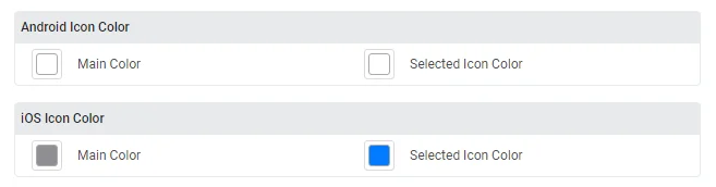
Choose the color of the icon for the Android and iOS versions of your app.
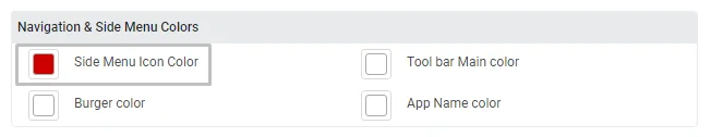
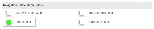
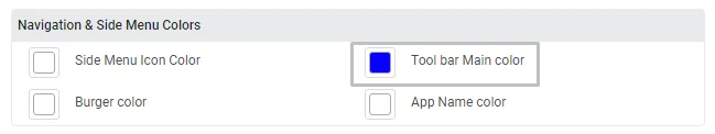
Then, customize your navigation and side menu colors, which consist of four components:
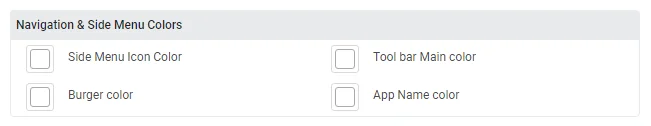
- Side menu icon color
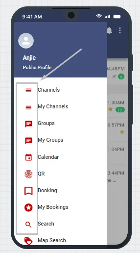
- Burger color
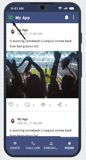
- Tool bar Main color
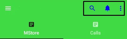
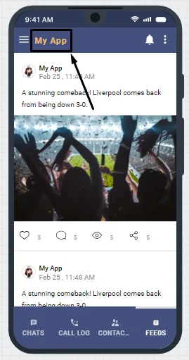
- App Name color
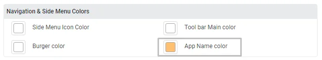
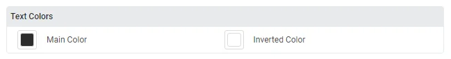
You can also customize the text colors.
You can see the live changes that you make in both the Android version and the iOS version to make sure that you have a visual aid to determine which color is best for your app.
Click on the switch button to display the iOS version.
Once you're done with the design, click save & continue.
Updated about 1 year ago