
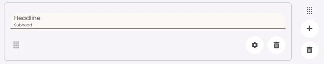
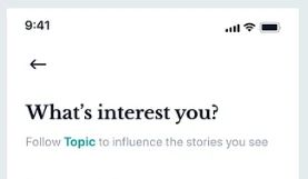
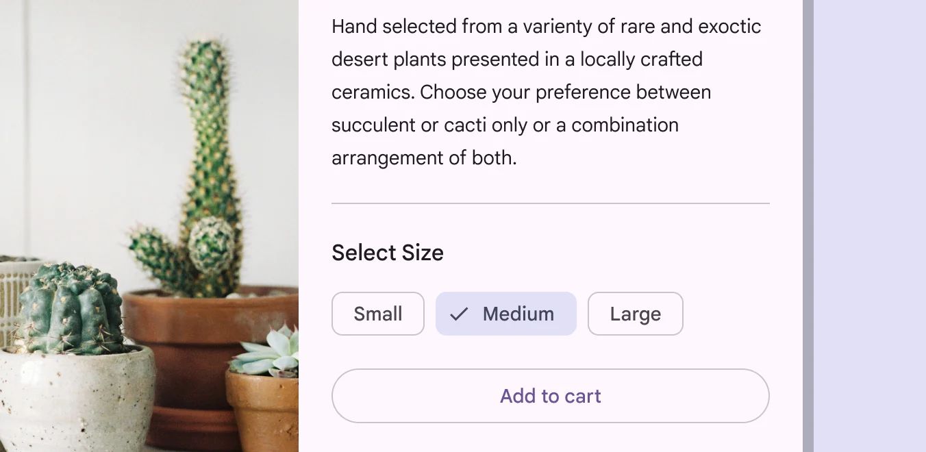
A headline is an element that organizes and briefly describes the content that follows to guide readers. It contains space for optional text: a headline, subhead and a divider.
🧱 Gridding Rules
The Headline element follows a flexible grid system where it can be placed alone or alongside one other element in the same row.
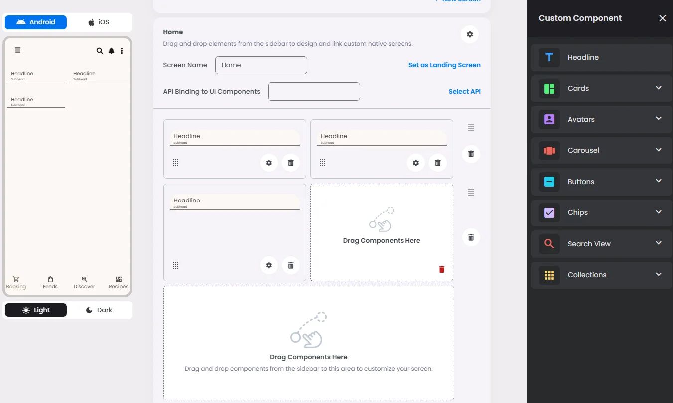
Min | Max |
30 grids | 60 grids |
⚙️ Applicable Settings
The following table outlines the available configuration options for this element. Each setting defines how the element behaves or appears within your app’s UI.
Field | Description |
Headline | The main title of the cell (e.g., "Workflow Component Setup"). |
Subhead | Secondary text placed under the headline (if supported). |
Text Alignment | Alignment of the text in the cell: left, center, or right. |
Font Size | Font size of the headline and subhead text. |
Divider (Seperator) | Optional line under the headline for separation (often defaulted to true). |
Custom Color | controls the color styling of text or divider. |
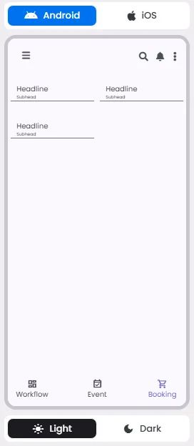
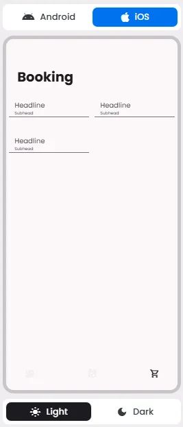
📱 UI for Android & iOS
The Headline element adapts its appearance and layout behavior based on the platform to align with native UI guidelines:
👇🏻 Action (onClick)
Element | Purpose | Supports Actions | Notes |
Headline | To present static content such as a headline, subhead, or divider. | ❌ | Informational/structural only. |
🃏 Headline Style Overview
In addition to being a headline element as it describes certain content, it can be used as a divider (separator) to separate between elements.
❓ FAQs
Q: How can I add a custom title or header to my booking & event hub in the app without writing any code?
A: With nandbox’s Headline element, you can easily add a custom title, create a branded header, or highlight sections in your booking and event hub—all without writing a single line of code. It’s perfect for guiding users, introducing categories, or giving your app a polished, professional look.
Q: What can I customize with the Headline element?
A: The Headline element gives you full control to style your section titles:
- Add a main heading (e.g., “Book Your Session” or “Upcoming Events”).
- Adjust font size and set text alignment (left, center, or right).
- Choose a text color that matches your app’s theme.
- Place up to three headlines in a row to organize content visually.
- Add an optional divider line to separate sections neatly.
It’s an easy way to make your Booking & Event Center stand out and feel user-friendly.
Q: How do I add and style a headline in my booking & event hub?
A:
- Open your app layout in the nandbox builder.
- Navigate to the Booking and Event Center layout.
- Drag the Headline element into your layout—place it above or within any section.
- Click to edit and customize:
- Enter your headline text (e.g., “Choose a Category”).
- Adjust font size, text alignment, and color.
- Toggle the divider line on or off for added style.
- Save and preview—your custom header is now live in the app!