
Custom components—also known as Workflows, Forms, or screens—are modular UI blocks designed using the App Builder. They are composed of structured menus, rows, and cells, enabling powerful front-end interactions for complex flows.
Components are created and structured visually using the App Builder. They cannot be created via API, but the API can interact with them in real time to build dynamic, integrated experiences.
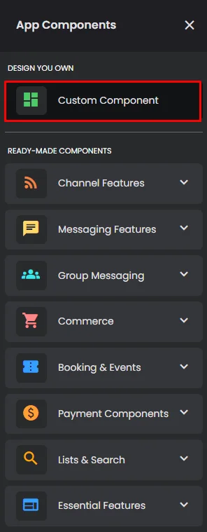
It is an adaptable part that helps you design a full interface for your app. You can make your own interface by combining items such as buttons, cards, text areas, etc. to organize and navigate through all your app screens.

This component is the best for any type of app.
Included Features
- Design Flexibility
Make your interface look the way you want it to.
- Interactive elements
Add buttons, cards, carousels, and many more elements to your app menu screens to make the user experience more engaging and to make navigating among them simple.
- Action Configuration
You can tell elements to do certain things, like moving around the screen, opening a URL, connecting with other components, or performing a certain function.
- Create Menus
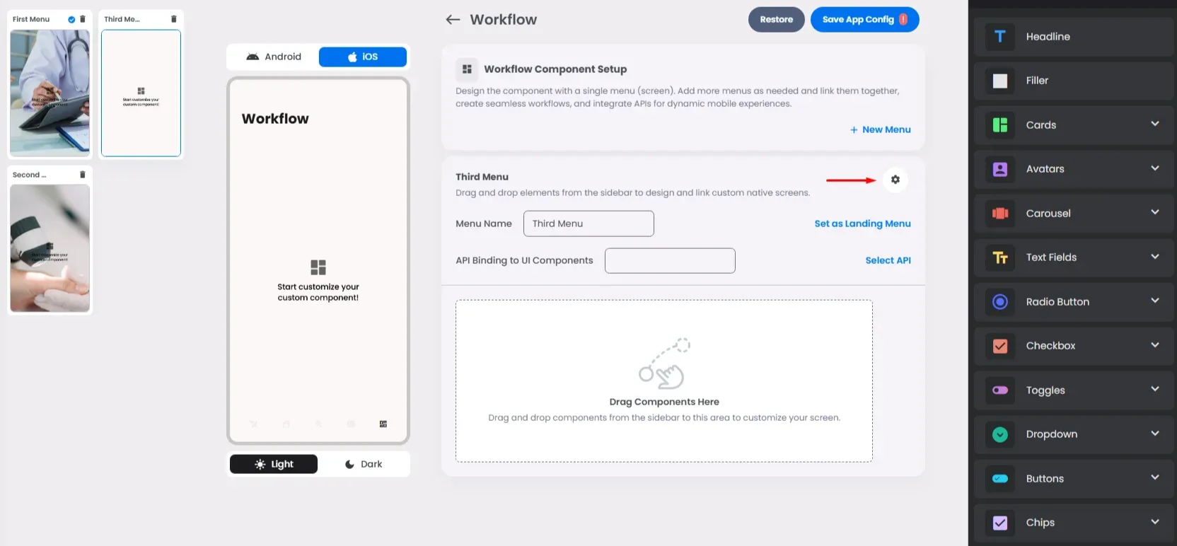
Use the component menus to build integrated forms, multi-step workflows, and custom logic-driven screens.
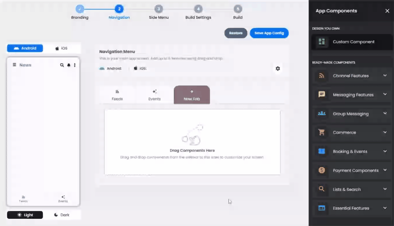
How To Install The Component
This component can be installed in:
- App's Navigation Page ✓
- App's Side Menu ✓
Click or drag and drop the Custom Component into your navigation or side menu to install it.
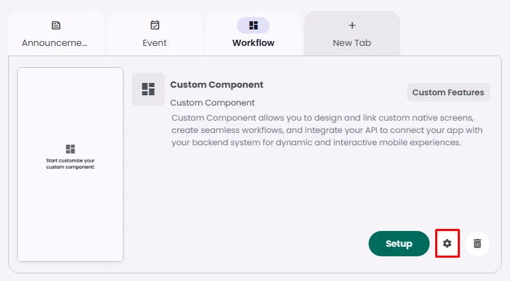
How To Configure The Component
Click the gear icon to configure the component’s settings.
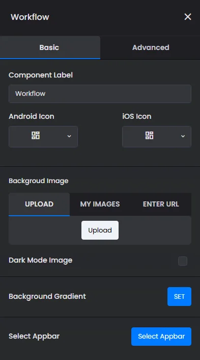
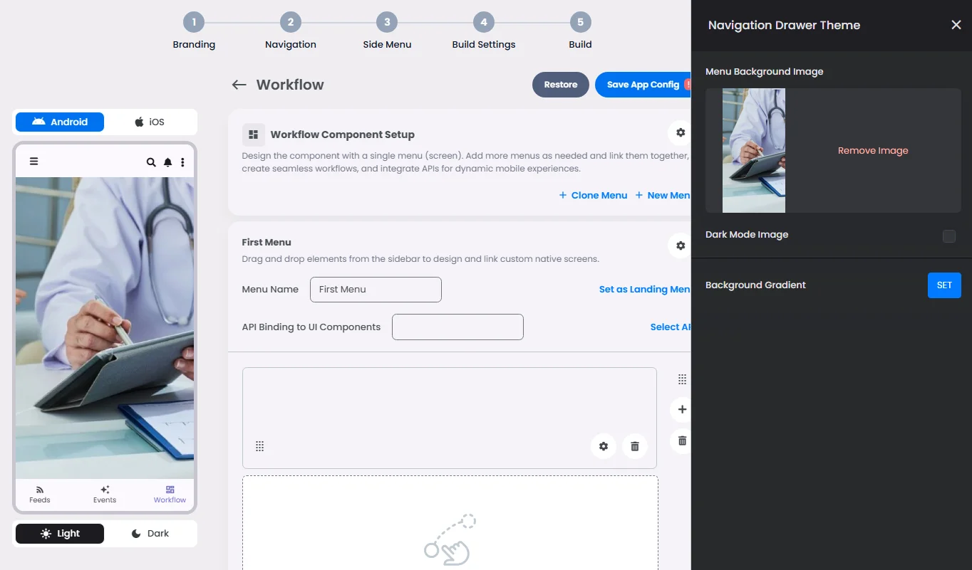
Background Menu Screens
Rename the component and choose an Android and an iOS icon for it.
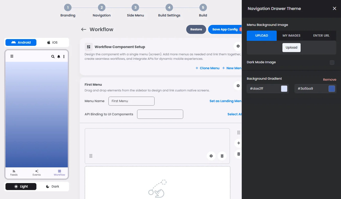
- Upload a background image for all your workflow menu screens or add a gradient background color.
Learn more about Appbar and how to implement it.
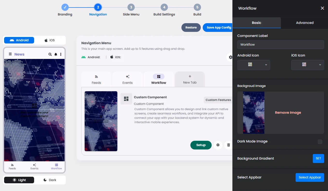
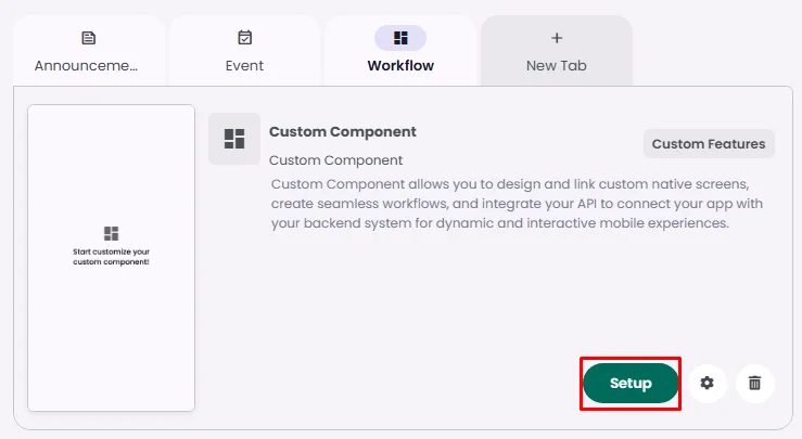
Click ‘Setup’ to set up your component design.
- Upload a background image for a single menu screen. If you have multiple menus, select your chosen one and click the cog gear icon to open the menu background settings.
You have the option to upload an image or add a gradient background color.
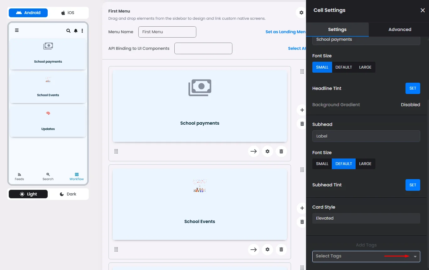
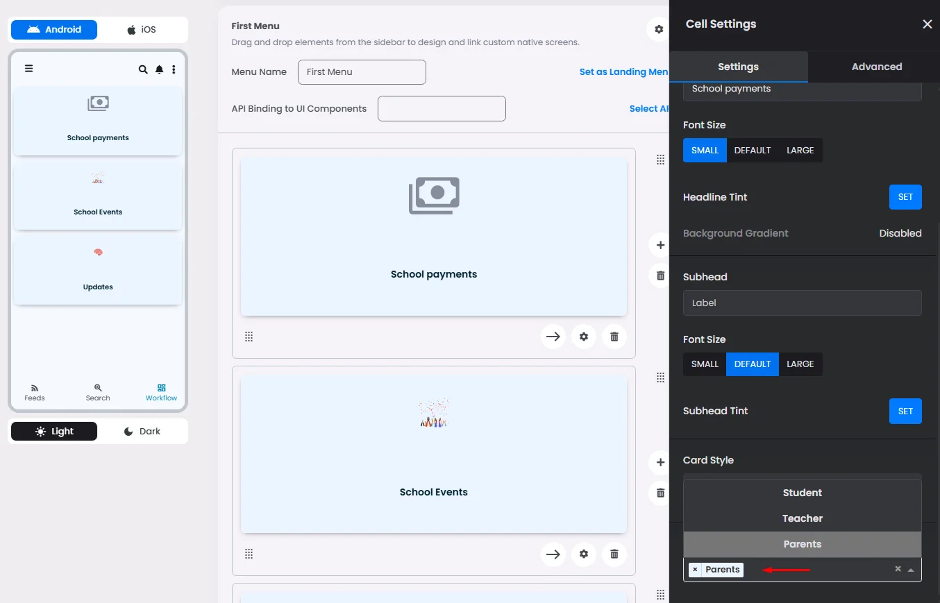
Control Element Appearance With Tags
You can control what content is shown to specific users and hidden from others using the Tags feature; Only users with the selected tag will be able to see this element.
For example, if this section is intended for parents to make school-related payments, you can assign the Parent tag to restrict access, since kids do not need to access this part.
Click the element and select the tag you want to assign
❓ FAQs
Q: Can I add custom features or special functionality to my app even if I’m not a developer?
A: Absolutely! With nandbox’s Custom Component system, you can design special buttons, build custom pages, and even create app workflows—all without writing a single line of code. Think of components as your own tailor-made screens and forms that you can drag and drop into your app.
Q: What can I do with custom components?
A:
- Design modular screens (Workflows or Forms) using easy drag-and-drop tools.
- Add elements like menus, buttons, cards, input fields, images, and more to shape your app’s user experience.
- Place these custom screens anywhere in your app—like in the main navigation or side menu—so users can access them easily.
Q: How can I create special buttons or custom pages?
A:
- Drag a Custom Component into your app’s navigation or side menu to add it.
- Click the gear icon to:
- Rename it.
- Upload desktop icons or backgrounds for all the custom component’s menus.
- Build your page by adding rows and filling them with elements like buttons, text fields, and images.
You’re in full control of how your page looks and works—no technical skills required.
Q: How do I link actions or add logic to these pages?
A:
- Use Actions (onClick) to make your elements interactive:
- Open a URL.
- Navigate to another screen or component.
- Trigger backend processes.
- In Advanced Settings, you can even connect form inputs or clickable items to backend APIs with JSON—so when a user clicks a button or submits a form, the app sends that data where it needs to go.
This makes it easy to create dynamic, powerful features—like contact forms, feedback pages, or API-powered workflows—without coding.
Grids Layout SystemElements Settings OverviewCustom Component Advanced SettingsActions (onClick)Custom Component Elements