
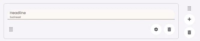
A headline is an element that organizes and briefly describes the content that follows to guide readers. It contains space for optional text: a headline, subhead and a divider.
🧱 Gridding Rules
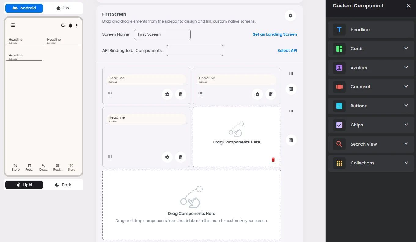
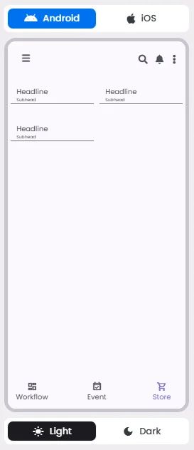
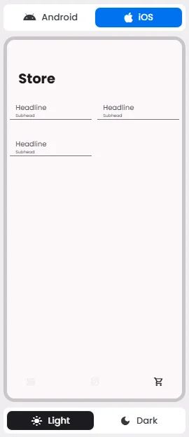
The Headline element follows a flexible grid system where it can be placed alone or alongside one other element in the same row.
Min | Max |
30 grids | 60 grids |
⚙️ Applicable Settings
The following table outlines the available configuration options for this element. Each setting defines how the element behaves or appears within your app’s UI.
Field | Description |
Headline | The main title of the cell (e.g., "Workflow Component Setup"). |
Subhead | Secondary text placed under the headline (if supported). |
Text Alignment | Alignment of the text in the cell: left, center, or right. |
Font Size | Font size of the headline and subhead text. |
Divider (Seperator) | Optional line under the headline for separation (often defaulted to true). |
Custom Color | controls the color styling of text or divider. |
📱 UI for Android & iOS
The Headline element adapts its appearance and layout behavior based on the platform to align with native UI guidelines:
👇🏻 Action (onClick)
Element | Purpose | Supports Actions | Notes |
Headline | To present static content such as a headline, subhead, or divider. | ❌ | Informational/structural only. |
🃏 Headline Style Overview
In addition to being a headline element as it describes certain content, it can be used as a divider (separator) to separate between elements.
❓ FAQs
Q: How can I add a custom headline or title to my in-app store without writing code?
A: You can easily add a store title, create eye-catching headlines, and style them to match your app’s branding—no coding needed. With nandbox’s visual builder, just drag in the Headline element to set up branded titles and subheadings for your storefront.
Q: What can I customize with the Headline element?
A:
The Headline element gives you full control over how your titles look:
- Add a main title (headline) and an optional subhead for extra details or highlights.
- Align your text left, center, or right to fit your layout.
- Adjust the font size for both the headline and subhead.
- Turn on a divider line beneath the headline for a clean, professional look.
- Choose custom text and divider colors to perfectly match your brand’s theme.
Q: Can I control where the headline appears on the screen?
A:
Absolutely! The Headline uses a flexible grid layout, so you can:
- Place it full-width across the page.
- Or position it side-by-side with another element (like an image or product list).
Just drag it into the row you want, and it will automatically adjust to fit your design.