
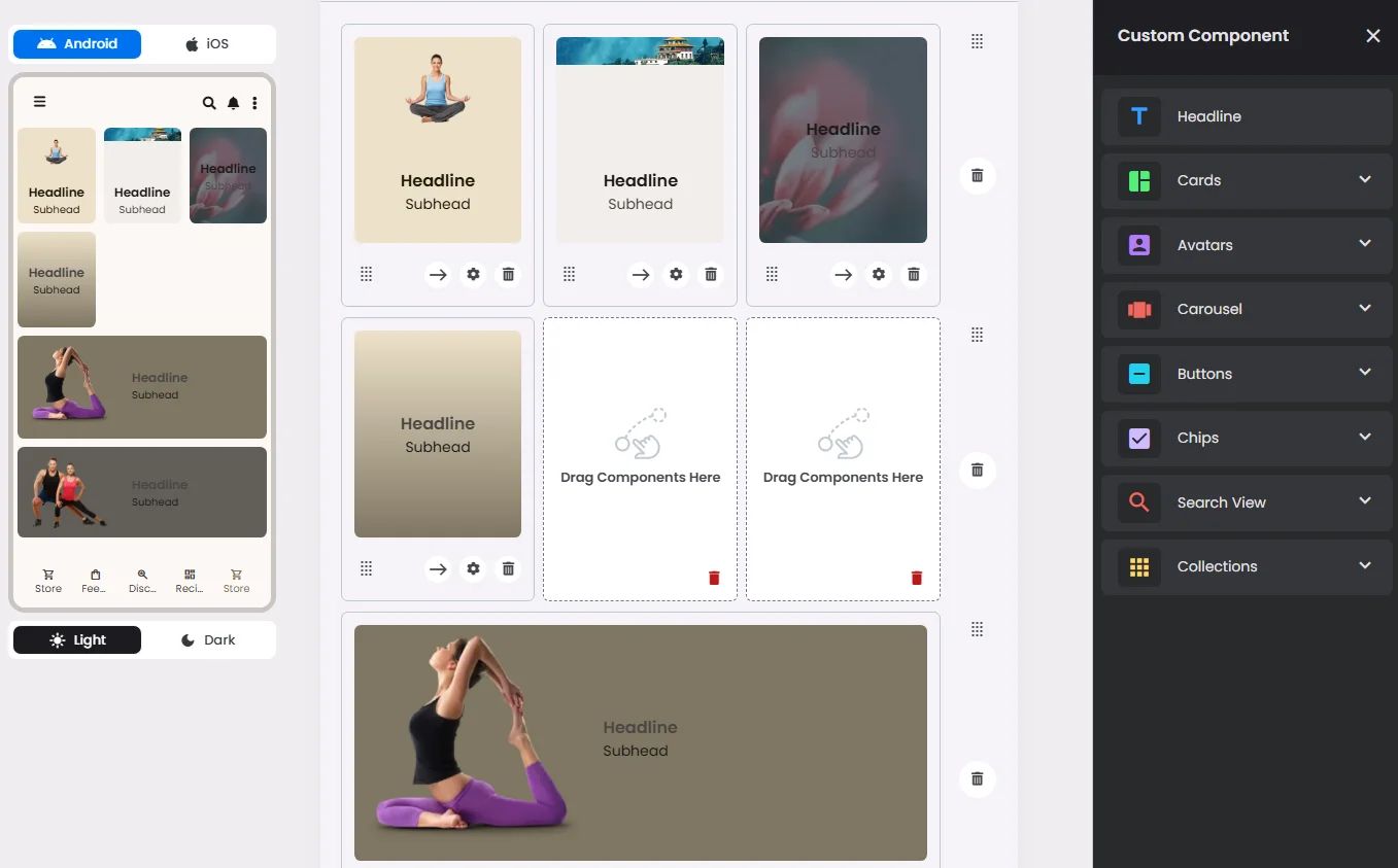
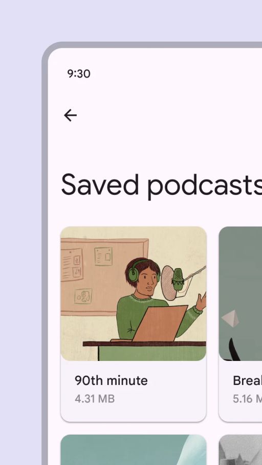
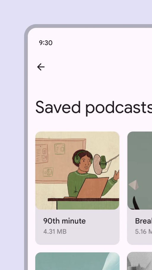
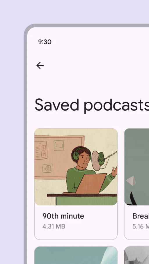
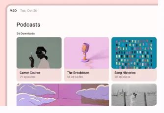
Cards can be used to contain related elements or other components, such as images, headlines, supporting text, buttons, and lists.

🧱 Gridding Rules
The Card element follows a flexible grid system where it can be placed alone or alongside one other element in the same row.
Min | Max |
20 grids | 60 grids |
⚙️ Applicable Settings
The following table outlines the available configuration options for this element. Each setting defines how the element behaves or appears within your app’s UI.
Field | Description |
Headline | The main title of the cell (e.g., "Workflow Component Setup"). |
Subhead | Secondary text placed under the headline (if supported). |
Text Alignment | Alignment of the text in the cell: left, center, or right. |
Font Size | Font size of the headline and subhead text. |
Custom Color | controls the color styling of text or divider. |
Cell ID | This is the unique name for the cell. It's used to find or manage the cell later. If both cell_id and callback are provided, the system will use cell_id. |
Callback | This is the action name linked to the cell when a user interacts with it. You must add this when creating the cell. Once the cell is saved, this value can’t be changed. |
Cell Order | This controls where the cell appears inside the row (from left to right). Like callback, it must be set when creating the cell and can’t be changed later. |
Style | The visual style of the element (e.g., filled, outlined). You need to set this when creating the cell, and it can't be changed after saving. |
BG Image | Background image for the cell when using light mode. |
BG Image Dark | Background image for the cell when using dark mode. |
Image | An image shown inside the cell when light mode is active. |
Image Dark | An image shown inside the cell when dark mode is active. |
Submit | Defines which values get submitted when this cell is triggered: |
Next | What happens after the cell is triggered — open another screen or menu, or run a function. You must set this during creation, and it can’t be changed afterward. |
Keep in mind that the color scheme is based on easy-to-understand color pairs. These color pairs give you a minimum 3:1 difference that’s simple to see. Check out this documentation to understand how the color scheme you have chosen affects the colors of your elements.
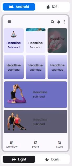
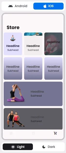
📱 Android & iOS Interface
The Card element adapts its appearance and layout behavior based on the platform to align with native UI guidelines:
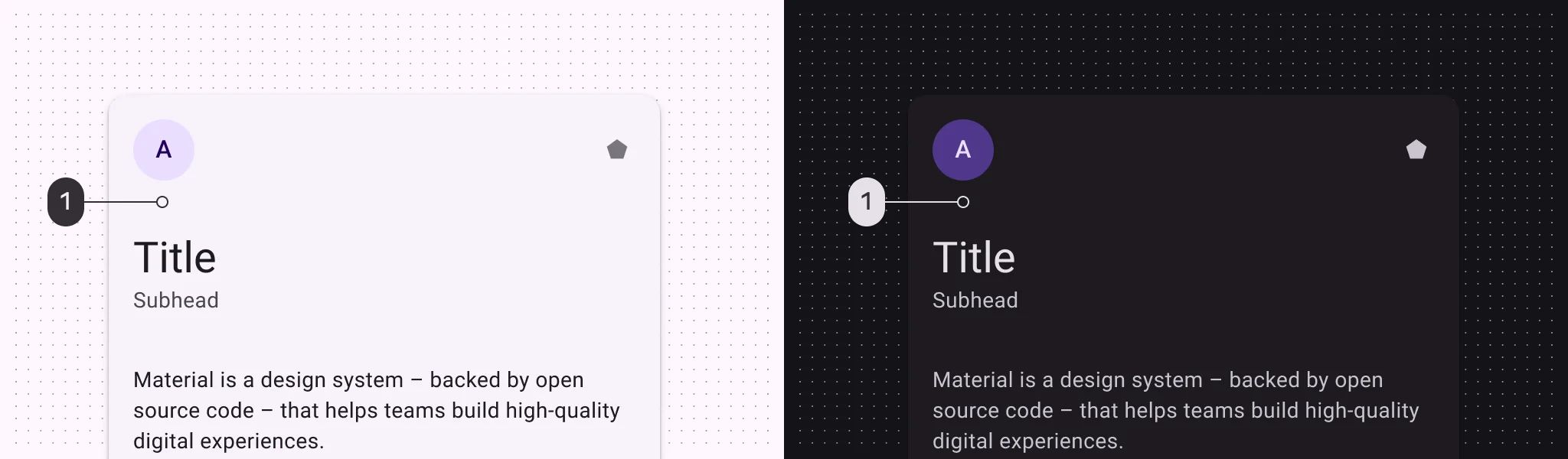
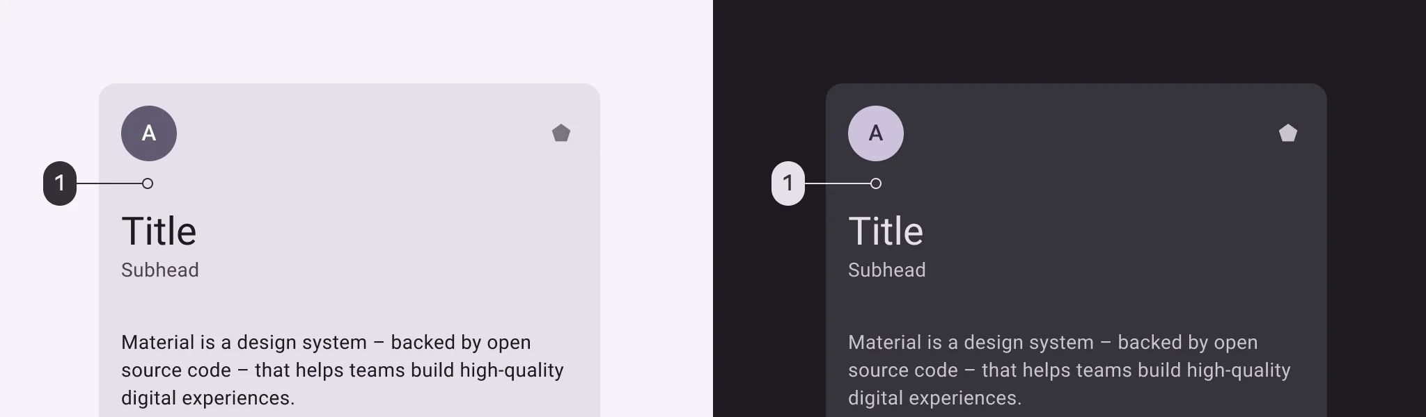
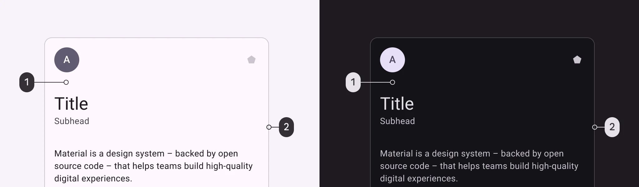
🃏 Card Style Overview
Cards have structure and visual behavior, including image placement, text alignment, padding, and interactive zones. Each card style defines how content is presented within the layout.
There are 3 types of them: Elevated, Filled, and Outlined.
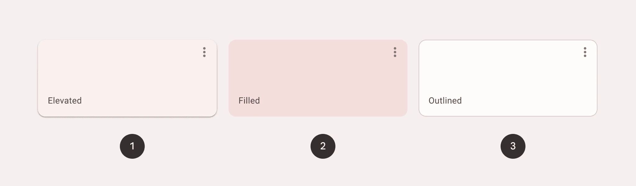
Elevated Card


To apply color values, design tokens are used. In terms of design, this means using color numbers that match tokens. A color value will be a token that points to a value for execution.
Filled Card

To apply color values, design tokens are used. In terms of design, this means using color numbers that match tokens. A color value will be a token that points to a value for execution.
Outlined Card

To apply color values, design tokens are used. In terms of design, this means using color numbers that match tokens. A color value will be a token that points to a value for execution.
🧰 Usage
Use a card to display content and actions on a single topic. It should be simple to scan cards to find information that is useful and effective. Things like text and pictures should be put on cards in a way that makes the order clear.

Recommended—Let cards make the best use of space while filling the part of a screen that meets functional needs. For a better user experience, it's recommended to keep the number of cards (grid) to no more than three.
❓ FAQs
Q: How can I display products in card-style blocks in my in-app store without coding?
A: With nandbox’s visual store editor, you can easily create a beautiful store layout using product cards—no coding required. Just drag the Cards element into your layout to showcase products with images, names, prices, and action buttons. Everything is styled automatically and fully responsive.
Q: What does the Cards element do in my store layout?
A:
The Cards element helps you display products neatly and attractively. You can:
- Automatically pull items from a selected product collection (like “New Arrivals” or “Best Sellers”).
- Show product images, titles, and prices in an engaging card format.
- Control how many items appear per row—choose 1, 2, or 3 cards per row.
- Decide whether to show a title bar above the card block for section headings.
It’s perfect for highlighting featured items, categories, or flash sales without any development work.
Q: Can I control how product cards look and where they appear?
A:
Yes! You have full flexibility to:
- Place cards anywhere in your store layout using the grid system.
- Choose between one-column, two-column, or three-column rows to fit your design.
- Adjust the display to be full-width or arranged side-by-side with other elements.
- Select any collection to auto-fill the cards with the right product data.
All styling is built in—there’s no need to design or code the cards yourself.