
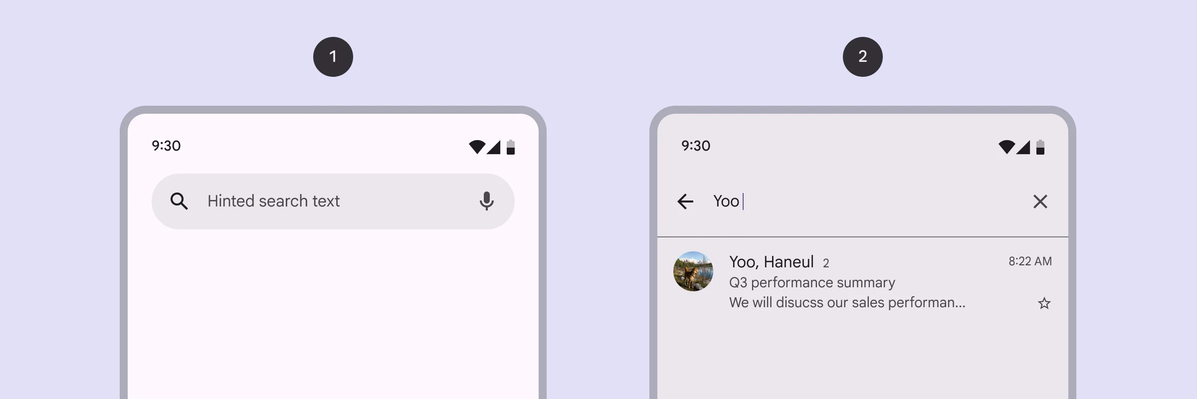
The Marketplace Search View allows users to efficiently search for services, events, or providers by entering relevant terms—streamlining the discovery process.
Think of Search View as your app’s spotlight for discovery. It encourage users to quickly search for a specific service, event, or provider without having to scroll through every category. Especially as your catalog grows, search becomes indispensable for delivering fast, relevant results.
🧱 Gridding Rules
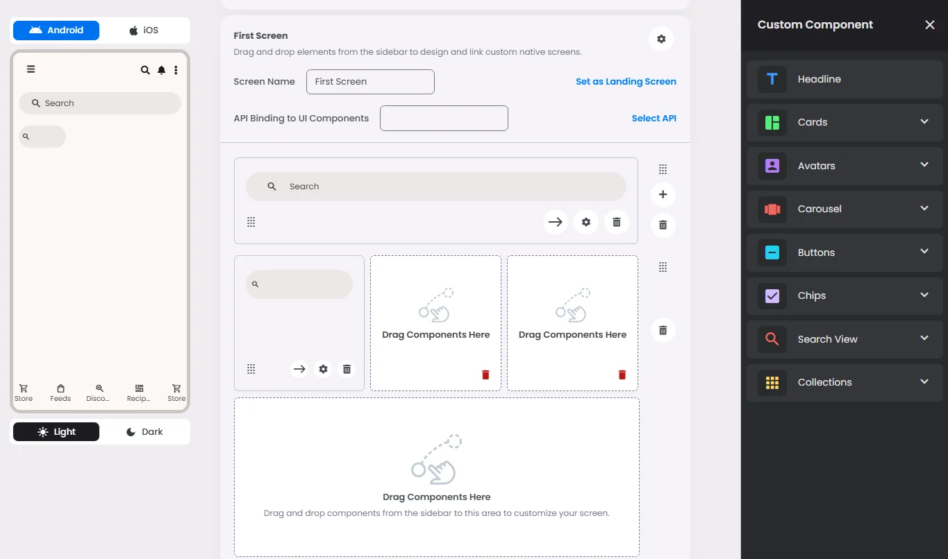
The Search element follows a flexible grid system where it can be placed alone or alongside one other element in the same row.
Min | Max |
20 grids | 60 grids |
⚙️ Settings
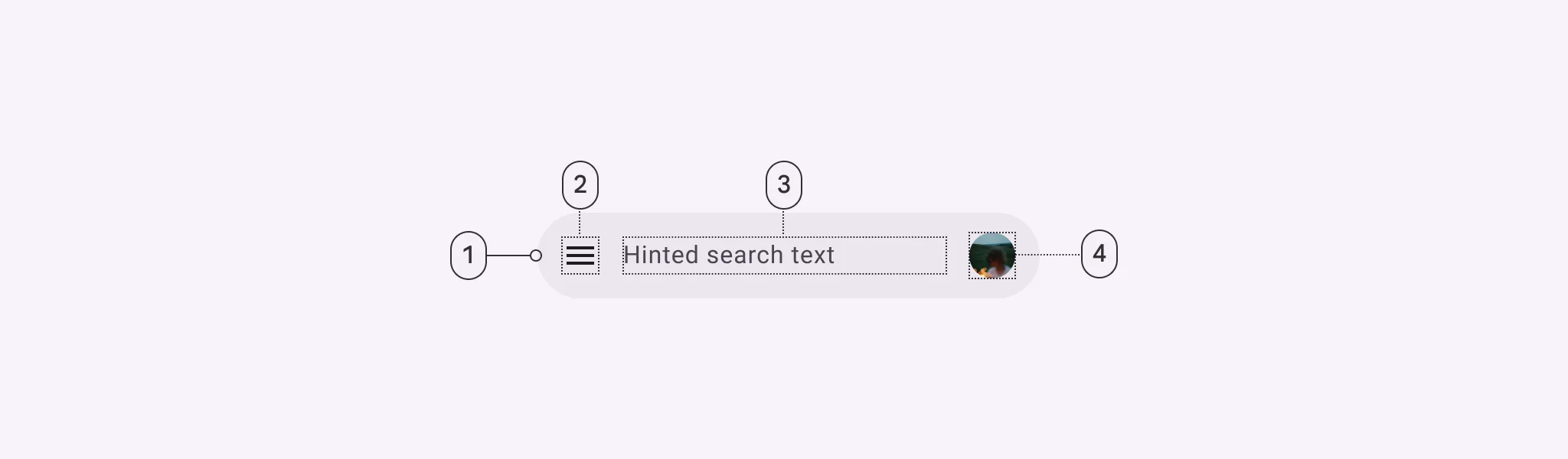
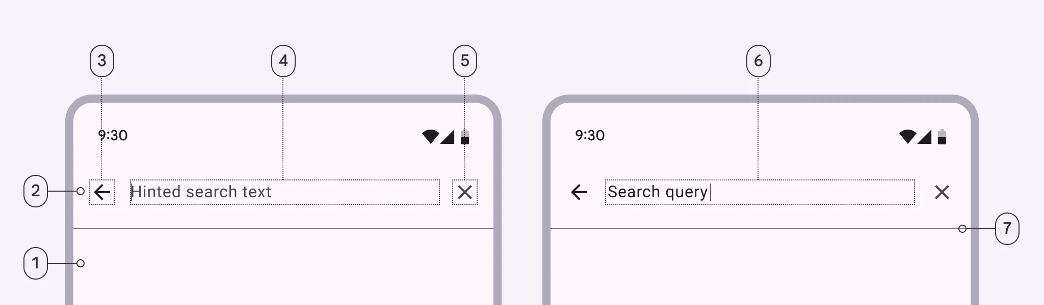
The following table outlines the available configuration options for this element. Each setting defines how the element behaves or appears within your app’s UI.
Field | Description |
Label | The main label for form fields like inputs or dropdowns. |
Custom Color | controls the color styling of text or divider. |
Divider | Shows a line under the cell to separate it from others, if supported. Default is off. |
Cell ID | This is the unique name for the cell. It's used to find or manage the cell later. If both cell_id and callback are provided, the system will use cell_id. |
Callback | This is the action name linked to the cell when a user interacts with it. You must add this when creating the cell. Once the cell is saved, this value can’t be changed. |
Cell Order | This controls where the cell appears inside the row (from left to right). Like callback, it must be set when creating the cell and can’t be changed later. |
Form | The type of the element. You must choose this when creating the cell, and it can't be changed later. |
Style | The visual style of the element (e.g., filled, outlined). You need to set this when creating the cell, and it can't be changed after saving. |
Version | A system-generated version number that updates automatically whenever the cell is changed. |
Body | Main text content displayed inside the cell. |
Prefix | Text that appears at the beginning of an input field (before the user's input). |
Trailing Icon | An icon shown at the end (right side) of the cell. |
Maximum | The highest value a user can enter in the field. |
Minimum | The lowest value a user can enter in the field. |
Value Type | The kind of data expected (like text or number). Must be set when creating the cell and stays fixed. |
Cell Query | Allows you to ask the user for special data like their location or contact number. |
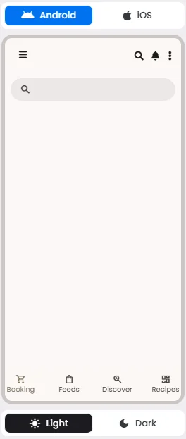
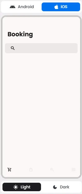
📱 Android & iOS Interface
The Search element adapts its appearance and layout behavior based on the platform to align with native UI guidelines:
👇🏻 Action (onClick)
Element | Purpose | Supports Actions | Available Actions |
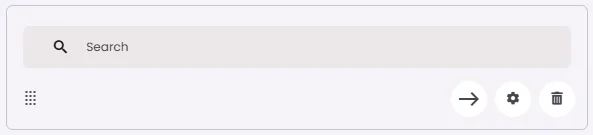
Search | To allow users to search and discover content by entering keywords or phrases. | ✅ | Execute Function: List View |
🃏 Search Style Overview
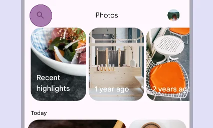
Search is a navigation method that allows people to quickly find information across an app.
There are 2 types of them: Search bar & Search view.
Search Bar
🧰 Usage
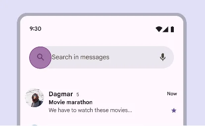
Use a search bar when search is the primary focus of the app, such as in a list.
Search View
🧰 Usage
Use a search view when search is not the primary focus of the app, such as in a menu.
Keep the search clear and easy to use. Add a short hint in the search box like ‘Search services or events’ so people can know what to type. Make sure it works with common words and small spelling mistakes. On mobile, check that the search bar is big enough to tap and type without trouble.
❓ FAQs
Q: How can I add a search bar so users can find events or bookings in my app without any coding?
A: With nandbox’s Search View element, you can easily add a search bar to your booking hub. This lets users quickly find events or appointments by typing keywords—no technical setup or backend work required.
Q: What can the Search View do in my app?
A: The Search View makes it easy for users to:
- Search by event or booking name
- Filter results in real time as they type
- Search by categories, dates, or tags to narrow things down fast
It creates a smooth and intuitive search experience—perfect for apps with lots of offerings.
Q: How do I set up and customize the search bar?
A:
- Open the nandbox builder and navigate to your Booking and Event Center layout.
- Drag the Search View element into the layout where you want the search bar to appear.
- In the settings panel:
- Choose which fields are searchable:
- Event/Booking Title
- Category
- Date or Keywords
- Set a custom placeholder (e.g., “Search for events…”).
- Save your changes and preview the layout.
Your search bar is now live, letting users find what they need in seconds—all without writing a single line of code.