
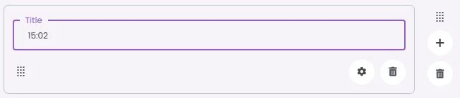
Time Picker is a clock-based input that lets users select a specific time, typically used for scheduling or setting reminders.
🧱 Gridding Rules
The Time Picker element follows a flexible grid system where it can be placed alone or alongside one other element in the same row.
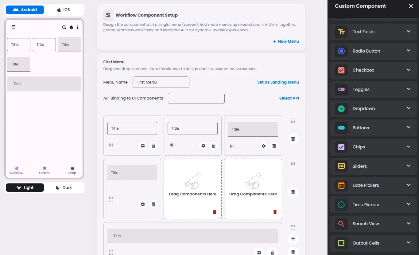
Min | Max |
20 grids | 60 grids |
⚙️ Settings
The following table outlines the available configuration options for this element. Each setting defines how the element behaves or appears within your app’s UI.
Field | Description |
Label | The main label for form fields like inputs or dropdowns. |
Icon | An icon shown at the start (left side) of the cell. |
Custom Color | controls the color styling of text or divider. |
Cell ID | This is the unique name for the cell. It's used to find or manage the cell later. If both cell_id and callback are provided, the system will use cell_id. |
Callback | This is the action name linked to the cell when a user interacts with it. You must add this when creating the cell. Once the cell is saved, this value can’t be changed. |
Cell Order | This controls where the cell appears inside the row (from left to right). Like callback, it must be set when creating the cell and can’t be changed later. |
Form | The type of the element. You must choose this when creating the cell, and it can't be changed later. |
Style | The visual style of the element (e.g., filled, outlined). You need to set this when creating the cell, and it can't be changed after saving. |
Version | A system-generated version number that updates automatically whenever the cell is changed. |
Prefix | Text that appears at the beginning of an input field (before the user's input). |
Options | A list of choices is shown to the user in dropdowns, radio buttons, or multi-select elements. Only needed for cells that require selection. |
Value | The default or current value for the cell (like a pre-selected option). |
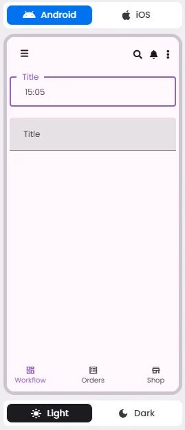
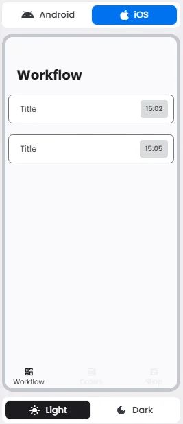
📱 Android & iOS Interface
The Time Picker element adapts its appearance and layout behavior based on the platform to align with native UI guidelines:
👇🏻 Action (onClick)
Element | Purpose | Supports Actions | Notes |
Time Picker | To let users select a specific time using a clock-style interface. | ❌ | Designed for time input only. Not actionable. Best suited for booking and reminder features. |
🃏 Time Pickers Style Overview
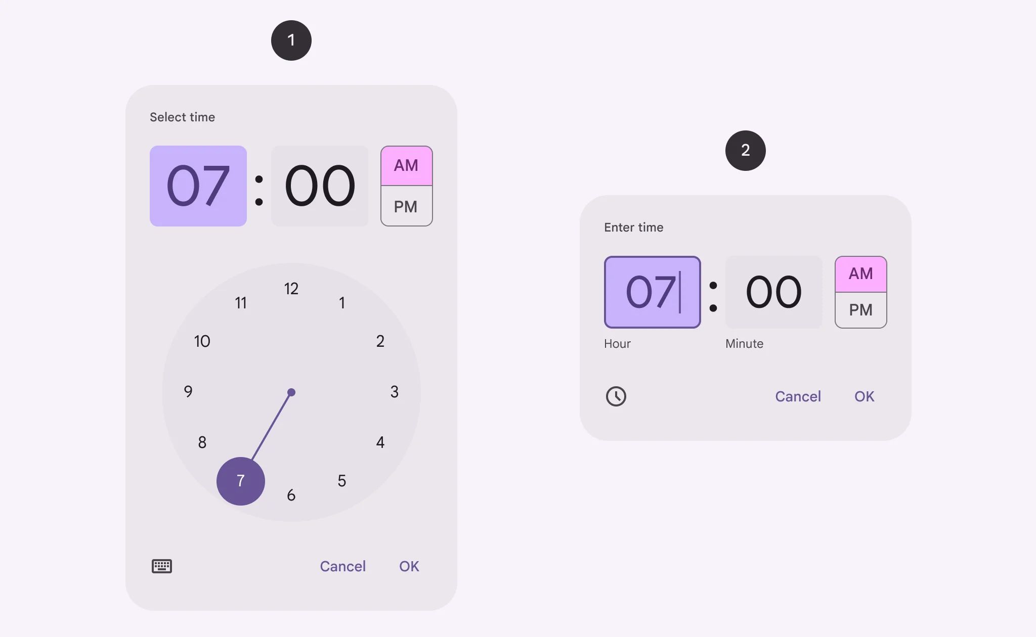
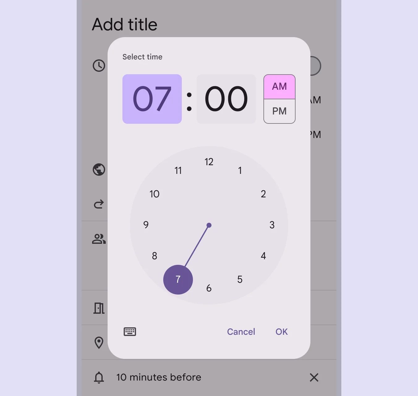
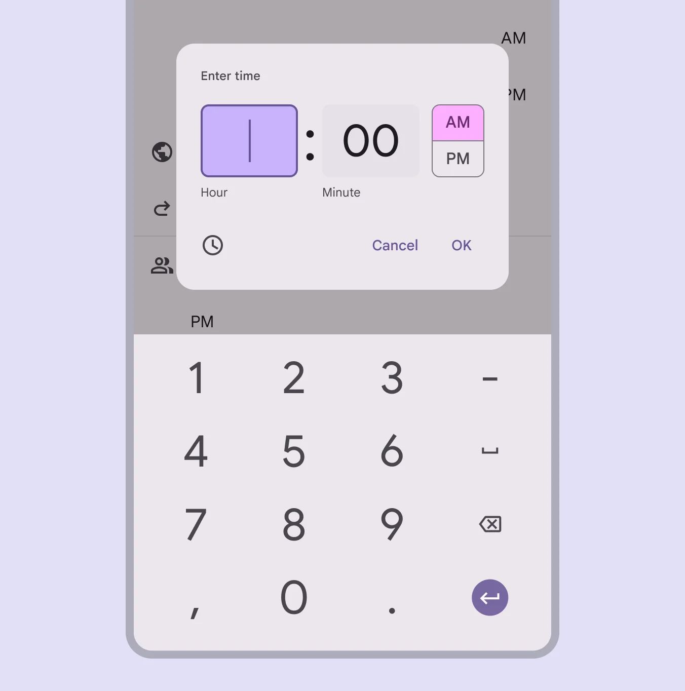
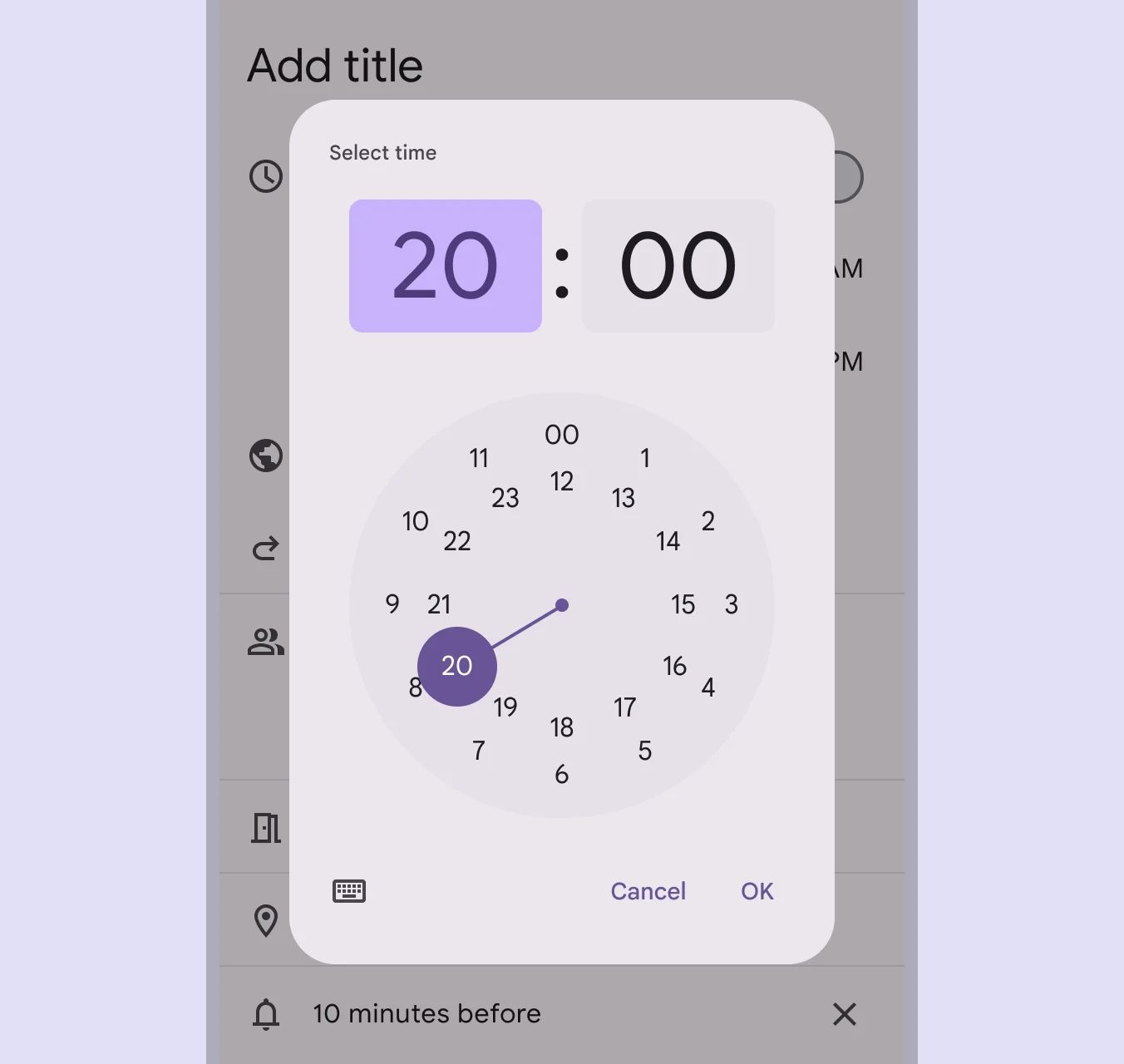
Time Picker is a dialog interface that lets users select a time using a clock-style or text input format. They are designed for ease of use on both mobile and desktop, ensuring precise time selection in workflows like scheduling, alarms, or reminders.
There are 2 types of them: Dial time picker & Input time picker.
🧰 Usage
They can be used for a wide range of scenarios, like scheduling a meeting.
Input time picker
Time input pickers allow people to specify a time using keyboard numbers.
Dial time picker
The dial view can be changed to reflect time selection across 24 hours.
❓ FAQs
Q: How can I add a time picker so users can choose a time (like appointment time or reminder) in my app without coding?
A: You can use the Time Picker element to let users select a specific time directly in your app. It’s perfect for booking forms or scheduling—and you can set it up visually in the builder with no coding required.
Q: How do I insert and configure a Time Picker?
A:
- Drag the Time Picker element into your screen layout.
- Open its settings panel to customize:
- Label: Add a clear title like “Select Time” or “Appointment Time.”
- Default Time: Set it to the current time or a predefined option to guide users.
- Time Format: Choose between 12-hour (AM/PM) or 24-hour display.
- Step Interval: Control how users scroll through times (for example, increments of 5, 15, or 30 minutes).
Q: Can I set a default value or control how precise the time selection is?
A:
Yes. You can:
- Set a default time so the field is pre-filled when users open the screen.
- Adjust the step interval to limit selections to specific increments (like only allowing 15-minute time slots).
This helps streamline user input and avoid invalid or overly precise entries.
Q: Is the Time Picker interactive or does it trigger actions?
A:
The Time Picker is an input-only element. It doesn’t trigger actions directly when tapped. However, once a user selects a time, the value can be passed into forms, workflows, or API calls through a submit button or other interactive elements you configure with onClick actions.