
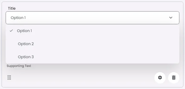
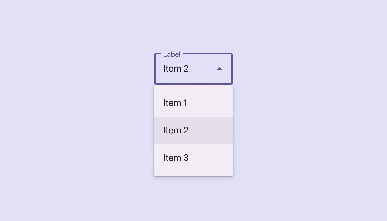
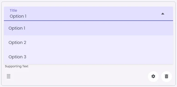
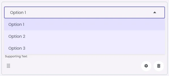
A dropdown menu gives users a compact way to choose one option from many. Instead of showing all options at once, it shows them in a list only when the user taps it. This saves space and keeps your UI clean.
They are used when screen space is limited or when you have many choices. But if you have more than six options, it’s often easier to use a full list. Always add clear label, like ‘Select country’ or ‘Choose color’ so users know what they’re picking.
🧱 Gridding Rules
The Dropdown Menu element follows a flexible grid system where it can be placed alone or alongside one other element in the same row.
Min | Max |
20 grids | 60 grids |
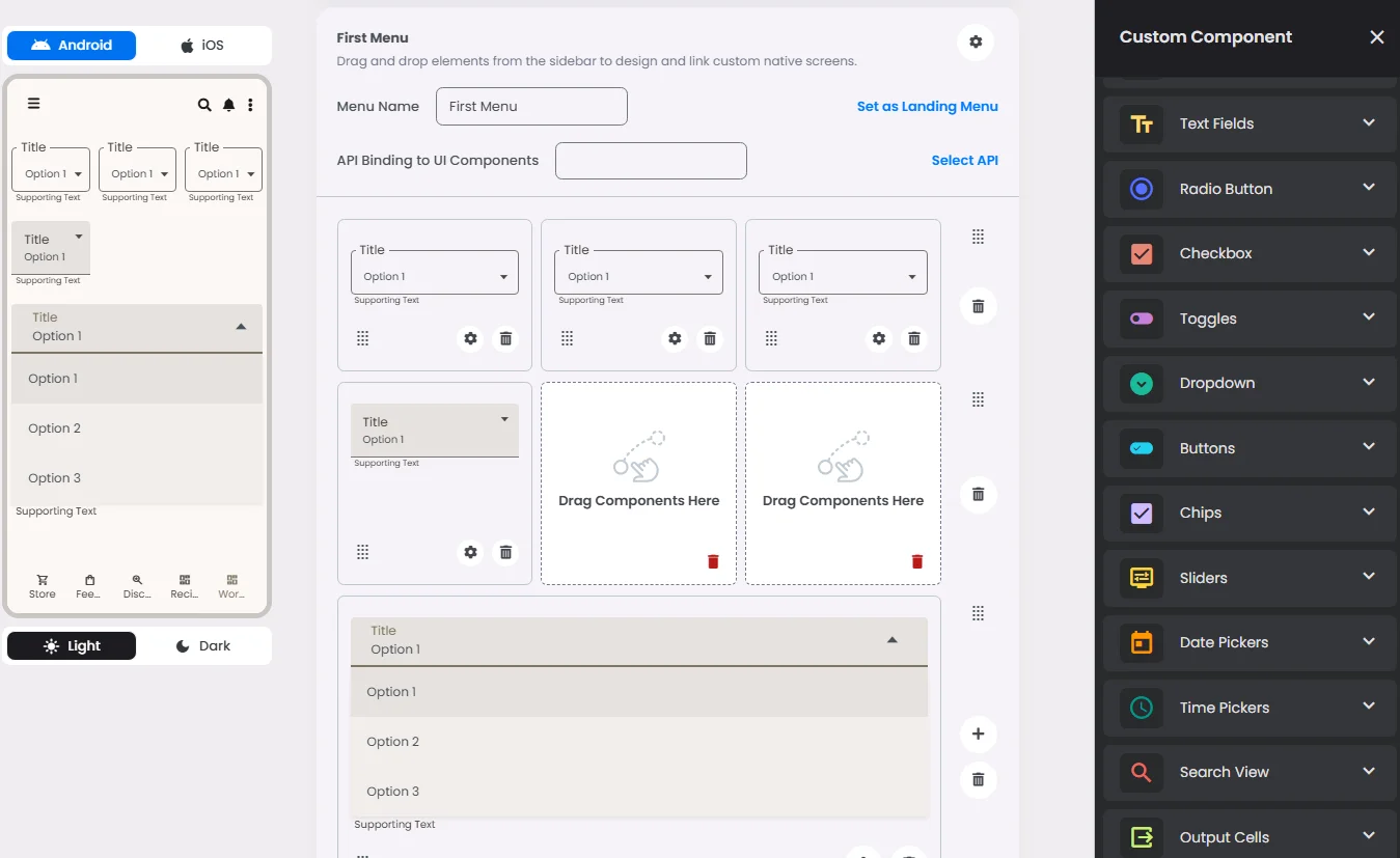
⚙️ Settings
The following table outlines the available configuration options for this element. Each setting defines how the element behaves or appears within your app’s UI.
Field | Description |
Label | The main label for form fields like inputs or dropdowns. |
Image | An image shown inside the cell when light mode is active. |
Icon | An icon shown at the start (left side) of the cell. |
Divider | Shows a line under the cell to separate it from others, if supported. Default is off. |
Options | A list of choices is shown to the user in dropdowns, radio buttons, or multi-select elements. Only needed for cells that require selection. |
Custom Color | controls the color styling of text or divider. |
Cell ID | This is the unique name for the cell. It's used to find or manage the cell later. If both cell_id and callback are provided, the system will use cell_id. |
Callback | This is the action name linked to the cell when a user interacts with it. You must add this when creating the cell. Once the cell is saved, this value can’t be changed. |
Cell Order | This controls where the cell appears inside the row (from left to right). Like callback, it must be set when creating the cell and can’t be changed later. |
Form | The type of the element. You must choose this when creating the cell, and it can't be changed later. |
Value | The default or current value for the cell (like a pre-selected option). |
Style | The visual style of the element (e.g., filled, outlined). You need to set this when creating the cell, and it can't be changed after saving. |
Version | A system-generated version number that updates automatically whenever the cell is changed. |
Body | Main text content displayed inside the cell. |
Helper | Helpful text shown below the cell to guide the user. Usually used for tips or extra context. |
Error | Error message shown when the user enters something wrong. It usually replaces the helper text. |
Prefix | Text that appears at the beginning of an input field (before the user's input). |
Suffix | Text that appears at the end of an input field (after the user's input). |
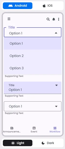
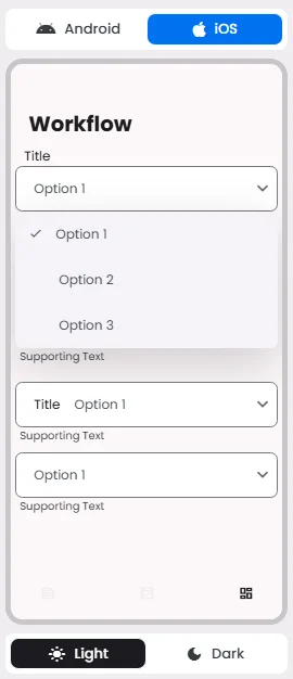
📱 Android & iOS Interface
The Dropdown Menu element adapts its appearance and layout behavior based on the platform to align with native UI guidelines:
👇🏻 Action (onClick)
Element | Purpose | Supports Actions | Notes |
Dropdown Menu | To allow the user to select a single option from a list of predefined choices. | ❌ | Informational/structural use only. Not intended to trigger interactive actions. |
🃏 Dropdown Menu Style Overview
Use menus to show items in a scannable way, as they’re easy to open, close, and select.
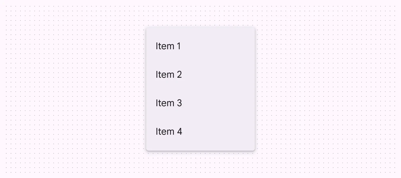
If you have more than six selections, you should use a list instead of dropdown menus.
🧰 Usage
Use dropdown menus to:
- Display a list of choices on a temporary surface.
- Take up less space than a set of radio buttons or choice chips.
🎨 Our Styles
Filled
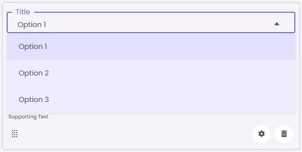
Floating
Outlined
Make one of the options a common default value that can give users a starting point. Also, avoid having too many similar or confusing options and keep it clear and simple.
❓ FAQs
Q: How can I add a dropdown menu in my app to let users pick from a list without coding?
A: You can use the Dropdown Menu element to create a simple, clean selection menu where users can choose one option from a list. Everything is done visually in the builder—no coding needed.
Q: What can I include in a dropdown menu?
A:
The Dropdown Menu is designed for single-choice selections and offers several customization options:
- Label: Add a descriptive label like “Choose your city” or “Select a category.”
- Options: Enter the list of choices users can pick from.
- Default Value: Set a pre-selected option for convenience.
- Style: Choose from filled, floating, or outlined designs to match your app’s theme.
- Image/Icon: Optionally include a small icon or image inside the dropdown cell.
- Divider: Add or remove a line below the dropdown for cleaner visual separation.
Q: How do I insert and configure a dropdown menu?
A:
- Drag the Dropdown Menu element into your screen layout.
- Adjust its width using the grid system (between 20–60 units depending on your design).
- Open the settings panel to:
- Enter a Label for the menu.
- Add your Options list.
- Set a Default Value if needed.
- Optionally add an Icon or Image and choose a Style.
Q: How do users interact with it?
A:
Users tap on the dropdown to open the menu and select one option from the list. This element is ideal for compact, user-friendly forms and replaces bulkier radio button groups.
The dropdown menu is for displaying and collecting user selections only. It doesn’t support onClick actions.