
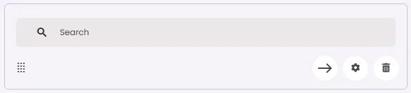
Search is an element that allows users to quickly find content by entering keywords or phrases.
🧱 Gridding Rules
The Search element follows a flexible grid system where it can be placed alone or alongside one other element in the same row.
Min | Max |
20 grids | 60 grids |
⚙️ Settings
The following table outlines the available configuration options for this element. Each setting defines how the element behaves or appears within your app’s UI.
Field | Description |
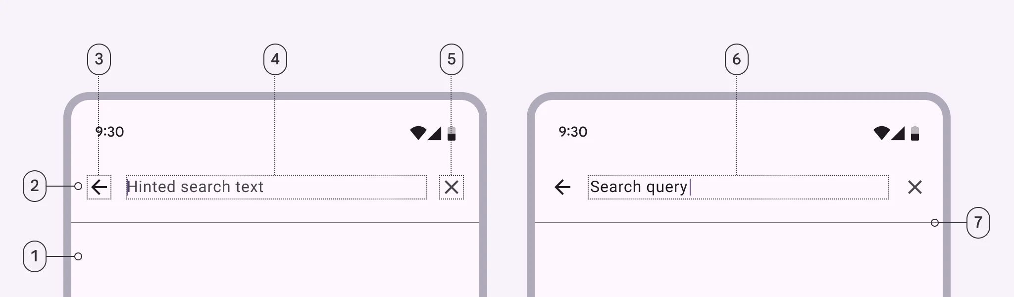
Label | The main label for form fields like inputs or dropdowns. |
Custom Color | controls the color styling of text or divider. |
Divider | Shows a line under the cell to separate it from others, if supported. Default is off. |
Cell ID | This is the unique name for the cell. It's used to find or manage the cell later. If both cell_id and callback are provided, the system will use cell_id. |
Callback | This is the action name linked to the cell when a user interacts with it. You must add this when creating the cell. Once the cell is saved, this value can’t be changed. |
Cell Order | This controls where the cell appears inside the row (from left to right). Like callback, it must be set when creating the cell and can’t be changed later. |
Form | The type of the element. You must choose this when creating the cell, and it can't be changed later. |
Style | The visual style of the element (e.g., filled, outlined). You need to set this when creating the cell, and it can't be changed after saving. |
Version | A system-generated version number that updates automatically whenever the cell is changed. |
Body | Main text content displayed inside the cell. |
Prefix | Text that appears at the beginning of an input field (before the user's input). |
Trailing Icon | An icon shown at the end (right side) of the cell. |
Maximum | The highest value a user can enter in the field. |
Minimum | The lowest value a user can enter in the field. |
Value Type | The kind of data expected (like text or number). Must be set when creating the cell and stays fixed. |
Cell Query | Allows you to ask the user for special data like their location or contact number. |
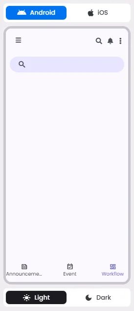
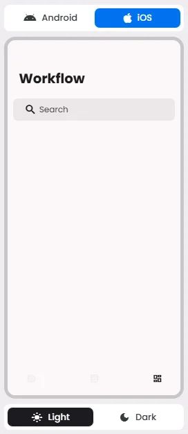
📱 Android & iOS Interface
The Search element adapts its appearance and layout behavior based on the platform to align with native UI guidelines:
👇🏻 Action (onClick)
Element | Purpose | Supports Actions | Available Actions |
Search | To allow users to search and discover content by entering keywords or phrases. | ✅ | Execute Function:
⇒ Search
⇒ Search View |
🃏 Search Style Overview
Search is a navigation method that allows people to quickly find information across an app.
There are 2 types of them: Search bar & Search view.
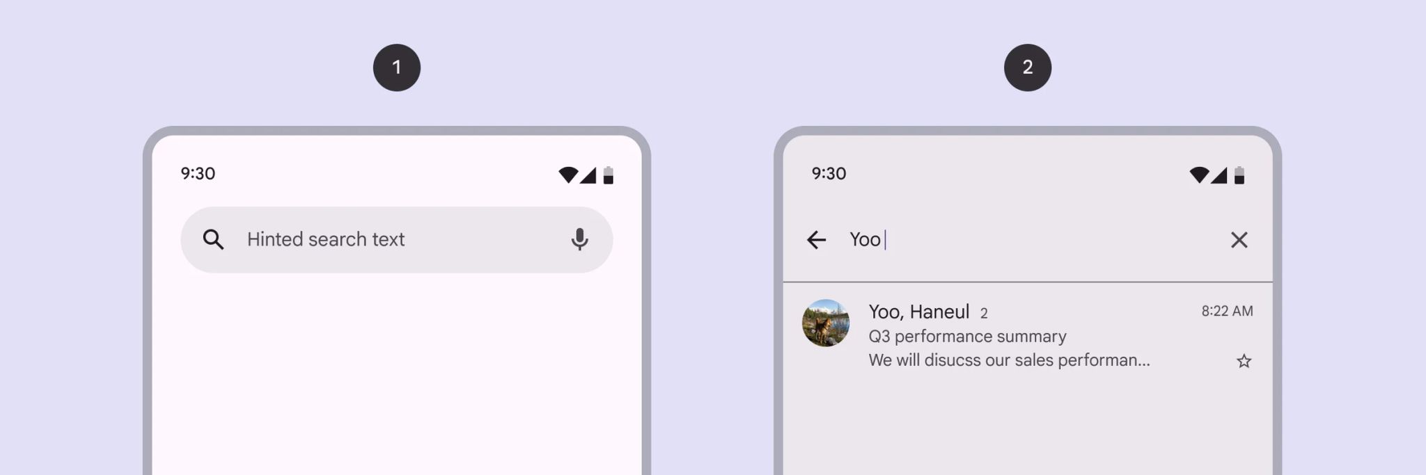
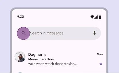
Search Bar

🧰 Usage
Use a search bar when search is the primary focus of the app, such as in a list.
Search View
🧰 Usage
Use a search view when search is not the primary focus of the app, such as in a menu.
❓ FAQs
Q: How can I add a search bar to my app so users can find items or content without coding?
A: You can use the Search element to add a search box to your app. Whether it’s a simple search bar for lists or a more advanced Search View for filtering content, you can set it up visually in the builder—no coding required.
Q: What’s the difference between Search Bar and Search View?
A:
- Search Bar: Best when search is the main focus of the screen, like browsing a product catalog or contact list.
- Search View: Ideal when search is a secondary feature, such as filtering through settings or optional categories.
Both options support real-time input and keyword tracking while offering full customization without development work.
Q: How do I insert and configure a search field?
A:
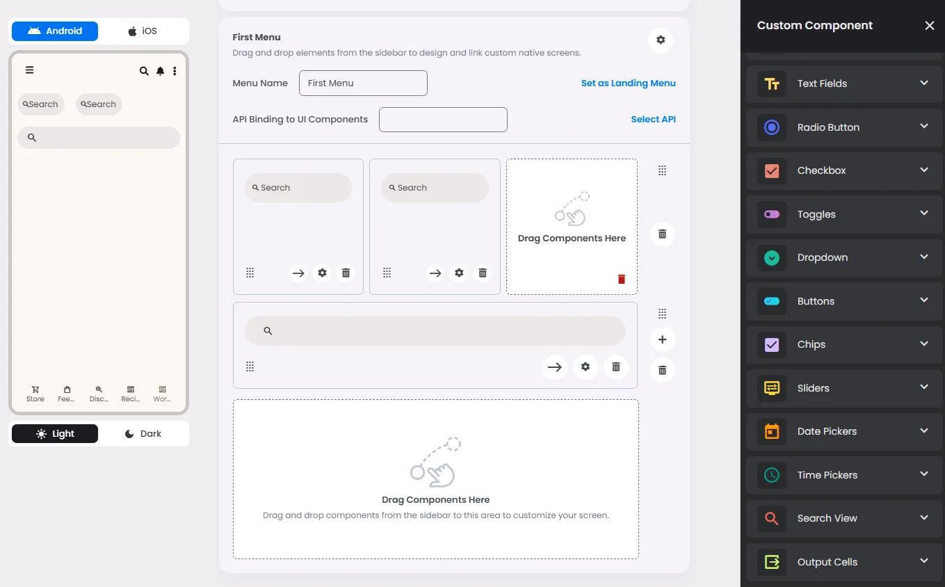
- Drag the Search element into your screen layout.
- Adjust its width using the flexible 20–60 grid units to fit your design.
- Customize settings:
- Placeholder (Label): Add a descriptive label for accessibility (e.g., “Search Products”).
- Trailing & Leading Icon: Add a magnifying glass or another search-related icon.
- Custom Colors: Set text and icons colors to match your app’s branding.
Q: Can I trigger actions based on search input?
A:
Yes. The Search component allows you to:
- Perform real-time filtering in lists or other content areas.
- Use Search View for an expanded search experience with filters, headers, and icons.
- Define custom behavior for search queries through the callback property, letting your app react dynamically as users type.