
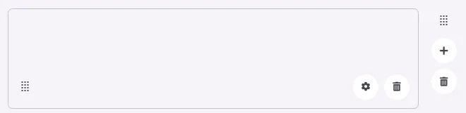
A filler is an element used to fill in spaces in your menu.
🧱 Gridding Rules
The Filler element follows a flexible grid system where it can be placed alone or alongside one other element in the same row.
Min | Max |
20 grids | 60 grids |
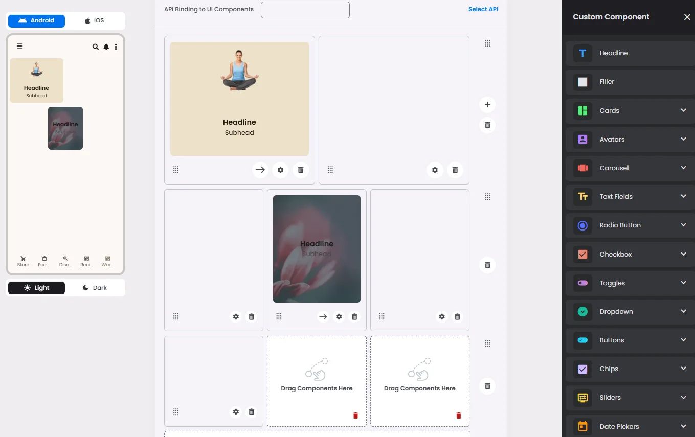
⚙️ Applicable Settings
The following table outlines the available configuration options for this element. Each setting defines how the element behaves or appears within your app’s UI.
Field | Description |
Cell ID | This is the unique name for the cell. It's used to find or manage the cell later. If both cell_id and callback are provided, the system will use cell_id. |
Callback | This is the action name linked to the cell when a user interacts with it. You must add this when creating the cell. Once the cell is saved, this value can’t be changed. |
Cell Order | This controls where the cell appears inside the row (from left to right). Like callback, it must be set when creating the cell and can’t be changed later. |
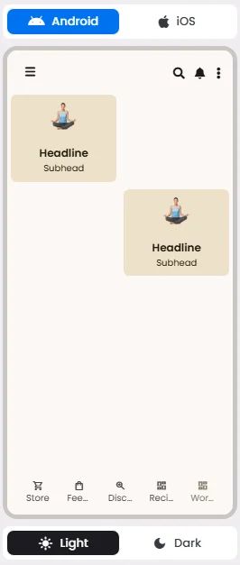
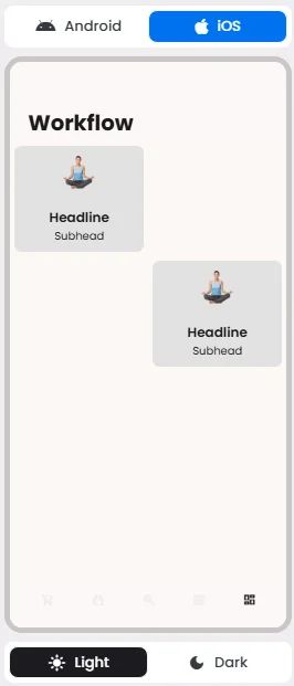
📱 UI for Android & iOS
The Filler element adapts its appearance and layout behavior based on the platform to align with native UI guidelines:
👇🏻 Action (onClick)
Element | Purpose | Supports Actions | Notes |
Filler | Occupy or pad empty spaces within workflow menus for layout consistency. | ❌ | Purely visual; helps with spacing but has no functional behavior. |
❓ FAQs
Q: How can I add space or blank areas between components in my app without coding?
A: You can use the Filler element in the nandbox builder to add space between sections, create blank areas on your screen, or adjust layout padding—all without writing any code.
Q: What exactly is the filler element?
A:
- The Filler is an invisible layout tool that helps you create blank space in your app.
- It works like an empty cell in the grid system, taking up width or height without displaying any content.
Q: How do I use it to control spacing?
A:
- Drag a Filler into a row between other elements (like buttons, cards, or text fields).
- Set its width (for horizontal space) or place it in its own row to add vertical spacing.
- Adjust the size by assigning units (e.g., 10, 20, or 30) to control how much space appears.
- The layout updates automatically to keep your design balanced.
Q: Can I use filler for padding or dividers?
A:
- Yes. Add filler at the start or end of rows to create side padding.
- Place filler between elements to maintain consistent gaps across your design.
- While it doesn’t add a visible divider line, the blank space acts as a clean visual break between sections.