
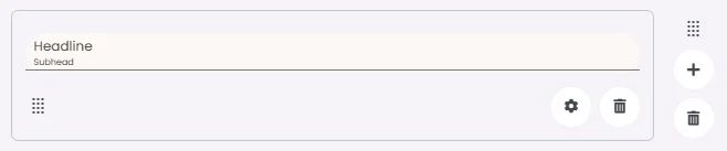
A headline is an element that organizes and briefly describes the content that follows to guide readers. It contains space for optional text: a headline, subhead and a divider.
🧱 Gridding Rules
The Headline element follows a flexible grid system where it can be placed alone or alongside one other element in the same row.
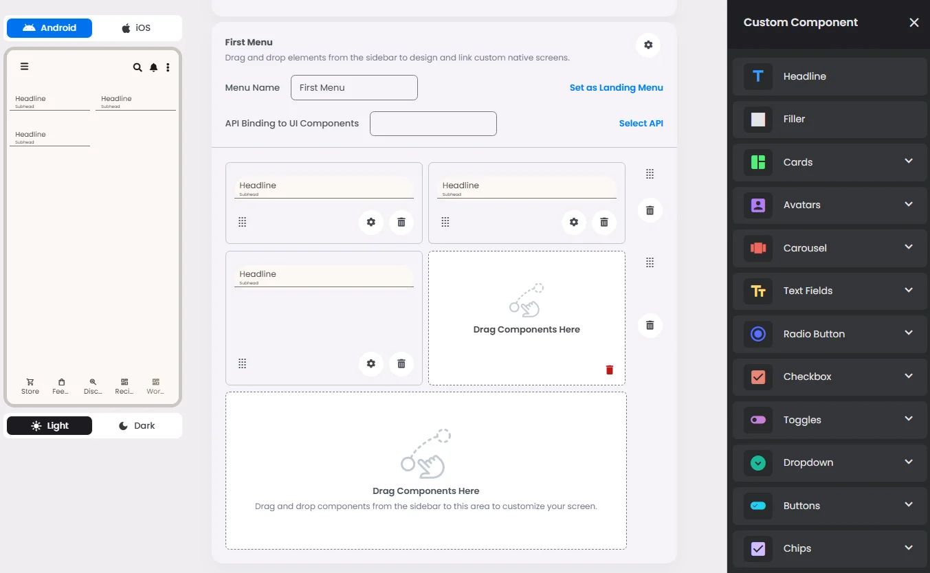
Min | Max |
30 grids | 60 grids |
⚙️ Applicable Settings
The following table outlines the available configuration options for this element. Each setting defines how the element behaves or appears within your app’s UI.
Field | Description |
Headline | The main title of the cell (e.g., "Workflow Component Setup"). |
Subhead | Secondary text placed under the headline (if supported). |
Text Alignment | Alignment of the text in the cell: left, center, or right. |
Font Size | Font size of the headline and subhead text. |
Divider (Seperator) | Optional line under the headline for separation (often defaulted to true). |
Custom Color | controls the color styling of text or divider. |
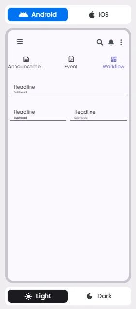
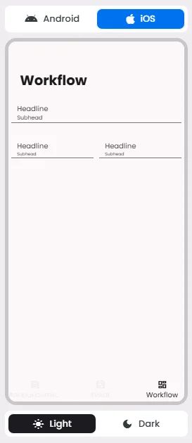
📱 UI for Android & iOS
The Headline element adapts its appearance and layout behavior based on the platform to align with native UI guidelines:
👇🏻 Action (onClick)
Element | Purpose | Supports Actions | Notes |
Headline | To present static content such as a headline, subhead, or divider. | ❌ | Informational/structural only. |
🃏 Headline Style Overview
In addition to being a headline element as it describes certain content, it can be used as a divider (separator) to separate between elements.
❓ FAQs
Q: How can I add and customize a headline or title in my app without coding?
A: With the Headline element in the nandbox builder, you can easily add titles to your screens, organize your layout, and guide users visually—all without writing any code. It allows you to display a main title, an optional subhead, and even a divider line, with full control over its style.
Q: How do I insert a headline element?
A:
- Open the component builder and drag the Headline element into your layout.
- Place it in its own row or alongside another element if needed.
- The headline fits flexibly within any layout between 30 and 60 grid units, making it responsive across devices.
Q: What can I customize in the headline text?
A:
You can adjust the following settings visually:
- Headline: Set the main title (e.g., “Welcome” or “Step 1: Enter Details”).
- Subhead: Add optional secondary text below the headline for context.
- Text Alignment: Align the headline to the left, center, or right.
- Font Size: Change the size of both the headline and subhead.
- Divider (Separator): Toggle a horizontal line below the text on or off.
- Custom Colors: Apply brand colors to the text and divider for a consistent look.
All of these settings can be adjusted directly in the UI—there’s no need for HTML, CSS, or any coding.
Q: Can I make it interactive or add actions to it?
A:
No, Headline elements are static and designed for layout and structure only. You can’t link them to other screens or trigger actions when tapped.