
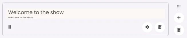
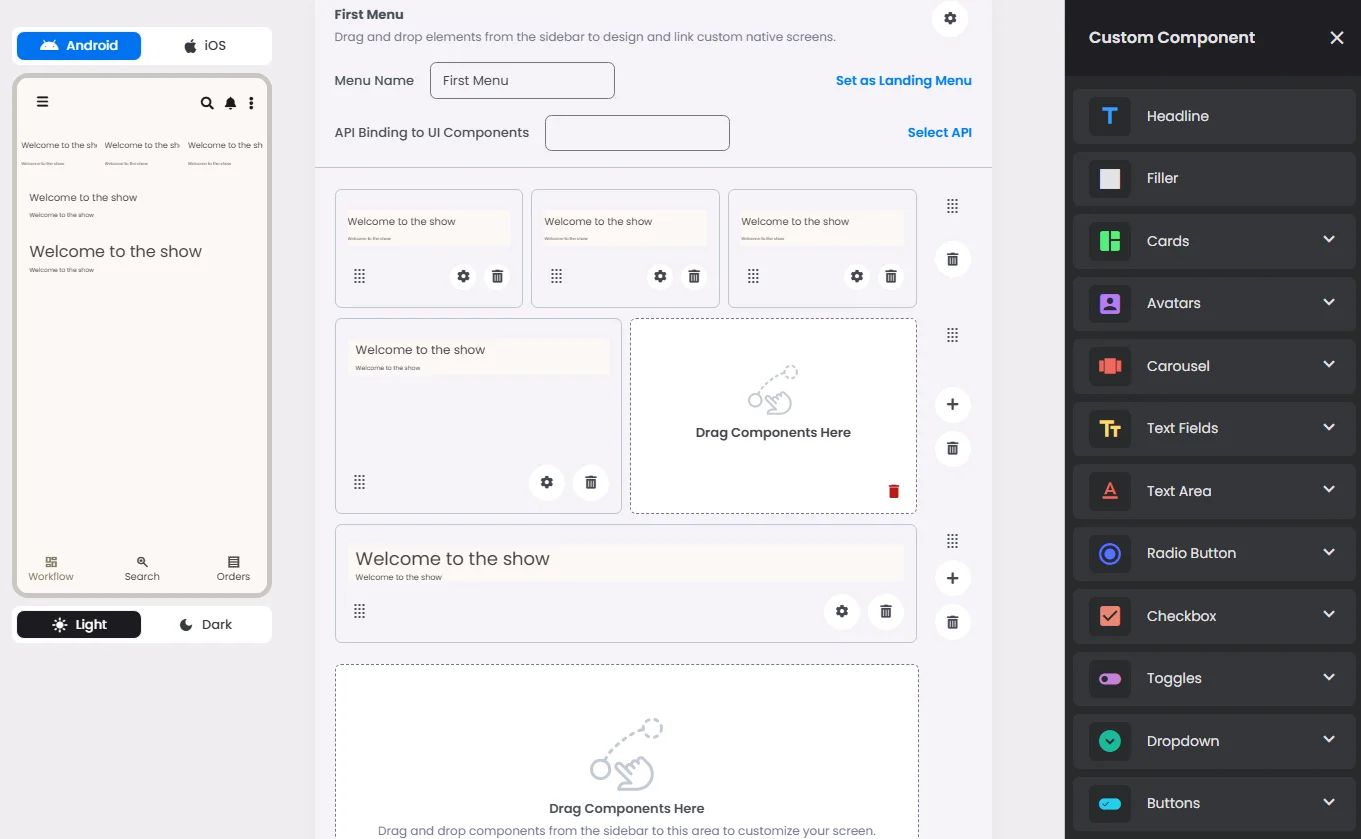
The Text Area element is a multi-line input field that allows you to write extended blocks of text, such as paragraphs, articles, or descriptions.
🧱 Gridding Rules
The Text Area element follows a flexible grid system where it can be placed alone or alongside one other element in the same row.
Min | Max |
30 grids | 60 grids |
⚙️ Applicable Settings
The following table outlines the available configuration options for this element. Each setting defines how the element behaves or appears within your app’s UI.
Field | Description |
Headline | The main title of the cell (e.g., "Workflow Component Setup"). |
Subhead | Secondary text placed under the headline (if supported). |
Text Alignment | Alignment of the text in the cell: left, center, or right. |
Font Size | Font size of the headline and subhead text. |
Divider (Seperator) | Optional line under the headline for separation (often defaulted to true). |
Custom Color | controls the color styling of text or divider. |
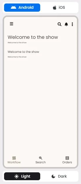
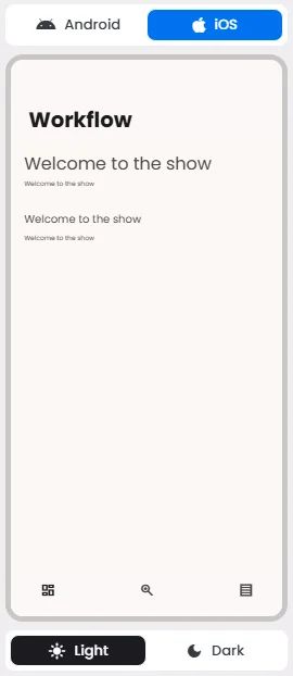
📱 UI for Android & iOS
The Text Area element adapts its appearance and layout behavior based on the platform to align with native UI guidelines:
👇🏻 Action (onClick)
Element | Purpose | Supports Actions | Notes |
Text Area | To present static content such as a headline, subhead, or divider. | ❌ | Informational/structural only. |
❓ FAQs
Q: How can I type longer text like paragraphs in my app without coding?
A: You can add a paragraph input box by using the Text-Area element. This allows you to create content such as blogs and company info, etc.—all through the visual builder without writing any code.
Q: How do I insert a Text-Area element?
A:
- In the component builder, drag and drop the Text-Area element onto your layout.
- Place it anywhere you want to type longer paragraphs, such as an article in your blog.
Q: How can I customize the Text-Area settings?
A:
You can easily adjust headline and subhead text— Add your text and choose a font size with the option of controlling your paragraph and divider colors extracted from your app theme in your app branding. These settings help create a clear and user-friendly experience.