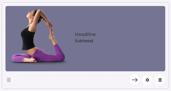
The Inline Card uses a horizontal layout where the image is positioned on one side, typically to the left or right of the headline and subhead. This side-by-side arrangement creates a compact and efficient design, ideal for showcasing items, profiles, or quick highlights where space optimization and visual balance are important.
🧱 Gridding Rules
The Inline Card element follows a flexible grid system where it can be placed alone or alongside one other element in the same row.
Max |
60 grids |
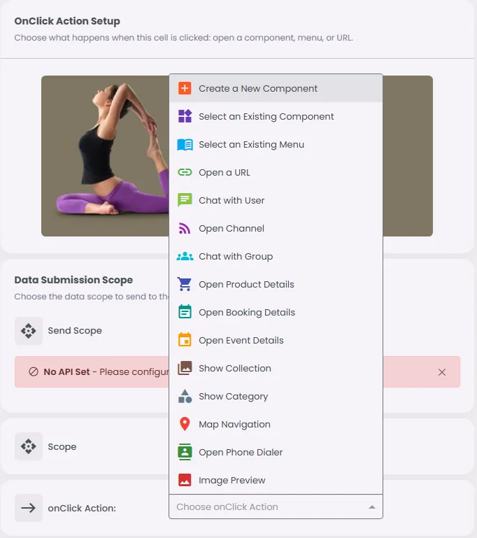
🔘 Actions
Element | Supports Actions | Available Actions |
Inline Card | ✅1 action | 1. Create a New Component
2. Select an Existing Component
3. Select an Existing Menu
4. Open URL
5. Chat with User
6. Open Channel
7. Chat with Group
8. Open Product Details
9. Open Booking Details
10. Open Event Details
11. Show Collection
12. Show Category
13. Map Navigation
14. Open Audio Directory
15. Open Phone Dialer
16. Image Preview
17. Open Video Directory
18. Open Catalog |