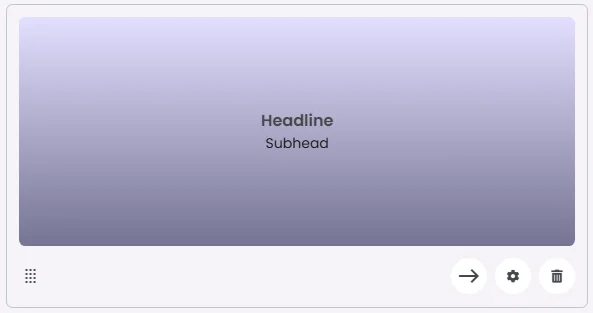
The Gradient Card features a smooth gradient background with centered headline and subhead text. It offers a bold and modern aesthetic, making it ideal for section headers, announcements, or call-to-action areas where visual impact is key. The gradient enhances readability while adding depth and color to the layout.
🧱 Gridding Rules
The Gradient Card element follows a flexible grid system where it can be placed alone or alongside one other element in the same row.
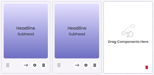
Min | Max |
20 grids | 60 grids |
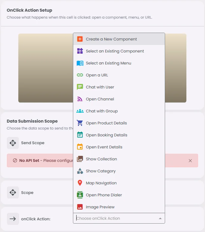
🔘 Actions
Element | Supports Actions | Available Actions |
Gradient Card | ✅1 action | 1. Create a New Component
2. Select an Existing Component
3. Select an Existing Menu
4. Open URL
5. Chat with User
6. Open Channel
7. Chat with Group
8. Open Product Details
9. Open Booking Details
10. Open Event Details
11. Show Collection
12. Show Category
13. Map Navigation
14. Open Audio Directory
15. Open Phone Dialer
16. Image Preview
17. Open Video Directory
18. Open Catalog |