
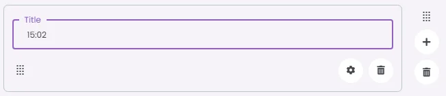
A time picker is a clock-based input lets users choose a specific hour and minute; either by typing or using a clock dial. It’s perfect for scheduling, reminders, or any screen where a precise time is needed.
🧱 Gridding Rules
The Time Picker element follows a flexible grid system where it can be placed alone or alongside one other element in the same row.
Min | Max |
20 grids | 60 grids |
⚙️ Settings
The following table outlines the available configuration options for this element. Each setting defines how the element behaves or appears within your app’s UI.
Field | Description |
Label | The main label for form fields like inputs or dropdowns. |
Icon | An icon shown at the start (left side) of the cell. |
Custom Color | controls the color styling of text or divider. |
Cell ID | This is the unique name for the cell. It's used to find or manage the cell later. If both cell_id and callback are provided, the system will use cell_id. |
Callback | This is the action name linked to the cell when a user interacts with it. You must add this when creating the cell. Once the cell is saved, this value can’t be changed. |
Cell Order | This controls where the cell appears inside the row (from left to right). Like callback, it must be set when creating the cell and can’t be changed later. |
Form | The type of the element. You must choose this when creating the cell, and it can't be changed later. |
Style | The visual style of the element (e.g., filled, outlined). You need to set this when creating the cell, and it can't be changed after saving. |
Version | A system-generated version number that updates automatically whenever the cell is changed. |
Prefix | Text that appears at the beginning of an input field (before the user's input). |
Options | A list of choices is shown to the user in dropdowns, radio buttons, or multi-select elements. Only needed for cells that require selection. |
Value | The default or current value for the cell (like a pre-selected option). |
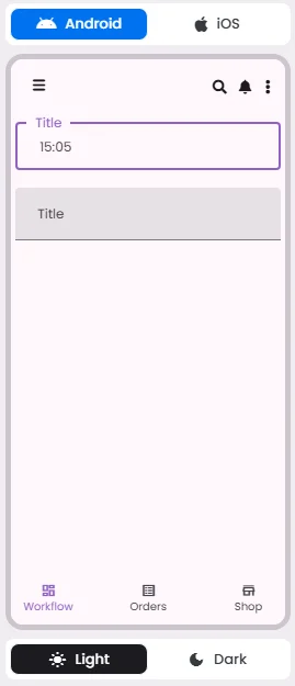
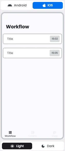
📱 Android & iOS Interface
The Time Picker element adapts its appearance and layout behavior based on the platform to align with native UI guidelines:
👇🏻 Action (onClick)
Element | Purpose | Supports Actions | Notes |
Time Picker | To let users select a specific time using a clock-style interface. | ❌ | Designed for time input only. Not actionable. Best suited for booking and reminder features. |
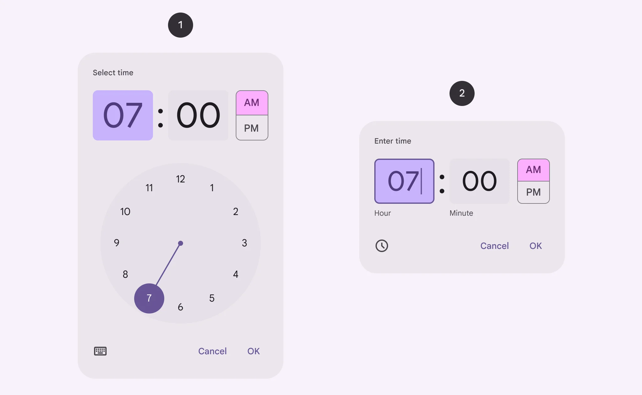
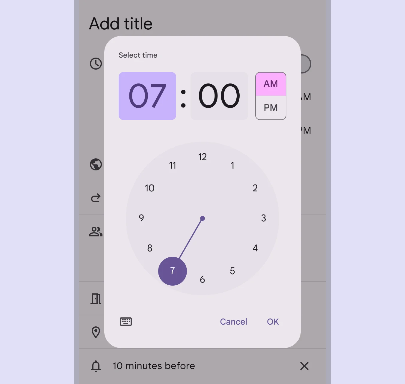
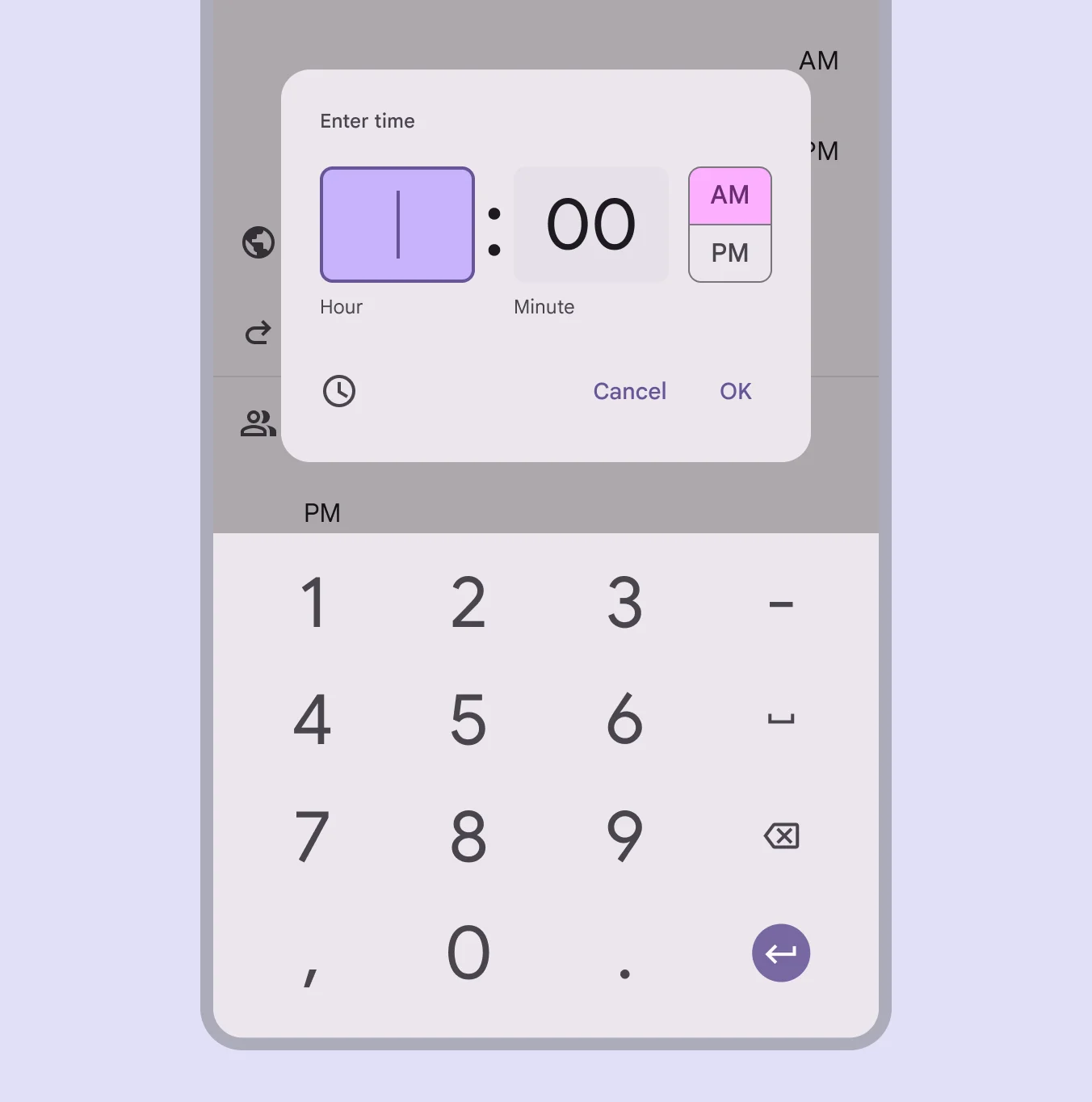
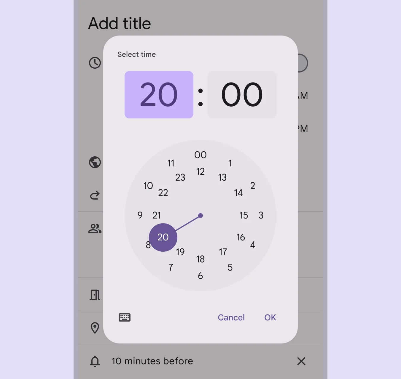
🃏 Time Pickers Style Overview
Time Picker is a dialog interface that lets users select a time using a clock-style or text input format. They are designed for ease of use on both mobile and desktop, ensuring precise time selection in workflows like scheduling, alarms, or reminders.
There are 2 types of them: Dial time picker & Input time picker.
🧰 Usage
They can be used for a wide range of scenarios, like scheduling a meeting.
Input time picker
Time input pickers allow people to specify a time using keyboard numbers.
Dial time picker
The dial view can be changed to reflect time selection across 24 hours.
Use the type ‘dial’ or ‘input’ that fits the context. If users are on mobile, a dial view might be easier to tap. If accuracy is important, allow them to enter the time as well. Always test both modes to see which feels more natural.
❓ FAQs
Q: How can I add a time picker so users can choose a time (like appointment time or reminder) in my app without coding?
A: You can use the Time Picker element to let users select a specific time directly in your app. It’s perfect for booking forms or scheduling—and you can set it up visually in the builder with no coding required.
Q: How do I insert and configure a Time Picker?
A:
- Drag the Time Picker element into your screen layout.
- Open its settings panel to customize:
- Label: Add a clear title like “Select Time” or “Appointment Time.”
- Default Time: Set it to the current time or a predefined option to guide users.
- Time Format: Choose between 12-hour (AM/PM) or 24-hour display.
- Step Interval: Control how users scroll through times (for example, increments of 5, 15, or 30 minutes).
Q: Can I set a default value or control how precise the time selection is?
A:
Yes. You can:
- Set a default time so the field is pre-filled when users open the screen.
- Adjust the step interval to limit selections to specific increments (like only allowing 15-minute time slots).
This helps streamline user input and avoid invalid or overly precise entries.
Q: Is the Time Picker interactive or does it trigger actions?
A:
The Time Picker is an input-only element. It doesn’t trigger actions directly when tapped. However, once a user selects a time, the value can be passed into forms, workflows, or API calls through a submit button or other interactive elements you configure with onClick actions.