
Search view is an element that allows users to type keywords to quickly find content inside your app. Instead of scrolling through everything, they can go straight to what they want. This helps especially when there’s a lot of content.
🧱 Gridding Rules
The Search element follows a flexible grid system where it can be placed alone or alongside one other element in the same row.
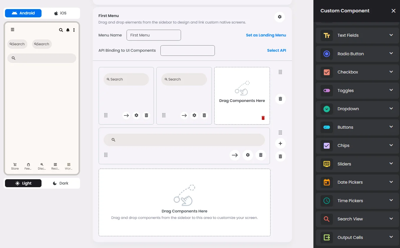
Min | Max |
20 grids | 60 grids |
⚙️ Settings
The following table outlines the available configuration options for this element. Each setting defines how the element behaves or appears within your app’s UI.
Field | Description |
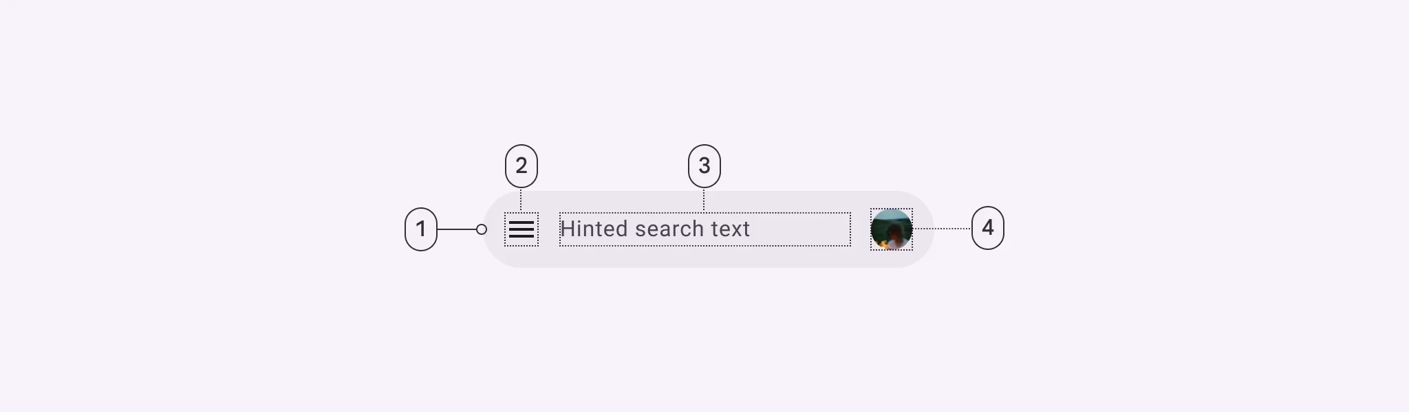
Label | The main label for form fields like inputs or dropdowns. |
Custom Color | controls the color styling of text or divider. |
Divider | Shows a line under the cell to separate it from others, if supported. Default is off. |
Cell ID | This is the unique name for the cell. It's used to find or manage the cell later. If both cell_id and callback are provided, the system will use cell_id. |
Callback | This is the action name linked to the cell when a user interacts with it. You must add this when creating the cell. Once the cell is saved, this value can’t be changed. |
Cell Order | This controls where the cell appears inside the row (from left to right). Like callback, it must be set when creating the cell and can’t be changed later. |
Form | The type of the element. You must choose this when creating the cell, and it can't be changed later. |
Style | The visual style of the element (e.g., filled, outlined). You need to set this when creating the cell, and it can't be changed after saving. |
Version | A system-generated version number that updates automatically whenever the cell is changed. |
Body | Main text content displayed inside the cell. |
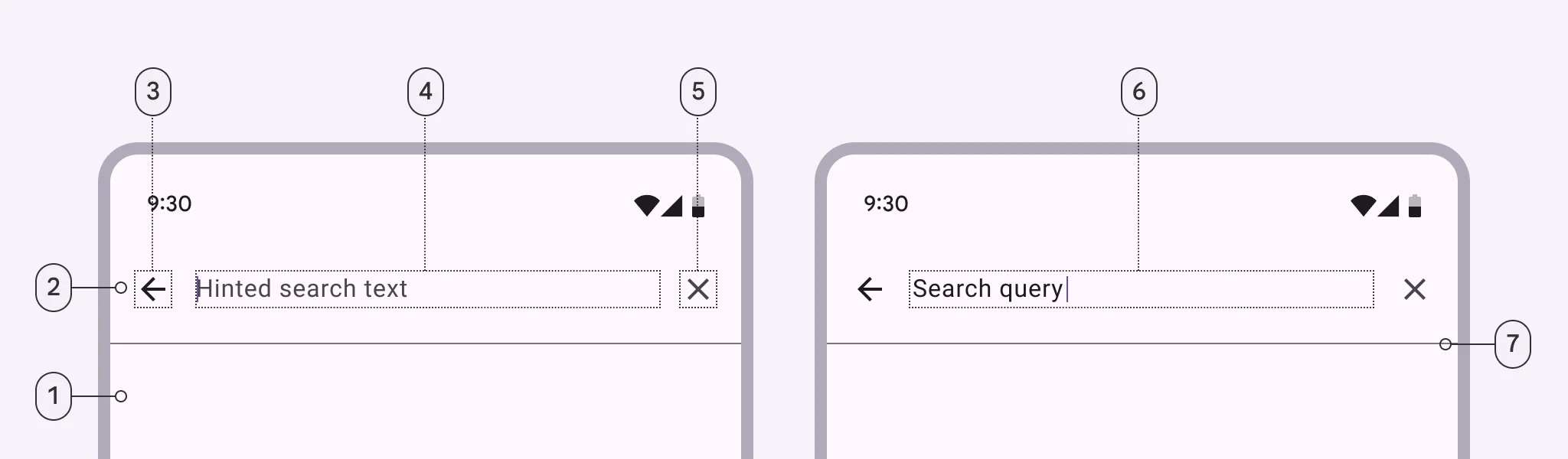
Prefix | Text that appears at the beginning of an input field (before the user's input). |
Trailing Icon | An icon shown at the end (right side) of the cell. |
Maximum | The highest value a user can enter in the field. |
Minimum | The lowest value a user can enter in the field. |
Value Type | The kind of data expected (like text or number). Must be set when creating the cell and stays fixed. |
Cell Query | Allows you to ask the user for special data like their location or contact number. |
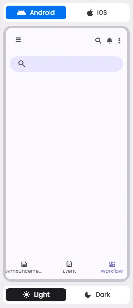
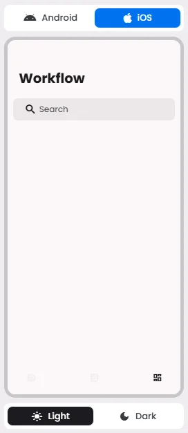
📱 Android & iOS Interface
The Search element adapts its appearance and layout behavior based on the platform to align with native UI guidelines:
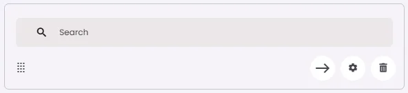
👇🏻 Action (onClick)
Element | Purpose | Supports Actions | Available Actions |
Search | To allow users to search and discover content by entering keywords or phrases. | ✅ | Execute Function:
⇒ Search
⇒ Search View |
🃏 Search Style Overview
Search is a navigation method that allows people to quickly find information across an app.
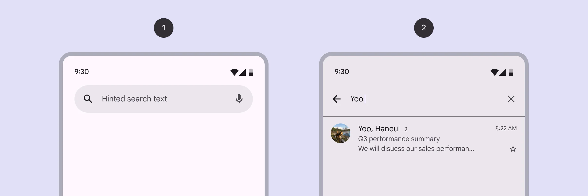
There are 2 types of them: Search bar & Search view.
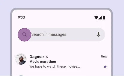
Search Bar
🧰 Usage
Use a search bar when search is the primary focus of the app, such as in a list.
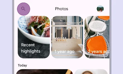
Search View
🧰 Usage
Use a search view when search is not the primary focus of the app, such as in a menu.
Use a search bar because searching is one of the main activities users engage in. Keep your search hint clear, like ‘Search items’ or ‘Find article,’ so users know what to type.
❓ FAQs
Q: How can I add a search bar to my app so users can find items or content without coding?
A: You can use the Search element to add a search box to your app. Whether it’s a simple search bar for lists or a more advanced Search View for filtering content, you can set it up visually in the builder—no coding required.
Q: What’s the difference between Search Bar and Search View?
A:
- Search Bar: Best when search is the main focus of the screen, like browsing a product catalog or contact list.
- Search View: Ideal when search is a secondary feature, such as filtering through settings or optional categories.
Both options support real-time input and keyword tracking while offering full customization without development work.
Q: How do I insert and configure a search field?
A:
- Drag the Search element into your screen layout.
- Adjust its width using the flexible 20–60 grid units to fit your design.
- Customize settings:
- Placeholder (Label): Add a descriptive label for accessibility (e.g., “Search Products”).
- Trailing & Leading Icon: Add a magnifying glass or another search-related icon.
- Custom Colors: Set text and icons colors to match your app’s branding.
Q: Can I trigger actions based on search input?
A:
Yes. The Search component allows you to:
- Perform real-time filtering in lists or other content areas.
- Use Search View for an expanded search experience with filters, headers, and icons.
- Define custom behavior for search queries through the callback property, letting your app react dynamically as users type.