
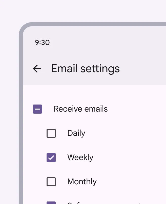
Checkboxes are used when you have options that relate to each other and users might want more than one. Keep option labels short and clear, like ‘Receive emails,’ ‘Dark mode,’ ‘Show notifications.’ That way users understand quickly what each one means.
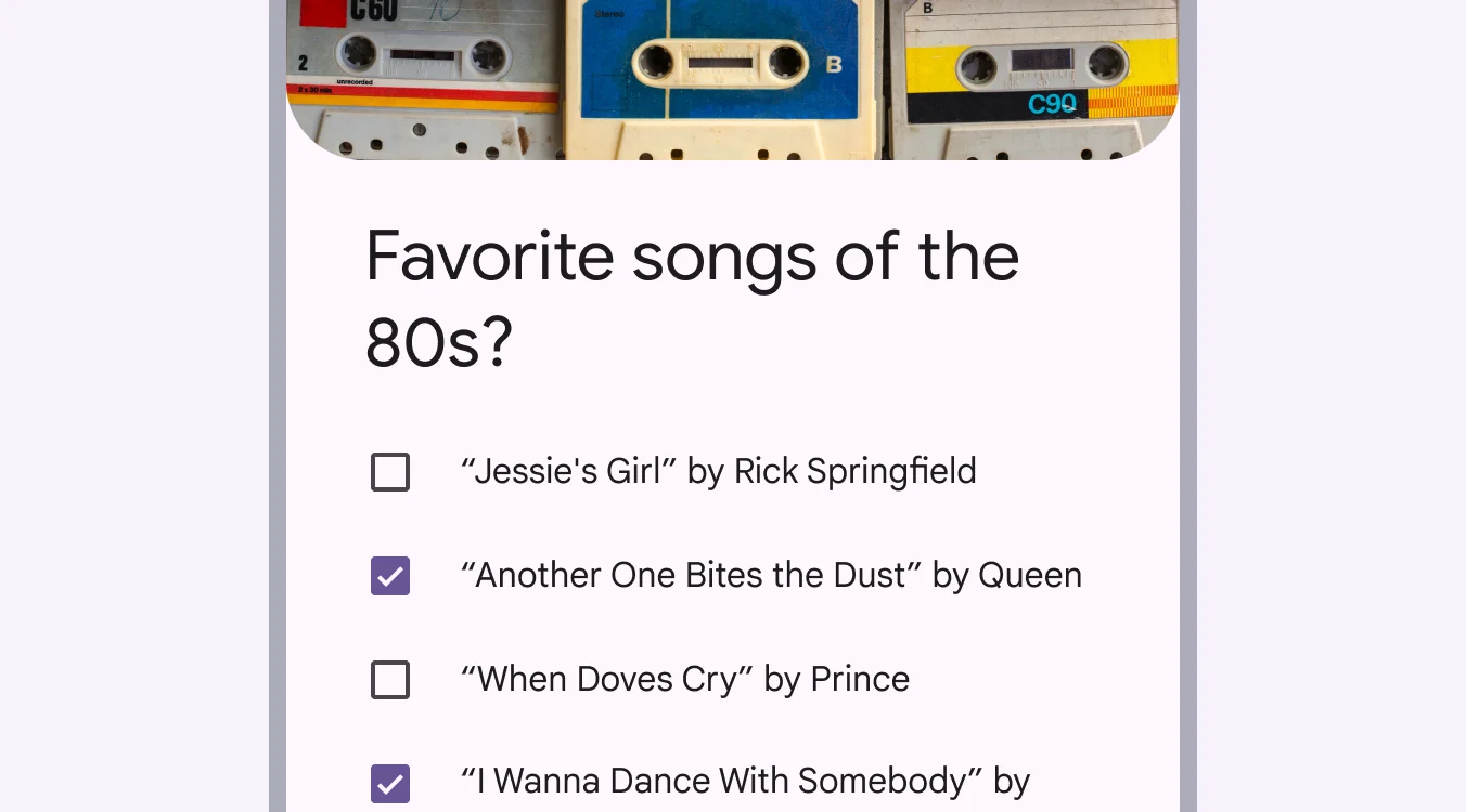
It is used when you want people to pick one or more choices from a list. You can check several boxes at once, which makes it great for things like preferences, settings, or surveys.
🧱 Gridding Rules
You can place the Checkbox element alone in the row using a flexible grid system.
Max |
60 grids |
⚙️ Settings
The following table outlines the available configuration options for this element. Each setting defines how the element behaves or appears within your app’s UI.
Field | Description |
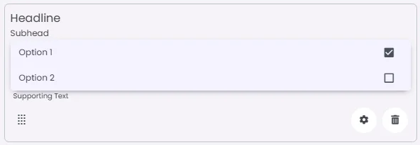
Headline | A main title is shown in the cell if supported by the element type. |
Subhead | A smaller, secondary title is shown below the headline. |
Image | An image shown inside the cell when light mode is active. |
Icon | An icon shown at the start (left side) of the cell. |
Divider | Shows a line under the cell to separate it from others, if supported. Default is off. |
Font Size | Controls how large or small the text appears in the cell. |
Text Alignment | Adjusts how the content inside the cell is aligned — left, center, or right. |
Options | A list of choices is shown to the user in dropdowns, radio buttons, or multi-select elements. Only needed for cells that require selection. |
Custom Color | controls the color styling of text or divider. |
Cell ID | This is the unique name for the cell. It's used to find or manage the cell later. If both cell_id and callback are provided, the system will use cell_id. |
Callback | This is the action name linked to the cell when a user interacts with it. You must add this when creating the cell. Once the cell is saved, this value can’t be changed. |
Cell Order | This controls where the cell appears inside the row (from left to right). Like callback, it must be set when creating the cell and can’t be changed later. |
Form | The type of the element. You must choose this when creating the cell, and it can't be changed later. |
Value | The default or current value for the cell (like a pre-selected option). |
Style | The visual style of the element (e.g., filled, outlined). You need to set this when creating the cell, and it can't be changed after saving. |
Version | A system-generated version number that updates automatically whenever the cell is changed. |
Body | Main text content displayed inside the cell. |
Helper | Helpful text shown below the cell to guide the user. Usually used for tips or extra context. |
Error | Error message shown when the user enters something wrong. It usually replaces the helper text. |
Prefix | Text that appears at the beginning of an input field (before the user's input). |
Suffix | Text that appears at the end of an input field (after the user's input). |
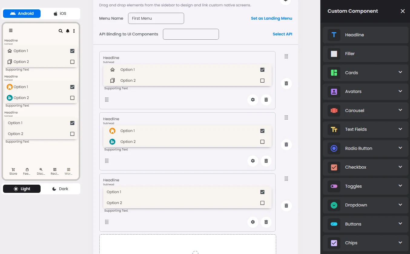
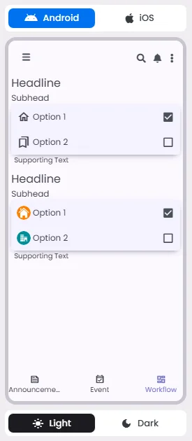
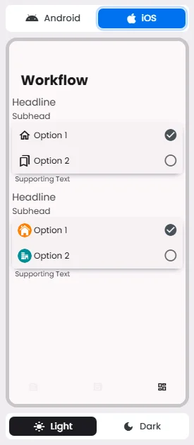
📱 Android & iOS Interface
The Checkbox element adapts its appearance and layout behavior based on the platform to align with native UI guidelines:
👇🏻 Action (onClick)
Element | Purpose | Supports Actions | Notes |
Checkbox | To provide a set of selectable choices for the user. | ❌ | Informational/structural use only. No interactive actions are triggered from this element. |
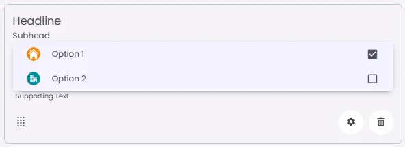
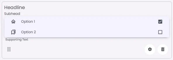
🃏 Checkbox Style Overview
A checkbox is used to allow users to make multiple selections from a list of available options.

🧰 Usage
Use checkbox when:
- Select one or more options from a list
- Present a list containing sub-selections
- Turn an item on or off in a desktop environment
- Visually group similar options together
Checkboxes visually group similar items effectively and take up less space than switches.
🎨 Our Styles
Standard
Image
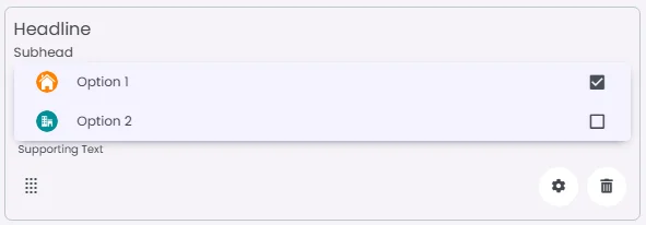
Iconic
Don’t fill a checkbox with too many options. If you have a long list, consider breaking it into smaller groups or categories so it’s easier to scan.
❓ FAQs
Q: How can I add checkboxes or multiple-choice options in my app without writing code?
A: You can use the Checkbox element to create multiple-choice options where users can select more than one answer. It’s perfect for forms, surveys, or preference settings—and it’s all done visually in the builder, no coding required.
Q: How do I insert and set up checkboxes?
A:
- Open the screen editor and drag the Checkbox element into your layout.
- Add a group label or prompt, such as “Choose your interests” or “Select all that apply.”
- Enter each option you want users to choose from (for example: News, Events, Updates).
- Since checkboxes support multiple selections, users can tick all the options that apply to them.
Q: Can I set default checked values?
A:
Yes. In the Checkbox settings, you can pre-select one or more options to be checked by default. For example, “Subscribe to newsletter” can already be ticked when the form loads to encourage sign-ups.