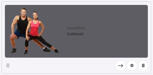
The Floating Card combines a headline and subhead with a dynamically positioned image that appears to float alongside the content. Featuring a horizontal layout, this style adds a sense of depth and movement, making it ideal for showcasing key content, promotions, or interactive elements in a visually distinctive way.
🧱 Gridding Rules
The Card element follows a flexible grid system where it can be placed alone or alongside one other element in the same row.
Max |
60 grids |
🔘 Actions
Element | Supports Actions | Available Actions |
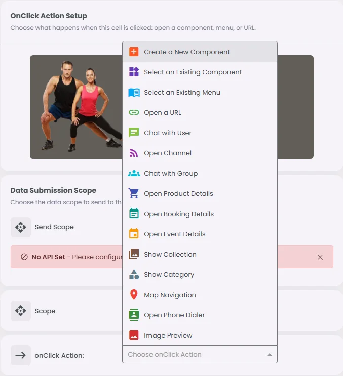
Floating Card | ✅1 action | 1. Create a New Component
2. Select an Existing Component
3. Select an Existing Menu
4. Open URL
5. Chat with User
6. Open Channel
7. Chat with Group
8. Open Product Details
9. Open Booking Details
10. Open Event Details
11. Show Collection
12. Show Category
13. Map Navigation
14. Open Audio Directory
15. Open Phone Dialer
16. Image Preview
17. Open Video Directory
18. Open Catalog |