
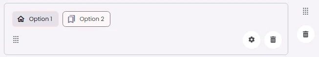
Suggestion chips present relevant actions or options based on user context.
🧱 Gridding Rules
You can place the Suggestion Chips element alone in the row using a flexible grid system.
Max |
60 grids |
⚙️ Applicable Settings
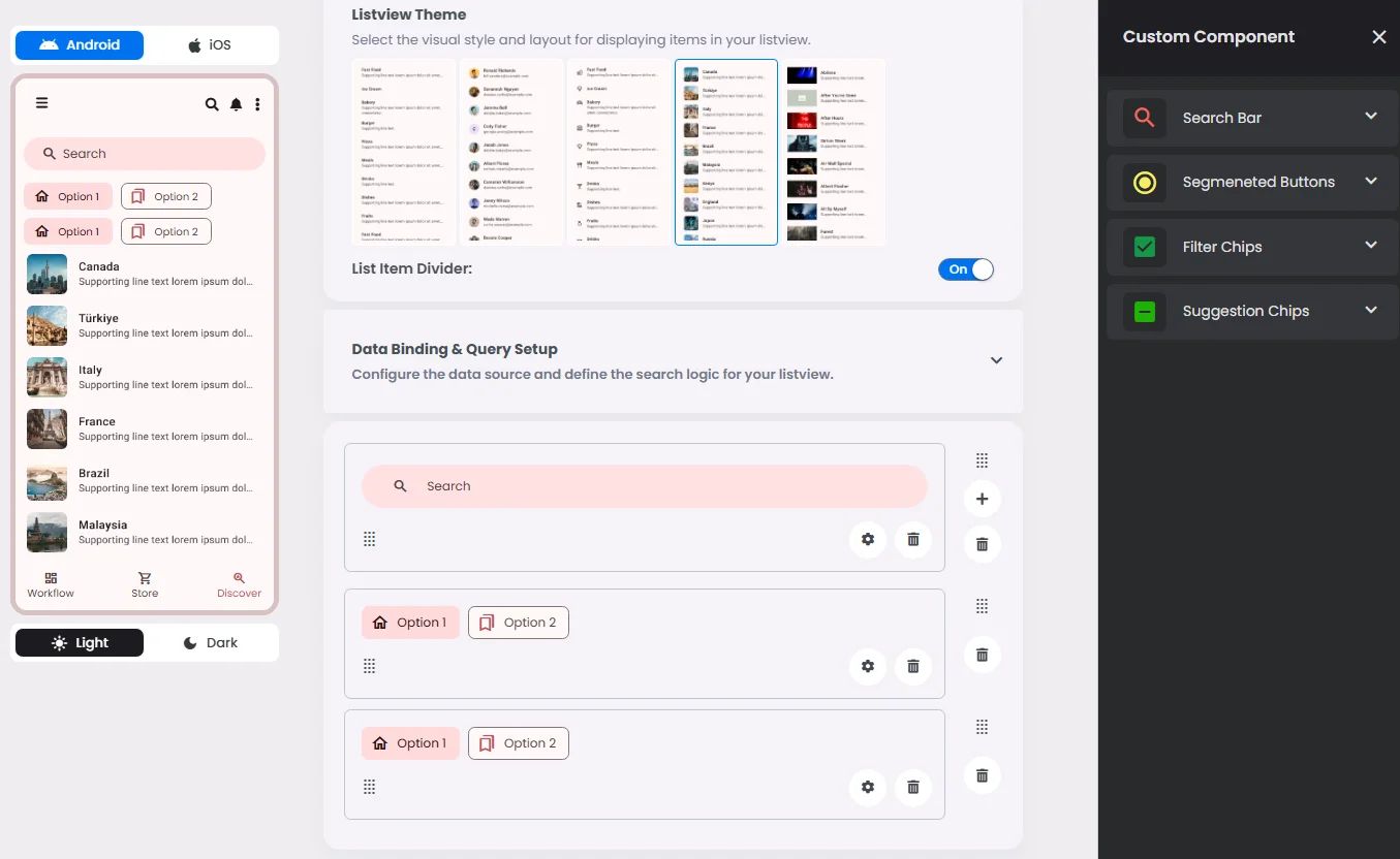
The following table outlines the available configuration options for this element. Each setting defines how the element behaves or appears within your app’s UI.
Field | Description |
Icon | An icon is shown at the start (left side) of the cell. |
Custom Color | controls the color styling of text or divider. |
Cell ID | This is the unique name for the cell. It's used to find or manage the cell later. If both cell_id and callback are provided, the system will use cell_id. |
Callback | This is the action name linked to the cell when a user interacts with it. You must add this when creating the cell. Once the cell is saved, this value can’t be changed. |
Cell Order | This controls where the cell appears inside the row (from left to right). Like callback, it must be set when creating the cell and can’t be changed later. |
Headline | A main title is shown in the cell if supported by the element type. |
Subhead | A smaller, secondary title is shown below the headline. |
Text Alignment | Adjusts how the content inside the cell is aligned — left, center, or right. |
Font Size | Controls how large or small the text appears in the cell. |
Form | The type of the element. You must choose this when creating the cell, and it can't be changed later. |
Style | The visual style of the element (e.g., filled, outlined). You need to set this when creating the cell, and it can't be changed after saving. |
Version | A system-generated version number that updates automatically whenever the cell is changed. |
Prefix | Text that appears at the beginning of an input field (before the user's input). |
Options | A list of choices is shown to the user in dropdowns, radio buttons, or multi-select elements. Only needed for cells that require selection. |
Value | The default or current value for the cell (like a pre-selected option). |
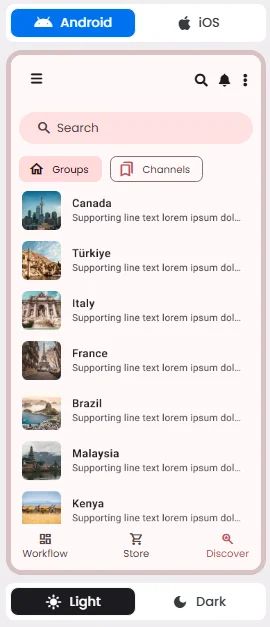
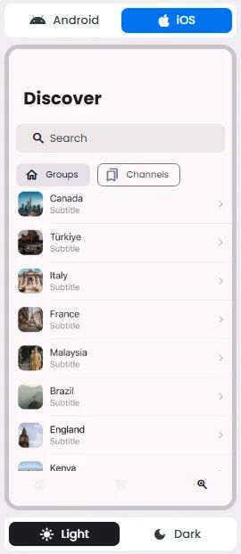
📱 Android & iOS Interface
The Suggestion Chips element adapts its appearance and layout behavior based on the platform to align with native UI guidelines:
👇🏻 Action (onClick)
Element | Purpose | Supports Actions | Notes |
Suggestion Chips | To provide contextual prompts or predicted user intents. | ❌ | Assist input by offering selectable suggestions; do not perform actions directly. |
🃏 Suggestion Chips Style Overview
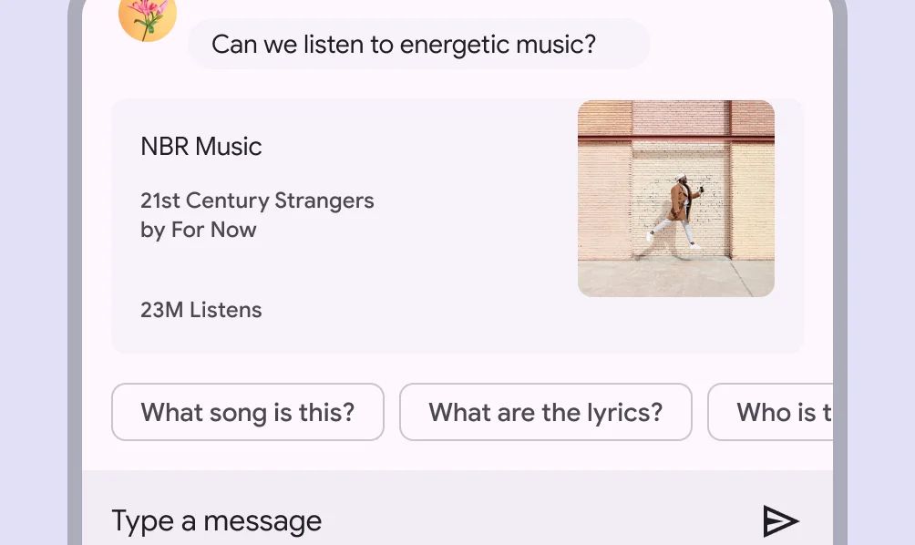
Suggestion Chips serve as lightweight, contextual options that help guide users by offering quick, predictive responses or next steps. They streamline user interaction by reducing the need for manual input, especially in conversational or search interfaces.

🧰 Usage
A suggestion chip helps the user start a search.
❓ FAQs
Q: How can I add quick suggestion tags (autocomplete chips) to help users select options in my app—without writing code?
A: You can easily add smart suggestion tags, create autocomplete chips, and set up helpful suggestions without coding using the Suggestion Chips component in nandbox. These clickable chips make it faster for users to pick options or run searches—perfect for search bars, forms, and filters.
Q: What are Suggestion Chips and what do they do?
The Suggestion Chips element allows you to:
- Show predefined, clickable suggestions under a search bar
- Offer popular options like “Top Picks,” “Free Events,” or “Nearby”
- Automatically fill a search field or trigger an action when a chip is tapped
- Customize chip labels, styles, and layout to match your branding
- Guide users with helpful suggestions, making your app more intuitive and engaging
This is great for improving search experiences and simplifying user input.
Q: How do I add and configure suggestion chips?
- Open your nandbox builder and go to the List View component where you want suggestions.
- Drag the Suggestion Chips element below a Search Bar.
- Add your custom chips:
- Set labels like “Popular,” “Recent,” or any terms you want to suggest.
- Define what happens when a chip is tapped (e.g., auto-fill the field or run a search).
- Style your chips to fit your app (adjust colors, shapes, and spacing).
- Save and preview—your suggestions will now appear live and clickable for users.