
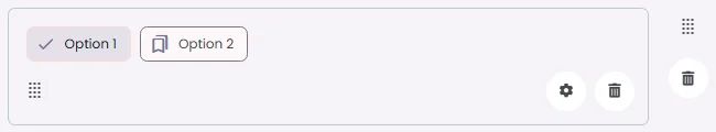
Filter chips are an element that allows users to select or deselect options to refine content based on categories or filters.
🧱 Gridding Rules
You can place the Filter Chips element alone in the row using a flexible grid system.
Max |
60 grids |
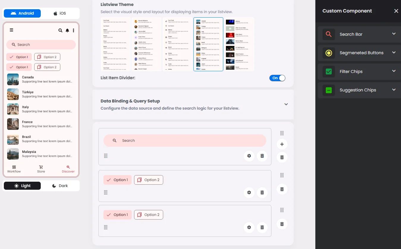
⚙️ Applicable Settings
The following table outlines the available configuration options for this element. Each setting defines how the element behaves or appears within your app’s UI.
Field | Description |
Label | The main label for form fields like inputs or dropdowns. |
Icon | An icon shown at the start (left side) of the cell. |
Custom Color | controls the color styling of text or divider. |
Cell ID | This is the unique name for the cell. It's used to find or manage the cell later. If both cell_id and callback are provided, the system will use cell_id. |
Callback | This is the action name linked to the cell when a user interacts with it. You must add this when creating the cell. Once the cell is saved, this value can’t be changed. |
Cell Order | This controls where the cell appears inside the row (from left to right). Like callback, it must be set when creating the cell and can’t be changed later. |
Form | The type of the element. You must choose this when creating the cell, and it can't be changed later. |
Style | The visual style of the element (e.g., filled, outlined). You need to set this when creating the cell, and it can't be changed after saving. |
Version | A system-generated version number that updates automatically whenever the cell is changed. |
Prefix | Text that appears at the beginning of an input field (before the user's input). |
Options | A list of choices is shown to the user in dropdowns, radio buttons, or multi-select elements. Only needed for cells that require selection. |
Value | The default or current value for the cell (like a pre-selected option). |
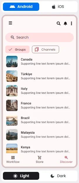
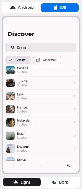
📱 Android & iOS Interface
The Filter Ships element adapts its appearance and layout behavior based on the platform to align with native UI guidelines:
👇🏻 Action (onClick)
Element | Purpose | Supports Actions | Notes |
Filter Chips | To allow users to apply or remove filters on content or results. | ❌ | Used for filtering only. Selection triggers data queries, not actions. |
🃏 Filter Chips Style Overview
Filter chips are elements that allow users to filter a dataset or content by toggling specific criteria on or off. They represent a set of options, and multiple filter chips can be selected simultaneously to refine results.

🧰 Usage
Write filter chips with nouns that describe the category to include in the results. Avoid negative phrases like "Exclude images.”
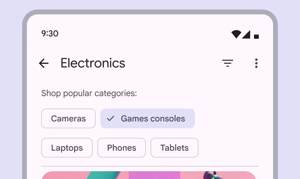
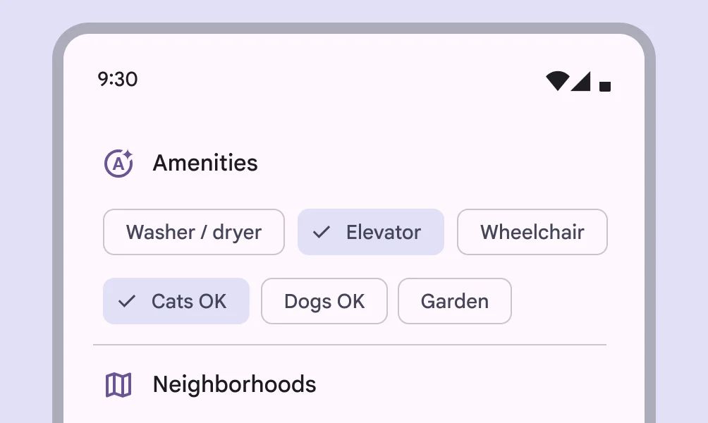
Filter chips should not present only a single option
❓ FAQs
Q: How can I let users filter lists with clickable tags (chips) in my app—without writing any code?
A: You can quickly add filter tags, create clickable chips for filtering, and build an interactive filter system without coding using the Filter Chips element in nandbox. These chips let users refine lists—like products, content, or events—instantly with just a tap.
Q: What are Filter Chips and what can they do?
The Filter Chips component lets you:
- Add tags like “All,” “Popular,” “Newest,” or custom categories
- Link each chip to a filter condition that updates your list automatically
- Choose between single-select (one chip active at a time) or multi-select (select multiple filters together)
- Customize labels, colors, and layout for a polished look
It’s a great way to make browsing easier and keep your app organized.
Q: How do I add and configure Filter Chips?
- In your nandbox builder, open the List View component where you can add filter chips.
- Drag the Filter Chips element above your List View.
- Configure your chips:
- Add and label each chip (e.g., “Top Rated,” “On Sale”).
- Set up filter conditions (like category, tag, or status).
- Choose if chips should be single-select or multi-select.
- Link the chips to your List View so filters apply in real time.
- Save and preview—users can now tap tags to filter content instantly.