
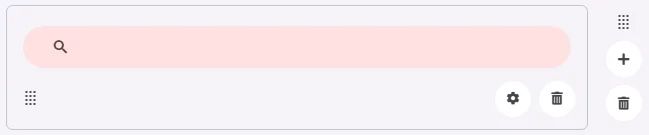
A Search Bar is a designed element for searching and filtering content. It allows users to type text queries and view suggestions or results dynamically.
🧱 Gridding Rules
The Search Bar element follows a flexible grid system where it can be placed alone or alongside one other element in the same row.
Min | Max |
20 grids | 60 grids |
⚙️ Applicable Settings
The following table outlines the available configuration options for this element. Each setting defines how the element behaves or appears within your app’s UI.
Field | Description |
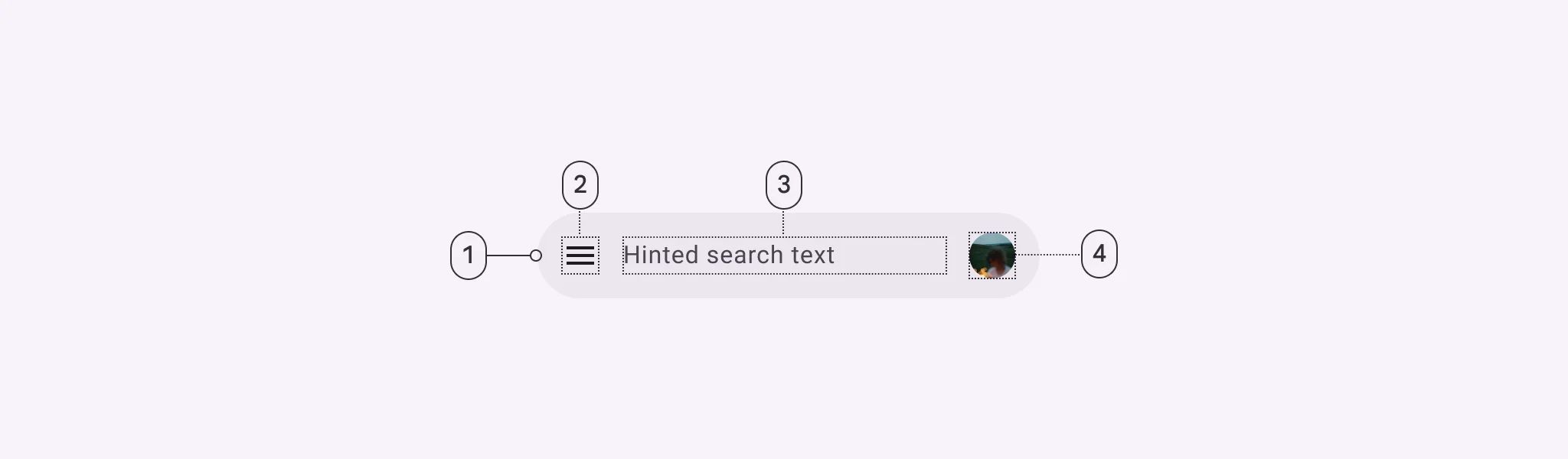
Cell_id | This is the unique name for the cell. It's used to find or manage the cell later. If both cell_id and callback are provided, the system will use cell_id. |
Callback | This is the action name linked to the cell when a user interacts with it. You must add this when creating the cell. Once the cell is saved, this value can’t be changed. |
Cell_order | This controls where the cell appears inside the row (from left to right). Like callback, it must be set when creating the cell and can’t be changed later. |
Label | The main label for form fields like inputs or dropdowns. |
Body | Main text content displayed inside the cell. |
Custom Color | controls the color styling of text or divider. |
Prefix | Text that appears at the beginning of an input field (before the user's input). |
Placeholder | Light grey text is shown inside an input before anything is typed, giving a hint on what to enter. |
BG Image | Background image for the cell when using light mode. |
BG Image Dark | Background image for the cell when using dark mode. |
Icon | An icon shown at the start (left side) of the cell. |
Value Type | The kind of data expected (like text or number). Must be set when creating the cell and stays fixed. |
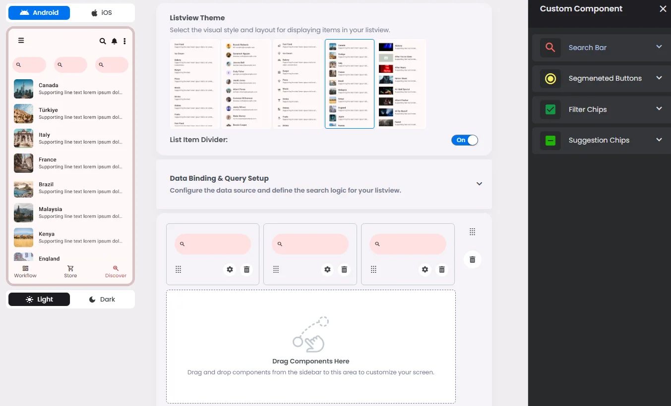
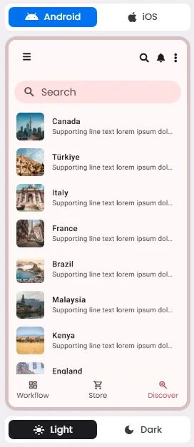
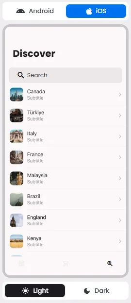
📱 UI for Android & iOS
The Search Bar element adapts its appearance and layout behavior based on the platform to align with native UI guidelines:
👇🏻 Action (onClick)
Element | Purpose | Supports Actions | Notes |
Search Bar | To allow users to input and submit search queries. | ❌ | Input-only element used for filtering or triggering query logic. Best paired with chips or buttons for dynamic search experiences. |
🃏 Search Bar Style Overview
The Search Bar is a user input component that allows users to type keywords or phrases to dynamically filter and retrieve relevant results from a connected data source.
🧰 Usage
Search is a navigation method that allows people to quickly find information across an app. Users input a query into the search bar or text field of the search view and then see related results.

❓ FAQs
Q: How can I add a search bar to my app so users can easily find items without any coding?
A: You can quickly add a search bar, let users browse and find items, and set up full search functionality—no coding required—using the Search Bar element in nandbox. It connects directly to a List View and filters results instantly as users type.
Q: What does the Search Bar element do?
The Search Bar makes it easy for users to:
- Search through lists in real time (e.g., posts, products, contacts).
- Filter items as they type—no page reloads or delays.
- Customize what’s searchable (e.g., titles, descriptions, tags).
- Display a placeholder message like “Search posts…” or “Find products here.”
It’s ideal for apps with long lists or content feeds where users need a quick way to find what they’re looking for.
Q: How do I add and set up the Search Bar?
- In your nandbox builder, open the List View component where you can add the search bar element.
- Drag and drop the Search Bar element into your screen layout—place it above or beside your list.
- Click to configure:
- Link to a List View as its data source (e.g., content, products, or users).
- Select which fields users can search (like title, subtitle, tags, or keywords).
- Customize the placeholder text for better user experience (e.g., “Search events…”).
- Save and preview—the search bar now filters the connected list instantly as users type.