
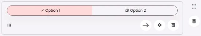
Segmented buttons are a group of connected buttons that allow users to select one or more options from a set.
🧱 Gridding Rules
You can place the Segmented Button element alone in the row using a flexible grid system.
Max |
60 grids |
⚙️ Applicable Settings
The following table outlines the available configuration options for this element. Each setting defines how the element behaves or appears within your app’s UI.
Field | Description |
Label | The main label for form fields like inputs or dropdowns. |
Icon | An icon shown at the start (left side) of the cell. |
Custom Color | controls the color styling of text or divider. |
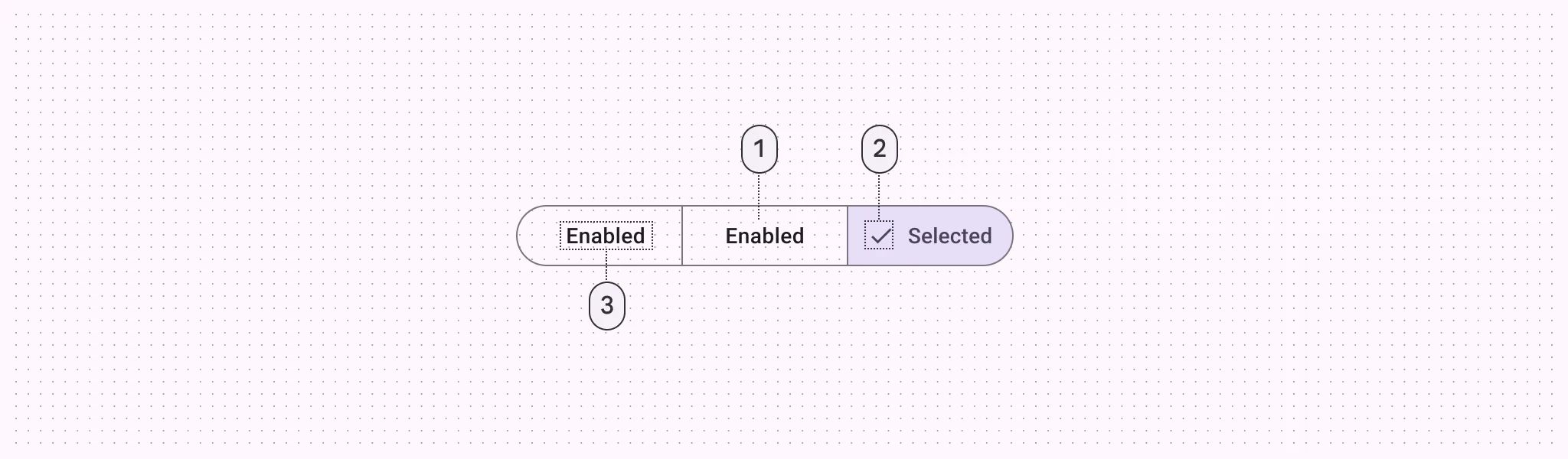
Cell ID | This is the unique name for the cell. It's used to find or manage the cell later. If both cell_id and callback are provided, the system will use cell_id. |
Callback | This is the action name linked to the cell when a user interacts with it. You must add this when creating the cell. Once the cell is saved, this value can’t be changed. |
Cell Order | This controls where the cell appears inside the row (from left to right). Like callback, it must be set when creating the cell and can’t be changed later. |
Form | The type of the element. You must choose this when creating the cell, and it can't be changed later. |
Style | The visual style of the element (e.g., filled, outlined). You need to set this when creating the cell, and it can't be changed after saving. |
Version | A system-generated version number that updates automatically whenever the cell is changed. |
Prefix | Text that appears at the beginning of an input field (before the user's input). |
Options | A list of choices is shown to the user in dropdowns, radio buttons, or multi-select elements. Only needed for cells that require selection. |
Value | The default or current value for the cell (like a pre-selected option). |
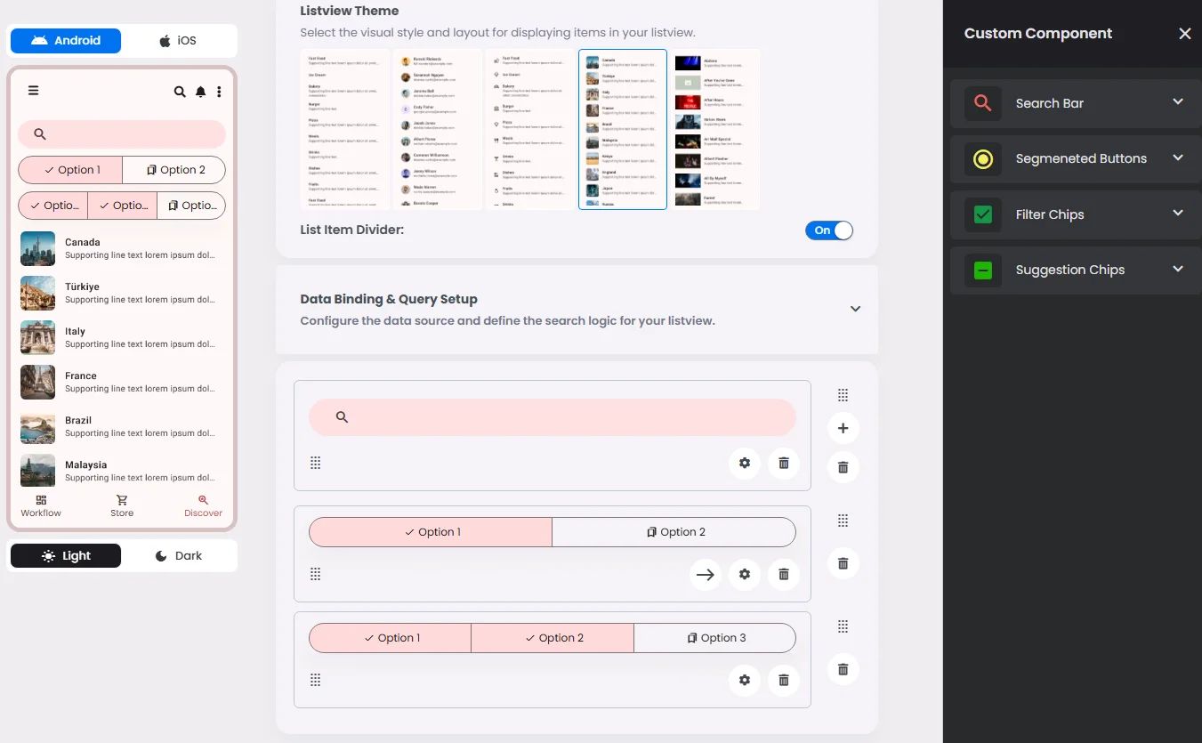
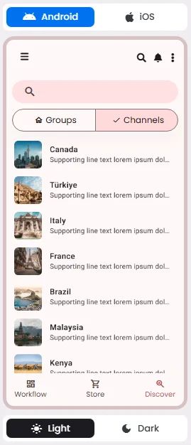
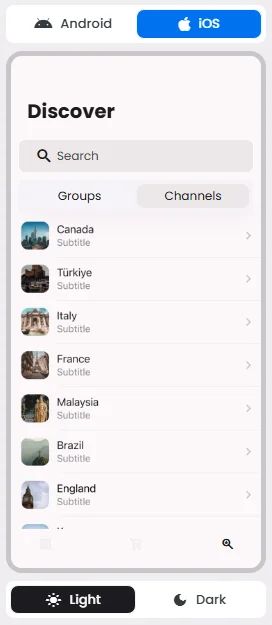
📱 Android & iOS Interface
The Segmented Button element adapts its appearance and layout behavior based on the platform to align with native UI guidelines:
👇🏻 Action (onClick)
Element | Purpose | Supports Actions | Notes |
Segmented Buttons | To let users select one or more options from a connected group. | ❌ | Used to trigger query logic through value matching. Selection only, not action-executing. |
🃏 Segmented Buttons Style Overview
Segmented buttons are grouped selection controls that allow users to toggle between related options, switch views, or sort elements within a single horizontal layout.
There are two types of segmented buttons: Single-select & Multi-select.
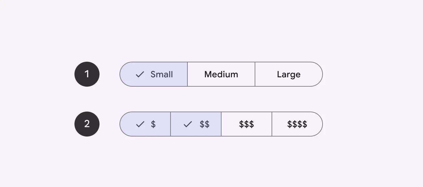
Single-select
🧰 Usage
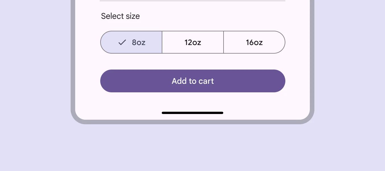
Use a single-select segmented button to select one option from a set.
Multi-select
🧰 Usage
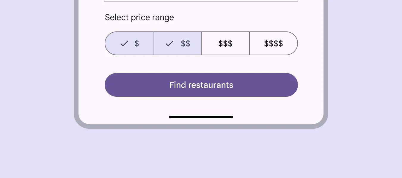
Use a multi-select segmented button to select or sort from two to five options, unlike single-select.
❓ FAQs
Q: How can I add segmented buttons so users can switch between views or filters in my app without coding?
A: You can easily add segmented filters, create tab-style buttons, and let users switch between content views—all without writing code using the Segmented Buttons element in nandbox. It’s perfect for giving users an easy way to toggle between categories, filters, or data views right on the same screen.
Q: What are Segmented Buttons used for?
The Segmented Buttons element helps you:
- Create multi-option buttons like “All,” “Favorites,” or “Upcoming Events.”
- Let users filter content or switch between different views in one tap.
It’s a simple way to organize your app and make it easier for users to find what they need.
Q: How do I set up segmented buttons?
- In your nandbox builder, open the List View component where you can add segmented buttons.
- Drag and drop the Segmented Buttons element into your layout.
- Click to configure:
- Add segments (e.g., “All,” “Free Events,” “Booked”).
- Set labels and link them to filters or data views.
- Choose which segment should be active by default.
- Connect the buttons to your list or content block using filters or visibility rules.
- Save and preview—users can now switch between segments instantly.